Style combination · Contrasts
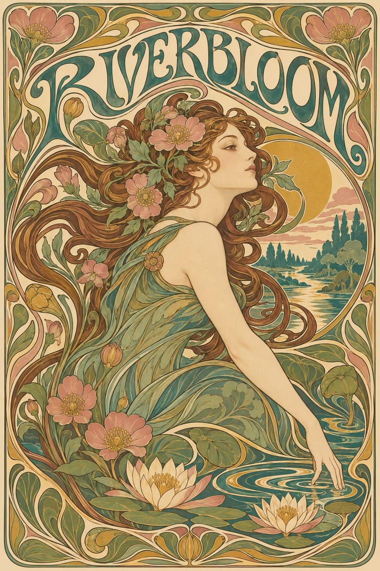
Art Nouveau × International Typographic Style
Ornamental curves against an orthogonal grid make a strong deliberate tension; let one botanical flourish break a cold grid.
Mix them and make something Art Nouveau International Typographic Style
01
What each style brings
Each part of the design comes from the style with the stronger say in it, and each style gives at least two.
Art Nouveau International Typographic Style
- Type from Art Nouveau
-
International Typographic Style avoids ornamented display: this is where the two pull against each other, which is the point of the contrast.
- Colour from International Typographic Style
- Form from Art Nouveau
- Composition from International Typographic Style
-
Art Nouveau avoids modular grid: this is where the two pull against each other, which is the point of the contrast.
- Surface from Art Nouveau
02
The type
Open fonts standing in for each style’s own type, which is often hand-drawn or commercial.
Text · International Typographic Style
A post-war refinement of the New Typography in which the mathematical grid, objective photography and neo-grotesque sans-serifs were used to communicate with clarity and neutrality. Taught at the Basel and Zurich schools, it became the default language of international corporate and institutional communication.
Inter; International Typographic Style used Akzidenz-Grotesk and Helvetica
03
The colours
The ground and leading colours come from International Typographic Style, with a counter-accent from Art Nouveau. The ink reads on the ground at 4.5:1 or more.
Art Nouveau International Typographic Style
-
#f2f0e9ground · 36% -
#111111ink · 14% -
#e1251baccent · 18% -
#c9a24baccent · 14% -
#1f4e9caccent · 10% -
#3f7a75accent · 8%
As CSS
:root {
  --ground: #f2f0e9;
  --ink: #111111;
  --accent-1: #e1251b;
  --accent-2: #c9a24b;
  --accent-3: #1f4e9c;
  --accent-4: #3f7a75;
  --font-display: "Federant", sans-serif;
  --font-text: "Inter", sans-serif;
}
04
The two styles

05
More combinations
With Art Nouveau
- Fileteado Porteño Pairs well · Fileteado's acanthus scrolls share the whiplash; combine them for ornate, hand-made lettering frames.
- Psychedelic Poster Pairs well · San Francisco poster artists lifted Mucha's figures and whiplash wholesale; push the curves into saturated, vibrating colour for a 1960s-flavoured revival.
- Russian Constructivism Contrasts · Organic sensuality versus machine-age diagonals: use the opposition to stage nature against industry.
- Vienna Secession Contrasts · Set French whiplash against the Viennese square to show the turn from organic to geometric ornament within one decorative idiom.
- Skønvirke (Danish Art Nouveau, Bindesbøll) Contrasts · Shares the hand-lettering and abundance but swaps the whiplash line and the female figure for blunt abstract masses; set side by side they show the heavy Danish variant.
- Expressionist Woodcut Graphics Contrasts · The parent's smooth whiplash and floral harmony is exactly what the gouge splinters; use one against the other to stage order breaking down.
- Beggarstaffs Poster (Nicholson & Pryde) Contrasts · Its curving floral line is the opposite of cut masses; set side by side to show how much a poster can drop.
- Simplicissimus Satirical Style (Munich) Contrasts · The parent: Heine took over the Jugendstil idiom, but where Art Nouveau spends the whiplash line on flowers and idealised women, Simplicissimus spends it on a grotesque type and a caption. Choose it when the curve should mock rather than adorn.
With International Typographic Style
- Brutalist Web Design Pairs well · Strip the grid to raw HTML defaults to get a rawer, contemporary take on Swiss honesty.
- Psychedelic Poster Contrasts · Its exact opposite on legibility; borrow one swirling element to break a too-cold Swiss layout.
- Japanese Postwar Modernism Pairs well · Add Japanese restraint and emblematic colour fields to the grid for warmth without losing order.
- American Traditional Tattoo Flash Contrasts · Rational grid and sans-serif against sentimental, hand-lettered emblems: one flash motif on a Swiss layout makes a sharp contrast.
- Graffiti & Hip-Hop Graphics Contrasts · Put a single tag or throw-up over a strict Swiss grid to stage the clash between institutional order and a street voice.
- Pop Art Graphics Contrasts · Set one loud appropriated Pop image inside a strict grid with a neutral grotesque so the irony reads as deliberate rather than chaotic.
- Italian Painted Film Poster (Rome Studios) Contrasts · Grid, restraint and photographic objectivity are the opposite of a crowded painted montage.
- East German (DDR) Poster and Gebrauchsgrafik Pairs well · Shares the rational sans and plain ground; add DDR hand-drawn imagery to warm a Swiss layout.