Style combination · Pairs well
Bitmap × PS1
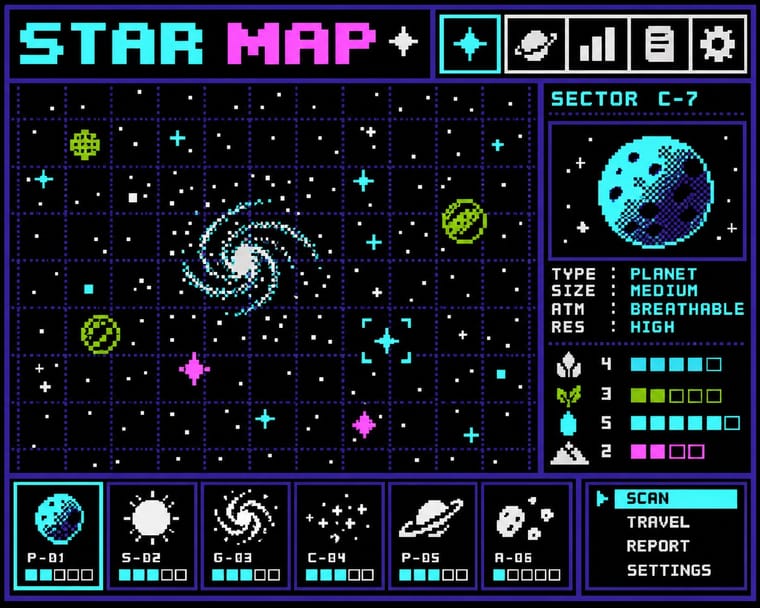
The PSX look is the bitmap pixel stretched across 3D surfaces; set its menus, HUD and captions in hard-edged bitmap capitals so the type shares the textures' resolution.
01
What each style brings
Each part of the design comes from the style with the stronger say in it, and each style gives at least two.
Bitmap & Pixel Graphics PS1 / Lo-Fi 3D Revival (PSX Aesthetic)
- Type from Bitmap
- Colour from PS1
- Form from Bitmap
- Composition from PS1
- Surface from PS1
02
The type
Open fonts standing in for each style’s own type, which is often hand-drawn or commercial.
Text · PS1
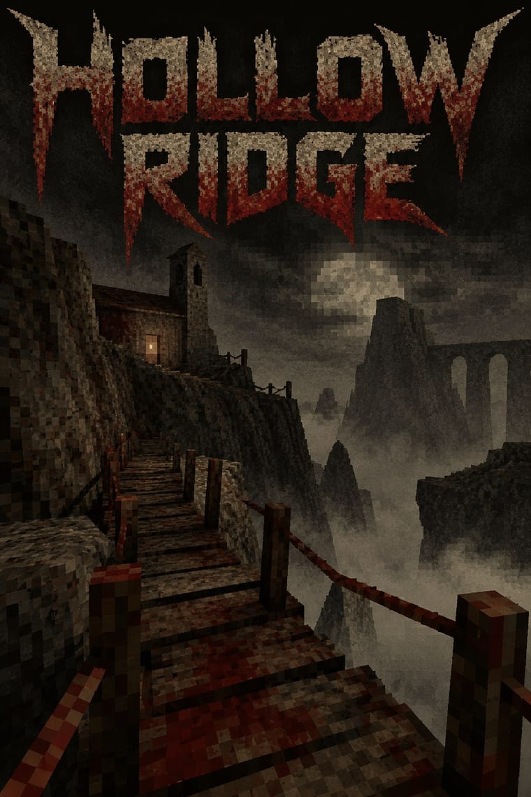
Indie games and their artwork that rebuild the look of late-1990s console and PC 3D on modern engines: few polygons, tiny low-resolution textures that warp as the original PlayStation's affine-only mapping did, dithering, grain and distance fog over murky, dark earth tones. Puppet Combo's horror games 'modeled after early PlayStation games and VHS' and Dusk's Quake-like shooter set it going; the Haunted PS1 community made it a scene, with game jams and digital Demo Discs whose menus and manual booklets imitate the era's demo discs.
VT323; PS1 used Bitmap and pixel fonts in capitals for menus and HUDs, in the manner of the PlayStation demo-disc and Namco Museum front ends the Haunted PS1 Demo Discs model their menus on (a working description: the scene has no settled typeface canon) and Title cards and on-screen lettering borrowed from VHS tapes and late-1990s survival-horror title screens, as in Puppet Combo's games modelled on early PlayStation games and VHS
03
The colours
The ground and leading colours come from PS1, with a counter-accent from Bitmap. The ink reads on the ground at 4.5:1 or more.
Bitmap & Pixel Graphics PS1 / Lo-Fi 3D Revival (PSX Aesthetic)
-
#0d0d0cground · 36% -
#c9c2a8ink · 14% -
#6b1d16accent · 18% -
#9bbc0faccent · 14% -
#5c5446accent · 10% -
#55ffffaccent · 8%
As CSS
:root {
  --ground: #0d0d0c;
  --ink: #c9c2a8;
  --accent-1: #6b1d16;
  --accent-2: #9bbc0f;
  --accent-3: #5c5446;
  --accent-4: #55ffff;
  --font-display: "Pixelify Sans", monospace;
  --font-text: "VT323", monospace;
}
04
The two styles
05
More combinations
With Bitmap
- Andean Woven Graphic Systems Pairs well · The woven cell of Andean tapestry is a pre-digital pixel grid; draw pixel icons with its stepped diagonals, but credit weaving communities rather than copying their motifs.
- Skeuomorphic UI Contrasts · Photoreal leather and glass are the opposite pole of 1-bit honesty; jump from one to the other to tell a story of interface history.
- International Typographic Style Pairs well · Snap pixel type and icons to a strict Swiss grid for a rational, screen-native take on modernist order.
- Art Nouveau Contrasts · Whiplash curves cannot survive a coarse pixel grid; staging that clash makes a memorable, deliberately jagged ornament.
- Kawaii Design Pairs well · Sprite-scale characters and kawaii roundness merge naturally; keep the palette limited so pixel mascots stay crisp.
- Demoscene Graphics (Cracktros, Demos & Text-Mode Art) Contrasts · Bitmap graphics is the legible, flat pixel of icons, sprites and system fonts; scene graphics spend the same pixels on chrome, gradients and motion for show. Pick the icon grid for an interface and the scene logo for a title screen.
- Square Kufic (Bannāʾī) Pairs well · Both build letters from square units, and Sakkal compares building bricks to large pixels; set a bitmap Latin wordmark on the same cell size as a square-Kufic mark for a bilingual identity, but keep sacred formulas out of jokey, game-like pixel contexts.
- Isometric Pixel Art Contrasts · Same hand-placed pixels, but front-on icons and sprites under hardware limits against a crammed, full-colour 2:1 city made as a picture.
With PS1
- Analog Horror Graphics Contrasts · Both mine 1990s screens for fear, and Puppet Combo borrows from VHS, but analog horror fakes flat 2D broadcast and tape graphics, while the PSX revival builds navigable, textured 3D spaces. Choose the warning screen or the walkable room.
- Demoscene Graphics (Cracktros, Demos & Text-Mode Art) Contrasts · The demoscene shows a machine performing flawlessly at its limit in chrome and gradients; the PSX revival fakes old hardware's flaws on a modern engine and keeps them murky. Pick mastery or imitation of limits.
- Low Poly Illustration Contrasts · Both count polygons, but low poly shows clean, untextured flat-shaded facets on bright grounds with a calm tone, while the PSX look wraps its meshes in tiny warping textures, fog and grain to make dread. Keep the facets clean for decoration and dirty them for horror.
- Weirdcore & Dreamcore Pairs well · Both turn half-familiar empty places uncanny; render a weirdcore corridor or mall as a fogged, low-texture 3D room you can walk through rather than a found snapshot.
- Vaporwave Contrasts · Vaporwave also reuses early 3D, but as pastel, ironic collage of busts and grids; the PSX revival keeps the 3D in dark earth tones and fog for horror. Drop the pastels when the brief wants unease.