Style combination · Pairs well
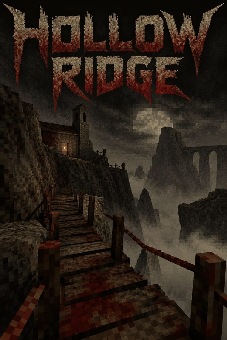
PS1 × Weirdcore
Both turn half-familiar empty places uncanny; render a weirdcore corridor or mall as a fogged, low-texture 3D room you can walk through rather than a found snapshot.
01
What each style brings
Each part of the design comes from the style with the stronger say in it, and each style gives at least two.
PS1 / Lo-Fi 3D Revival (PSX Aesthetic) Weirdcore & Dreamcore
- Type from PS1
- Colour from PS1
- Form from Weirdcore
- Composition from PS1
- Surface from Weirdcore
02
The type
Open fonts standing in for each style’s own type, which is often hand-drawn or commercial.
Display · PS1
Daydream
Press Start 2P, standing in for Bitmap and pixel fonts in capitals for menus and HUDs, in the manner of the PlayStation demo-disc and Namco Museum front ends the Haunted PS1 Demo Discs model their menus on (a working description: the scene has no settled typeface canon)
Text · Weirdcore
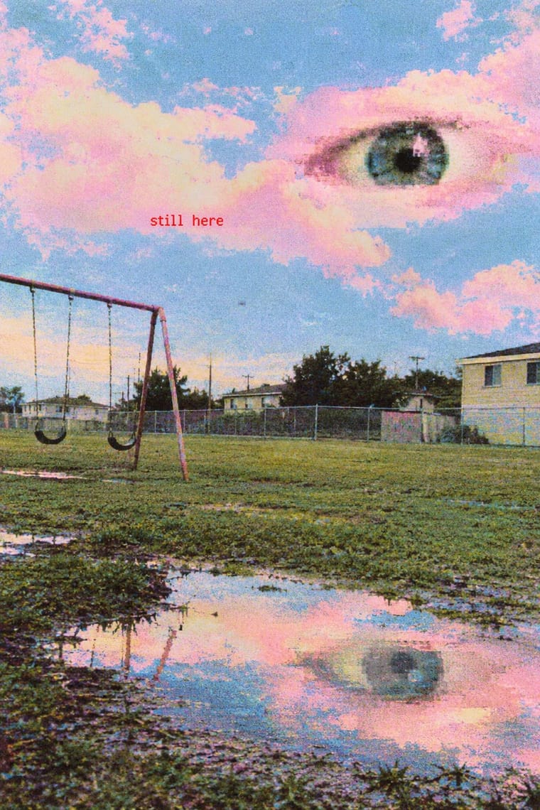
An internet aesthetic popularised on Reddit, TikTok and YouTube in the early 2020s, with dreamcore as its softer, pastel, cloud-filled sister. Found or low-quality snapshots of empty, half-familiar places (playgrounds, classrooms, malls, corridors) are crudely edited: disembodied eyes in clouds or darkness, faceless figures in doorways, and short captions such as 'nothing is real' in red or inside black voids. The aim is anemoia, a nostalgia for places one never knew, turned into unease and the feeling of being watched.
Instrument Sans; Weirdcore used Short captions in out-of-place red text ('are you lost?', 'nothing is real'), typed in whatever plain default face the editing app offers and dropped onto the photograph and White text inside black rectangular voids pasted over the picture, the void heightening the message
03
The colours
The ground and leading colours come from PS1, with a counter-accent from Weirdcore. The ink reads on the ground at 4.5:1 or more.
PS1 / Lo-Fi 3D Revival (PSX Aesthetic) Weirdcore & Dreamcore
-
#0d0d0cground · 36% -
#c9c2a8ink · 14% -
#6b1d16accent · 18% -
#ff0000accent · 14% -
#5c5446accent · 10% -
#a9c8e8accent · 8%
As CSS
:root {
  --ground: #0d0d0c;
  --ink: #c9c2a8;
  --accent-1: #6b1d16;
  --accent-2: #ff0000;
  --accent-3: #5c5446;
  --accent-4: #a9c8e8;
  --font-display: "Press Start 2P", monospace;
  --font-text: "Instrument Sans", sans-serif;
}
Use it with care
Weirdcore & Dreamcore: Weirdcore's found snapshots are other people's photographs, often of real homes, schools and playgrounds (the Backrooms photo was a real shop interior in Wisconsin, identified only in 2024): shoot or license your own places, and leave identifiable children and private interiors out. Its makers describe it as built to unsettle, from 'existentialism and derealization' (Nylon, 2021) to an 'aesthetic that can cause a panic attack' (a @unttochable video quoted by i-D, 2021), so take care before aiming it at children or using it near mental-health subjects, and keep video cuts to three or fewer flashes a second (WCAG 2.3.1).
04
The two styles
05
More combinations
With PS1
- Analog Horror Graphics Contrasts · Both mine 1990s screens for fear, and Puppet Combo borrows from VHS, but analog horror fakes flat 2D broadcast and tape graphics, while the PSX revival builds navigable, textured 3D spaces. Choose the warning screen or the walkable room.
- Demoscene Graphics (Cracktros, Demos & Text-Mode Art) Contrasts · The demoscene shows a machine performing flawlessly at its limit in chrome and gradients; the PSX revival fakes old hardware's flaws on a modern engine and keeps them murky. Pick mastery or imitation of limits.
- Bitmap & Pixel Graphics Pairs well · The PSX look is the bitmap pixel stretched across 3D surfaces; set its menus, HUD and captions in hard-edged bitmap capitals so the type shares the textures' resolution.
- Low Poly Illustration Contrasts · Both count polygons, but low poly shows clean, untextured flat-shaded facets on bright grounds with a calm tone, while the PSX look wraps its meshes in tiny warping textures, fog and grain to make dread. Keep the facets clean for decoration and dirty them for horror.
- Vaporwave Contrasts · Vaporwave also reuses early 3D, but as pastel, ironic collage of busts and grids; the PSX revival keeps the 3D in dark earth tones and fog for horror. Drop the pastels when the brief wants unease.
With Weirdcore
- Vaporwave Contrasts · Tanni's genealogy starts with vaporwave's spectral reuse of web imagery; vaporwave collages pastel consumer debris, busts and Japanese text with ironic luxury, while weirdcore empties the frame and drops the joke. Keep the found picture but swap the bust for a vacant playground to move from irony to unease.
- Early Web Vernacular Pairs well · Frame a weirdcore still in an old browser window, a default dialog box or a low-resolution GIF to make its debt to the amateur early web explicit; keep the window empty rather than crowding it with the early web's badges and counters.
- Internet Ugly & Meme Vernacular Contrasts · Both caption a crude found picture, but white Impact capitals ask for a laugh and a crowd to copy them; one small red lowercase line asks whether you are lost. Decide which the caption is for before choosing the picture.
- Lo-fi Anime Aesthetic Contrasts · Both are nostalgic online moods set to lo-fi music, but lofi paints a lived-in, occupied room that comforts; weirdcore photographs an empty one that watches back. Choose lofi for focus and calm, weirdcore when the brief wants disquiet.
- Hauntology & Ghost Box Design Contrasts · Both rebuild a misremembered past from found pictures and let nostalgia turn eerie, but Ghost Box designs the haunting: a Penguin-style grid, bold grotesque in a ruled band, a flat colour field and an institutional voice. Weirdcore drops grid, brand and author, and lets an anonymous snapshot and one small caption do it. Choose Ghost Box for an archival, designed eeriness and weirdcore for a found, amateur one.
- Surrealist Graphics Pairs well · Magritte's single displaced object in a calm, ordinary space is the grammar weirdcore remakes with snapshots and phone edits; study it so the one wrong thing (an eye, a door, a figure) feels placed rather than random.
- Glitch Art & Datamosh Graphics Pairs well · Borrow compression damage and an abrupt datamosh between two stills, but treat the damage as the decay of a memory rather than the subject of the work, and keep the rest of the snapshot readable.
- Analog Horror Graphics Contrasts · Both turn nostalgia into unease and share The Backrooms, but weirdcore is a still snapshot of an empty place with one small lowercase caption, while analog horror is a sequence of broadcast or tape fragments in an official voice and plain capitals. Choose the found image or the fake transmission.