Style combination · Contrasts
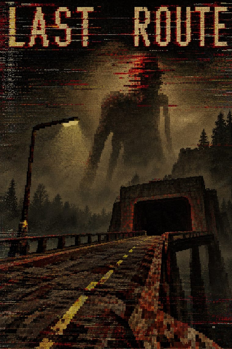
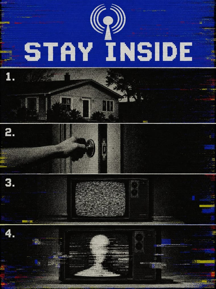
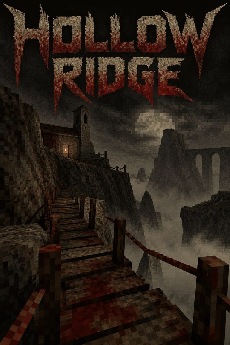
Analog Horror Graphics × PS1
Both mine 1990s screens for fear, and Puppet Combo borrows from VHS, but analog horror fakes flat 2D broadcast and tape graphics, while the PSX revival builds navigable, textured 3D spaces. Choose the warning screen or the walkable room.
01
What each style brings
Each part of the design comes from the style with the stronger say in it, and each style gives at least two.
Analog Horror Graphics PS1 / Lo-Fi 3D Revival (PSX Aesthetic)
- Colour from PS1
- Form from Analog Horror Graphics
- Composition from PS1
- Surface from Analog Horror Graphics
02
The type
Open fonts standing in for each style’s own type, which is often hand-drawn or commercial.
Display · Analog Horror Graphics
Memory
Big Shoulders, standing in for 'Grainy VCR text onscreen' (Kok, 2022): the blocky, fixed-width lettering of tape-deck on-screen displays and station character generators, sometimes scrolling across the picture; The Mandela Catalogue's captions are often lowercase ('suspect identified', 'answers lie beneath'), the exception to the capitals rule
Text · PS1
Indie games and their artwork that rebuild the look of late-1990s console and PC 3D on modern engines: few polygons, tiny low-resolution textures that warp as the original PlayStation's affine-only mapping did, dithering, grain and distance fog over murky, dark earth tones. Puppet Combo's horror games 'modeled after early PlayStation games and VHS' and Dusk's Quake-like shooter set it going; the Haunted PS1 community made it a scene, with game jams and digital Demo Discs whose menus and manual booklets imitate the era's demo discs.
VT323; PS1 used Bitmap and pixel fonts in capitals for menus and HUDs, in the manner of the PlayStation demo-disc and Namco Museum front ends the Haunted PS1 Demo Discs model their menus on (a working description: the scene has no settled typeface canon) and Title cards and on-screen lettering borrowed from VHS tapes and late-1990s survival-horror title screens, as in Puppet Combo's games modelled on early PlayStation games and VHS
03
The colours
The ground and leading colours come from PS1, with a counter-accent from Analog Horror Graphics. The ink reads on the ground at 4.5:1 or more.
Analog Horror Graphics PS1 / Lo-Fi 3D Revival (PSX Aesthetic)
-
#0d0d0cground · 36% -
#c9c2a8ink · 14% -
#6b1d16accent · 18% -
#bfbf00accent · 14% -
#5c5446accent · 10% -
#bf0000accent · 8%
As CSS
:root {
  --ground: #0d0d0c;
  --ink: #c9c2a8;
  --accent-1: #6b1d16;
  --accent-2: #bfbf00;
  --accent-3: #5c5446;
  --accent-4: #bf0000;
  --font-display: "Big Shoulders", sans-serif;
  --font-text: "VT323", monospace;
}
Use it with care
Analog Horror Graphics: Fake emergency alerts can be mistaken for real ones: in the United States 47 CFR § 11.45 bars transmitting EAS codes or the Attention Signal, or a recording or simulation of them, outside real emergencies and authorised tests, so keep real alert tones, codes and agency names out of anything that may be broadcast, and label a fictional warning as fiction. Keep strobing static and flashing alert screens to three flashes a second or fewer (WCAG 2.3.1). Invent the seal and flag on a fictional alert screen: real national emblems can be protected by law, and Indonesian law forbids showing the Garuda Pancasila damaged or altered from its prescribed shape, colours and proportions (first in Law 24/2009, since moved into the Criminal Code and narrowed by the Constitutional Court). The blue Peringatan Darurat Garuda is also a living pro-democracy protest symbol, not a horror prop. The genre corrupts other people's footage (The Beginner's Bible in The Mandela Catalogue), so use public-domain or licensed material. Gemini Home Entertainment's creatures grew out of 'classic internet creepypastas surrounding Skinwalkers or the Wendigo' (Kok, 2022). The skin-walker belongs to Navajo (Diné) tradition and is rarely discussed with outsiders, and Native critics such as Adrienne Keene have objected to non-Navajo writers using it; the wendigo comes from Algonquian folklore. Do not turn these or other Indigenous beliefs into monsters for a design.
04
The two styles
05
More combinations
With Analog Horror Graphics
- Demoscene Graphics (Cracktros, Demos & Text-Mode Art) Contrasts · Both put bitmap type on black screens, but the demoscene shows a machine running flawlessly at its limit and analog horror shows one failing. Pick mastery or breakdown.
- Weirdcore & Dreamcore Contrasts · Both turn nostalgia into unease and share The Backrooms, but weirdcore is a still snapshot of an empty place with one small lowercase caption, while analog horror is a sequence of broadcast or tape fragments in an official voice and plain capitals. Choose the found image or the fake transmission.
- Synthwave / Outrun Contrasts · Both finish 1980s screens with VHS tracking noise, scanlines and grain, but synthwave treats the decade with affection, in neon grids, chrome type and sunsets, while analog horror makes it a flat, official screen that is failing. Keep neon and chrome out, and let the noise mean something is wrong.
- Glitch Art & Datamosh Graphics Contrasts · Henty traces analog horror to the 'glitch aesthetics' of earlier internet horror. Glitch art breaks a digital file and makes the damage the subject; analog horror dates the damage to a dying VHS tape or a weak broadcast signal and uses it to hide what is happening. Keep the noise in service of the story, not as the picture.
- Plain Tobacco Packaging Contrasts · Both frighten with the flat, mandatory voice of an official warning: plain packaging does it for real, in print, with matt drab brown, clinical photographs and Helvetica capitals; analog horror fakes it on a screen and lets the signal decay. Borrow plain packaging's uncompromising flatness for a fictional warning screen, and save the noise for the moment the threat appears.
- Hauntology & Ghost Box Design Contrasts · Henty, who puts his study of analog horror 'firmly in the remit of Hauntology', calls the subgenre 'deeply intertwined and expressive of the nostalgic trends Hauntology rests on'. Both fake a past institution's public voice and let it turn eerie, but Ghost Box and Scarfolk design 1970s print in flat offset colour on paper, while analog horror fakes 1980s and 1990s broadcasts and tapes on screen and lets the signal decay. Choose the printed pastiche or the corrupted transmission.
With PS1
- Demoscene Graphics (Cracktros, Demos & Text-Mode Art) Contrasts · The demoscene shows a machine performing flawlessly at its limit in chrome and gradients; the PSX revival fakes old hardware's flaws on a modern engine and keeps them murky. Pick mastery or imitation of limits.
- Bitmap & Pixel Graphics Pairs well · The PSX look is the bitmap pixel stretched across 3D surfaces; set its menus, HUD and captions in hard-edged bitmap capitals so the type shares the textures' resolution.
- Low Poly Illustration Contrasts · Both count polygons, but low poly shows clean, untextured flat-shaded facets on bright grounds with a calm tone, while the PSX look wraps its meshes in tiny warping textures, fog and grain to make dread. Keep the facets clean for decoration and dirty them for horror.
- Weirdcore & Dreamcore Pairs well · Both turn half-familiar empty places uncanny; render a weirdcore corridor or mall as a fogged, low-texture 3D room you can walk through rather than a found snapshot.
- Vaporwave Contrasts · Vaporwave also reuses early 3D, but as pastel, ironic collage of busts and grids; the PSX revival keeps the 3D in dark earth tones and fog for horror. Drop the pastels when the brief wants unease.