Style combination · Contrasts
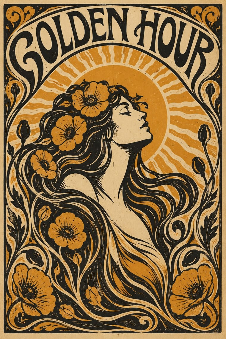
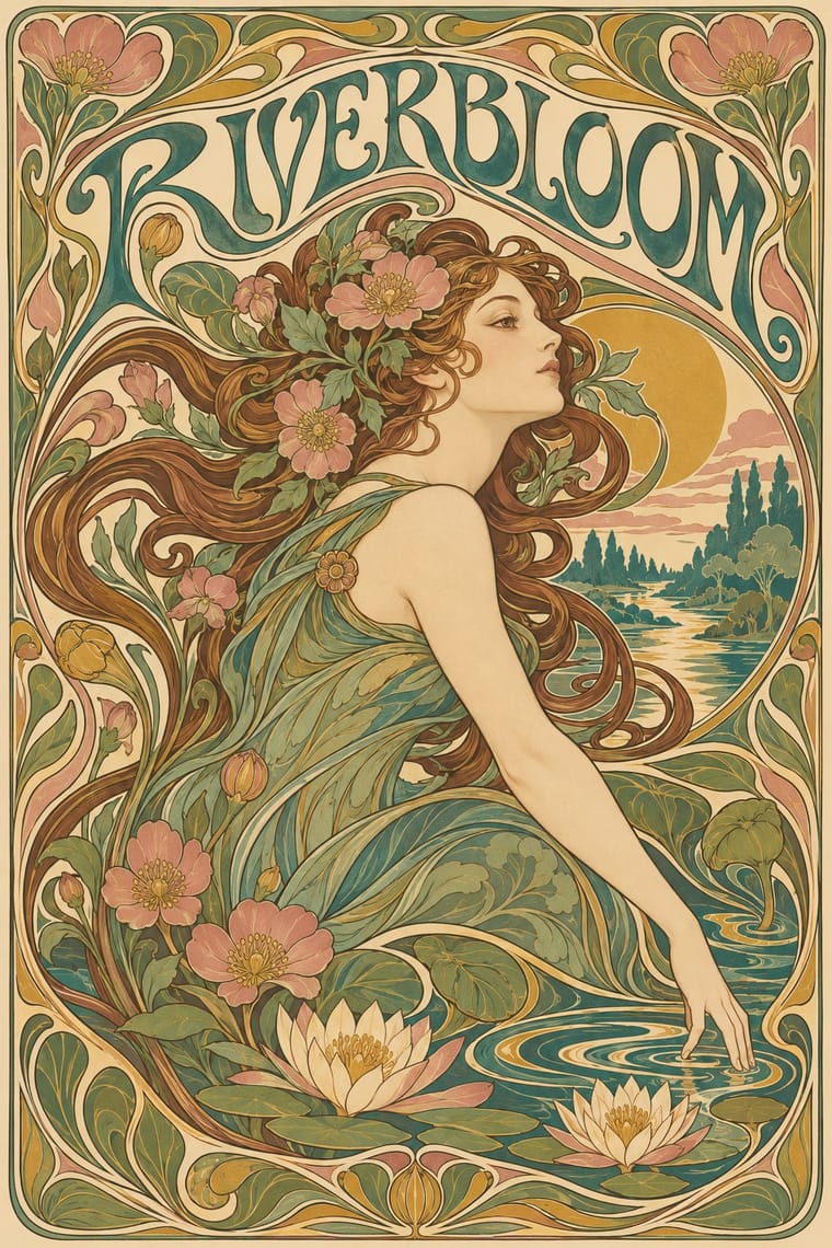
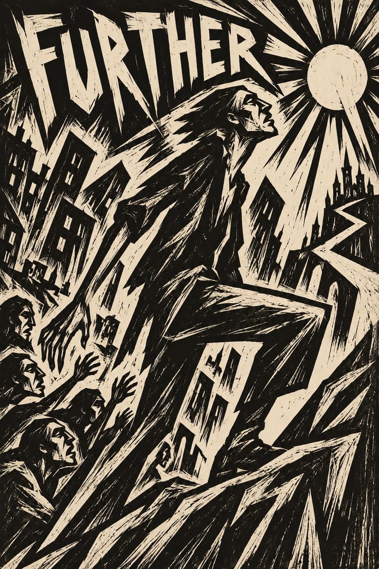
Art Nouveau × Expressionist Woodcut Graphics
The parent's smooth whiplash and floral harmony is exactly what the gouge splinters; use one against the other to stage order breaking down.
Mix them and make something Art Nouveau Expressionist Woodcut Graphics
01
What each style brings
Each part of the design comes from the style with the stronger say in it, and each style gives at least two.
Art Nouveau Expressionist Woodcut Graphics
- Type from Art Nouveau
- Colour from Expressionist Woodcut Graphics
- Form from Art Nouveau
-
Expressionist Woodcut Graphics avoids whiplash line: this is where the two pull against each other, which is the point of the contrast.
- Composition from Art Nouveau
- Surface from Expressionist Woodcut Graphics
02
The type
Open fonts standing in for each style’s own type, which is often hand-drawn or commercial.
Text · Expressionist Woodcut Graphics
The graphic arm of German Expressionism, from Die Brücke in Dresden (1905) to the Berlin journals Der Sturm and Die Aktion and Frans Masereel's woodcut novels. Artists revived the woodcut as a raw, subjective medium: they gouged distorted figures and jagged lettering into the same block and printed them in harsh black or a single flat ink, often on coloured paper, for exhibition posters, portfolios, manifestos and magazine covers.
Special Elite; Expressionist Woodcut Graphics used Hand-cut woodcut capitals and Rudolf Koch's Neuland (Klingspor, 1923), a display face in the same hand-cut spirit
03
The colours
The ground and leading colours come from Expressionist Woodcut Graphics, with a counter-accent from Art Nouveau. The ink reads on the ground at 4.5:1 or more.
Art Nouveau Expressionist Woodcut Graphics
-
#ede4cfground · 36% -
#151311ink · 14% -
#d9932faccent · 18% -
#c8432baccent · 14% -
#3f7a75accent · 10% -
#2c4a8caccent · 8%
As CSS
:root {
  --ground: #ede4cf;
  --ink: #151311;
  --accent-1: #d9932f;
  --accent-2: #c8432b;
  --accent-3: #3f7a75;
  --accent-4: #2c4a8c;
  --font-display: "Federant", sans-serif;
  --font-text: "Special Elite", monospace;
}
04
The two styles
05
More combinations
With Art Nouveau
- Fileteado Porteño Pairs well · Fileteado's acanthus scrolls share the whiplash; combine them for ornate, hand-made lettering frames.
- International Typographic Style Contrasts · Ornamental curves against an orthogonal grid make a strong deliberate tension; let one botanical flourish break a cold grid.
- Psychedelic Poster Pairs well · San Francisco poster artists lifted Mucha's figures and whiplash wholesale; push the curves into saturated, vibrating colour for a 1960s-flavoured revival.
- Russian Constructivism Contrasts · Organic sensuality versus machine-age diagonals: use the opposition to stage nature against industry.
- Vienna Secession Contrasts · Set French whiplash against the Viennese square to show the turn from organic to geometric ornament within one decorative idiom.
- Skønvirke (Danish Art Nouveau, Bindesbøll) Contrasts · Shares the hand-lettering and abundance but swaps the whiplash line and the female figure for blunt abstract masses; set side by side they show the heavy Danish variant.
- Beggarstaffs Poster (Nicholson & Pryde) Contrasts · Its curving floral line is the opposite of cut masses; set side by side to show how much a poster can drop.
- Simplicissimus Satirical Style (Munich) Contrasts · The parent: Heine took over the Jugendstil idiom, but where Art Nouveau spends the whiplash line on flowers and idealised women, Simplicissimus spends it on a grotesque type and a caption. Choose it when the curve should mock rather than adorn.
With Expressionist Woodcut Graphics
- Punk & DIY Zine Pairs well · Hand-cut jagged letters and one cheap ink suit gig posters and zines that want anger without photocopy clichés.
- Plakatstil / Sachplakat Contrasts · Same country and years: Bernhard's calm flat object poster against an anguished Brücke woodcut shows commercial clarity versus inner expression.
- Taller de Gráfica Popular Pairs well · Both gouge black-and-white relief images; add TGP's legible headlines and social subjects to steady expressionist distortion for a public message.
- Chinese Modern Woodcut Movement Pairs well · Lu Xun's movement learned from Kollwitz and Masereel; set the two side by side to show subjective anguish turning into collective resistance.
- Simplicissimus Satirical Style (Munich) Contrasts · Both distort the figure in protest, but Expressionist prints gouge it from the woodblock with angular, raw marks; Simplicissimus keeps a clean brush contour and flat tints, and adds a punchline.
- Argentine Adventure Historieta (Oesterheld–Breccia) Pairs well · Breccia's white scraped out of a black ground looks like the gouge of a Brücke woodcut; borrow the woodcut's jagged hand-cut capitals for a historieta title page or cover, and keep the comic's panels and captions inside.
- Hungarian Revolutionary Poster Pairs well · Kinchin sees 'a burgeoning taste for Futurist and Expressionist design' in the MA circle's exhibition poster (Bortnyik); add a gouged, splintered edge to the red body when the hero should look anguished rather than triumphant.
- Rorke's Drift Linocut Contrasts · Both gouge black relief prints, but the Brücke woodcut distorts one anguished figure on tilted axes, while Rorke's Drift spreads a whole story across calm, packed bands; pick by whether the image should confess or narrate.