Style combination · Contrasts
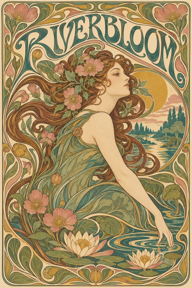
Art Nouveau × Russian Constructivism
Organic sensuality versus machine-age diagonals: use the opposition to stage nature against industry.
Mix them and make something Art Nouveau Russian Constructivism
01
What each style brings
Each part of the design comes from the style with the stronger say in it, and each style gives at least two.
Art Nouveau Russian Constructivism
- Type from Art Nouveau
- Colour from Russian Constructivism
- Form from Art Nouveau
-
Russian Constructivism avoids whiplash line: this is where the two pull against each other, which is the point of the contrast.
- Composition from Russian Constructivism
- Surface from Art Nouveau
02
The type
Open fonts standing in for each style’s own type, which is often hand-drawn or commercial.
Text · Russian Constructivism
Constructivism rejected art for art's sake in favour of the artist-engineer building useful things for the new Soviet society. In posters, books, film publicity and state advertising it fused bold grotesque type, heavy bars, photomontage and diagonal axes into an urgent, utilitarian language of agitation that shaped modern graphic design worldwide.
Archivo; Russian Constructivism used Soviet heavy grotesques and Rodchenko's constructed block lettering
03
The colours
The ground and leading colours come from Russian Constructivism, with a counter-accent from Art Nouveau. The ink reads on the ground at 4.5:1 or more.
Art Nouveau Russian Constructivism
-
#efe6d2ground · 36% -
#141414ink · 14% -
#d1261caccent · 18% -
#c9a24baccent · 14% -
#c9b28aaccent · 10% -
#3f7a75accent · 8%
As CSS
:root {
  --ground: #efe6d2;
  --ink: #141414;
  --accent-1: #d1261c;
  --accent-2: #c9a24b;
  --accent-3: #c9b28a;
  --accent-4: #3f7a75;
  --font-display: "Federant", sans-serif;
  --font-text: "Archivo", sans-serif;
}
04
The two styles
05
More combinations
With Art Nouveau
- Fileteado Porteño Pairs well · Fileteado's acanthus scrolls share the whiplash; combine them for ornate, hand-made lettering frames.
- International Typographic Style Contrasts · Ornamental curves against an orthogonal grid make a strong deliberate tension; let one botanical flourish break a cold grid.
- Psychedelic Poster Pairs well · San Francisco poster artists lifted Mucha's figures and whiplash wholesale; push the curves into saturated, vibrating colour for a 1960s-flavoured revival.
- Vienna Secession Contrasts · Set French whiplash against the Viennese square to show the turn from organic to geometric ornament within one decorative idiom.
- Skønvirke (Danish Art Nouveau, Bindesbøll) Contrasts · Shares the hand-lettering and abundance but swaps the whiplash line and the female figure for blunt abstract masses; set side by side they show the heavy Danish variant.
- Expressionist Woodcut Graphics Contrasts · The parent's smooth whiplash and floral harmony is exactly what the gouge splinters; use one against the other to stage order breaking down.
- Beggarstaffs Poster (Nicholson & Pryde) Contrasts · Its curving floral line is the opposite of cut masses; set side by side to show how much a poster can drop.
- Simplicissimus Satirical Style (Munich) Contrasts · The parent: Heine took over the Jugendstil idiom, but where Art Nouveau spends the whiplash line on flowers and idealised women, Simplicissimus spends it on a grotesque type and a caption. Choose it when the curve should mock rather than adorn.
With Russian Constructivism
- Punk & DIY Zine Pairs well · Punk borrowed Constructivist red-and-black agitprop; combine photomontage with xerox grit for protest graphics.
- International Typographic Style Pairs well · Tame Constructivist diagonals with a Swiss grid for informational work that still feels urgent.
- Art Deco Contrasts · Deco used similar geometry to sell luxury; set the two side by side to decide whether a layout should glamorise or agitate.
- Belle Époque Lithographic Poster Contrasts · Sensual drawn figures versus photomontaged workers: use the contrast to choose between seduction and mobilisation.
- ROSTA Windows Contrasts · In the same revolutionary years the ROSTA windows used stencilled cartoon frames and rhymed captions instead of photomontage and set grotesques; compare them to choose between folk legibility and machine-age form.
- Suprematism Pairs well · Add photomontage and heavy grotesque slogans to Suprematist floating planes to turn pure form into a message.
- British Style Press (The Face, i-D and Arena) Pairs well · Brody's source: take Rodchenko's diagonals, heavy bars and huge constructed letters, swap agitprop for fashion and club culture, and you get a Face spread.
- Mavo Pairs well · Borrow Constructivism's heavy bars and one red ink to steady a Mavo page, but keep Mavo's hand-drawn characters and abstract machine linocuts instead of a single clear slogan.