Style combination · Pairs well
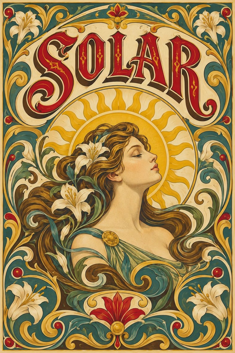
Art Nouveau × Fileteado Porteño
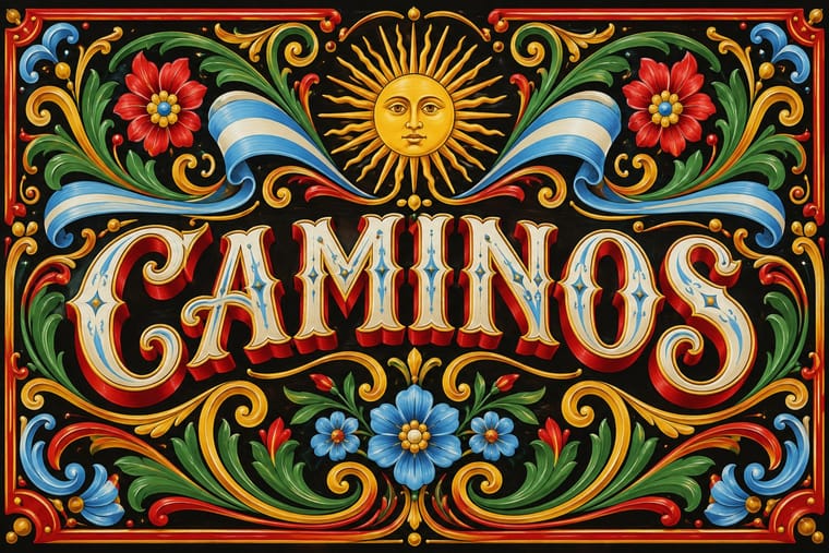
Fileteado's acanthus scrolls share the whiplash; combine them for ornate, hand-made lettering frames.
Use Art Nouveau's flatter whiplash line to tame filete's modelled acanthus for print and repeat patterns while keeping its curvilinear energy.
01
What each style brings
Each part of the design comes from the style with the stronger say in it, and each style gives at least two.
Art Nouveau Fileteado Porteño
- Type from Fileteado Porteño
- Colour from Art Nouveau
-
Fileteado Porteño avoids pastel: this is where the two pull against each other.
- Form from Art Nouveau
- Composition from Art Nouveau
- Surface from Fileteado Porteño
02
The type
Open fonts standing in for each style’s own type, which is often hand-drawn or commercial.
Display · Fileteado Porteño
Bloom
Yellowtail, standing in for Letra inglesa (copperplate-derived brush script)
Text · Art Nouveau
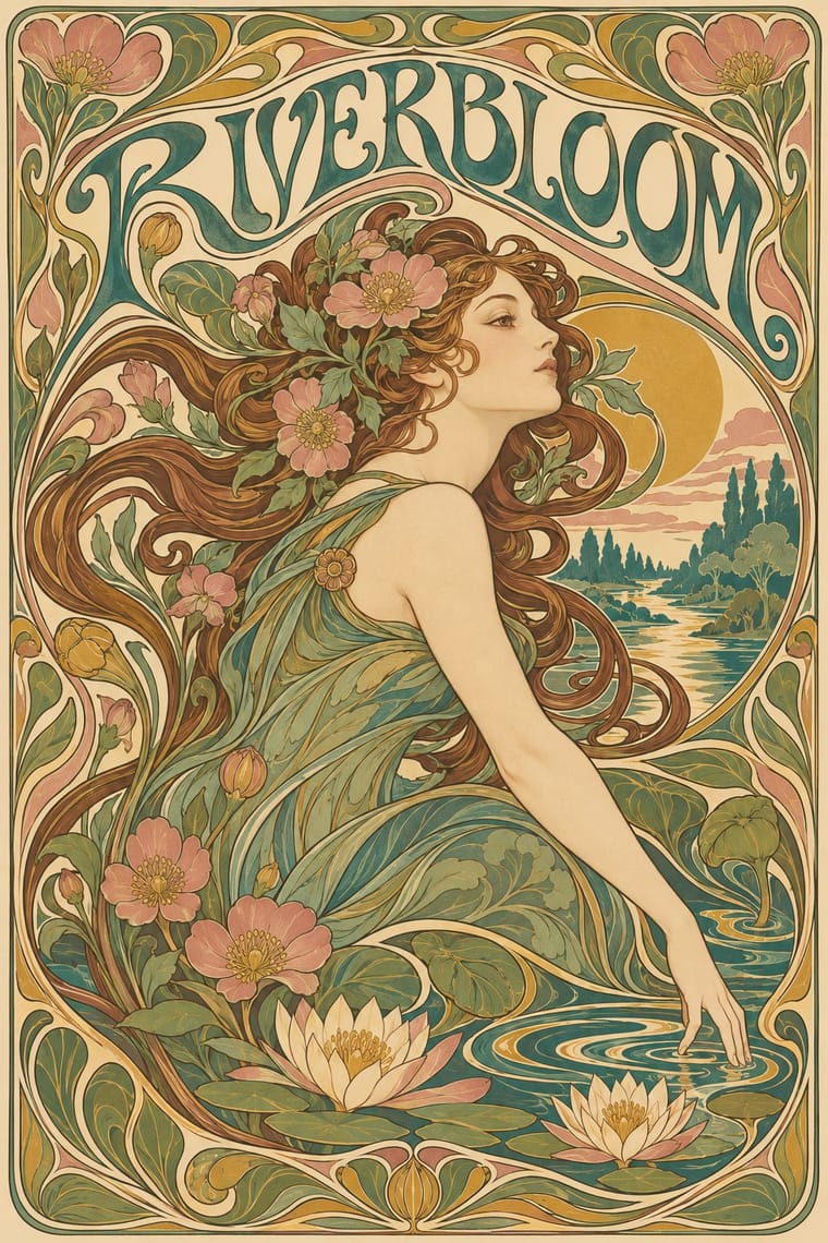
An international 'new art' that sought a modern style free of historical revival, drawing its forms from plant growth and the female figure. Graphic work flows with whiplash curves and stylised flowers, frames idealised women in arches, halos and mosaic borders, and draws custom lettering that bends to fill the space, fusing image, ornament and type into one decorative surface.
Bodoni Moda; Art Nouveau used Arnold Böcklin and Eckmann
03
The colours
The ground and leading colours come from Art Nouveau, with a counter-accent from Fileteado Porteño. The ink reads on the ground at 4.5:1 or more.
Art Nouveau Fileteado Porteño
-
#efe2c4ground · 36% -
#4b3b2aink · 14% -
#c9a24baccent · 18% -
#f2b705accent · 14% -
#3f7a75accent · 10% -
#c8102eaccent · 8%
As CSS
:root {
  --ground: #efe2c4;
  --ink: #4b3b2a;
  --accent-1: #c9a24b;
  --accent-2: #f2b705;
  --accent-3: #3f7a75;
  --accent-4: #c8102e;
  --font-display: "Yellowtail", cursive;
  --font-text: "Bodoni Moda", serif;
}
Use it with care
Fileteado Porteño: Filete porteño is UNESCO-listed intangible heritage (2015) and a living trade: commission or credit fileteadores rather than tracing their published panels, and keep its Argentine emblems and devotional images, such as the Virgin of Luján, in a respectful context.
04
The two styles
05
More combinations
With Art Nouveau
- International Typographic Style Contrasts · Ornamental curves against an orthogonal grid make a strong deliberate tension; let one botanical flourish break a cold grid.
- Psychedelic Poster Pairs well · San Francisco poster artists lifted Mucha's figures and whiplash wholesale; push the curves into saturated, vibrating colour for a 1960s-flavoured revival.
- Russian Constructivism Contrasts · Organic sensuality versus machine-age diagonals: use the opposition to stage nature against industry.
- Vienna Secession Contrasts · Set French whiplash against the Viennese square to show the turn from organic to geometric ornament within one decorative idiom.
- Skønvirke (Danish Art Nouveau, Bindesbøll) Contrasts · Shares the hand-lettering and abundance but swaps the whiplash line and the female figure for blunt abstract masses; set side by side they show the heavy Danish variant.
- Expressionist Woodcut Graphics Contrasts · The parent's smooth whiplash and floral harmony is exactly what the gouge splinters; use one against the other to stage order breaking down.
- Beggarstaffs Poster (Nicholson & Pryde) Contrasts · Its curving floral line is the opposite of cut masses; set side by side to show how much a poster can drop.
- Simplicissimus Satirical Style (Munich) Contrasts · The parent: Heine took over the Jugendstil idiom, but where Art Nouveau spends the whiplash line on flowers and idealised women, Simplicissimus spends it on a grotesque type and a caption. Choose it when the curve should mock rather than adorn.
With Fileteado Porteño
- Victorian Letterpress & Wood Type Pairs well · Wrap shaded wood-type capitals in a filete ribbon and corner scrolls for labels and menus that read porteño without a full painted panel.
- International Typographic Style Contrasts · Set one painted filete scroll against a strict grid and neutral sans so the ornament reads as a deliberate, celebratory interruption.
- Minimalist Graphic Design Contrasts · Its horror of empty panels is the opposite of minimalist restraint; isolate a single small filete motif on a large quiet field to stage the clash.
- Di Tella Graphic Design (Instituto Torcuato Di Tella) Contrasts · Same city, opposite choice: Buenos Aires' ornamental filete against the Di Tella's ornament-free flat-ink modernism; set side by side they show the porteño vernacular and the porteño avant-garde.
- Argentine Adventure Historieta (Oesterheld–Breccia) Contrasts · Two Buenos Aires vernaculars that both work on dark grounds: fileteado frames a lettered name with polychrome, highlighted acanthus and ribbons, while the historieta rejects ornament and lets bare black ink and side light carry a story.
- Hand-Painted Signage & Vernacular Lettering Pairs well · Add filete scrolls and bevelled shading to plain painted lettering for a richer, Buenos Aires-style sign.