Style combination · Pairs well
Memphis Design × Neo-Brutalism
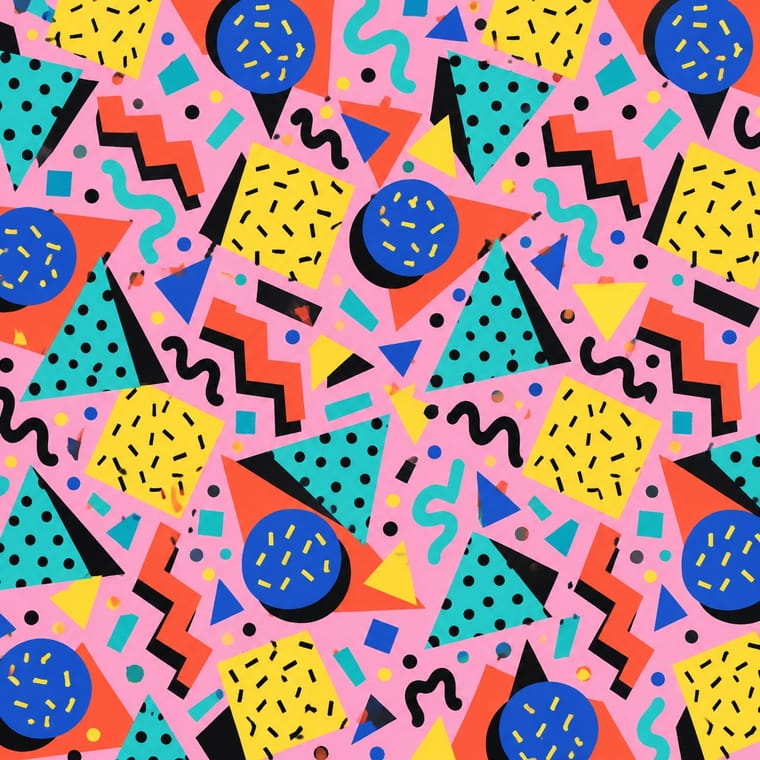
Memphis black outlines and flat clashing fills translate directly into neo-brutalist cards, buttons and stickers.
Pull Memphis squiggles, terrazzo dots and clashing pastels into the boxes for extra 1980s energy.
01
What each style brings
Each part of the design comes from the style with the stronger say in it, and each style gives at least two.
Memphis Design Neo-Brutalism
- Type from Neo-Brutalism
- Colour from Memphis Design
- Form from Memphis Design
- Composition from Neo-Brutalism
-
Memphis Design avoids modular grid: this is where the two pull against each other.
- Surface from Neo-Brutalism
02
The type
Open fonts standing in for each style’s own type, which is often hand-drawn or commercial.
Text · Memphis Design
The Milan collective founded by Ettore Sottsass, whose furniture, laminates and objects (first shown in September 1981) became a graphic language of their own. Clashing colours, speckles, squiggles, zigzags and primitive geometric shapes were combined with deliberate bad taste, mocking modernist good form while quoting 1950s kitsch, Pop and Art Deco.
Jost; Memphis Design used Futura and ITC Avant Garde Gothic
03
The colours
The ground and leading colours come from Memphis Design, with a counter-accent from Neo-Brutalism. The ink reads on the ground at 4.5:1 or more.
Memphis Design Neo-Brutalism
-
#ffd23fground · 36% -
#111111ink · 14% -
#ff5a36accent · 18% -
#23a094accent · 14% -
#2ec4b6accent · 10% -
#ff90e8accent · 8%
As CSS
:root {
  --ground: #ffd23f;
  --ink: #111111;
  --accent-1: #ff5a36;
  --accent-2: #23a094;
  --accent-3: #2ec4b6;
  --accent-4: #ff90e8;
  --font-display: "Space Grotesk", sans-serif;
  --font-text: "Jost", sans-serif;
}
04
The two styles
05
More combinations
With Memphis Design
- International Typographic Style Contrasts · Scatter Memphis squiggles across a strict Swiss grid to stage modernism versus its postmodern critique.
- Kawaii Design Pairs well · Memphis pastel geometry and kawaii's rounded characters share a toy-like optimism; combine them for playful packaging.
- Corporate Memphis Contrasts · Corporate Memphis tamed the original's clash and irony; restore real colour conflict and wit to escape generic tech illustration.
- Swiss Punk / New Wave Typography Pairs well · Add Memphis squiggles and pastel triangles to New Wave's floating bars for the full 1980s postmodern palette.
- La Movida Madrileña Graphics Pairs well · Memphis showed its first collection in Milan in 1981, three years before Madrid Me Mata: add its clashing laminate colours, squiggles and geometric primitives to a Movida poster for a fuller 1980s postmodern look, keeping the hand-drawn figures and lettering.
- Dutch Expressive Postmodernism (Studio Dumbar & Hard Werken) Pairs well · A contemporary 1980s attack on good taste: set Memphis primitives, squiggles and patterned laminates inside a Dumbar-style photographed set for a poster with real shadows and clashing colour.
- Milanese Industrial Modernism (Olivetti, Pirelli, Studio Boggeri) Contrasts · Milan's own later rebellion against functional wit; set Memphis's ornamental irony against this clean industrial optimism for a deliberate generational clash.
- Bauhaus Contrasts · Memphis parodied Bauhaus primaries and solids; compare them to decide whether geometry should be earnest or ironic.
With Neo-Brutalism
- Neumorphism Contrasts · Neumorphism's borderless soft relief is the opposite strategy; neo-brutalism's crisp outlines fix its contrast and affordance problems.
- Dark Tech Minimalism Contrasts · Beside sleek dark SaaS pages neo-brutalism reads as indie and human; choose it when a brand should feel approachable rather than premium.
- Pop Art Graphics Pairs well · Fill hard-shadowed cards with Pop Art's Ben-Day dots and comic outlines for a printed-ephemera feel.
- DTC 'Blanding' / Millennial Minimalism Contrasts · The post-blanding swing: thick outlines, clashing brights and hard shadows are the quickest way out of pastel sameness.
- Claymorphism & Soft 3D Contrasts · Neo-brutalism's black outlines and hard, unblurred offset shadows are the crisp counterpart to clay's soft blurred ones; borrow a solid outline for focus states when the inflated cards need sharper edges.