Style combination · Contrasts
Neo-Brutalism × Neumorphism
Neo-brutalism's black outlines and hard offset shadows solve neumorphism's contrast problem; borrow a crisp border for focus states.
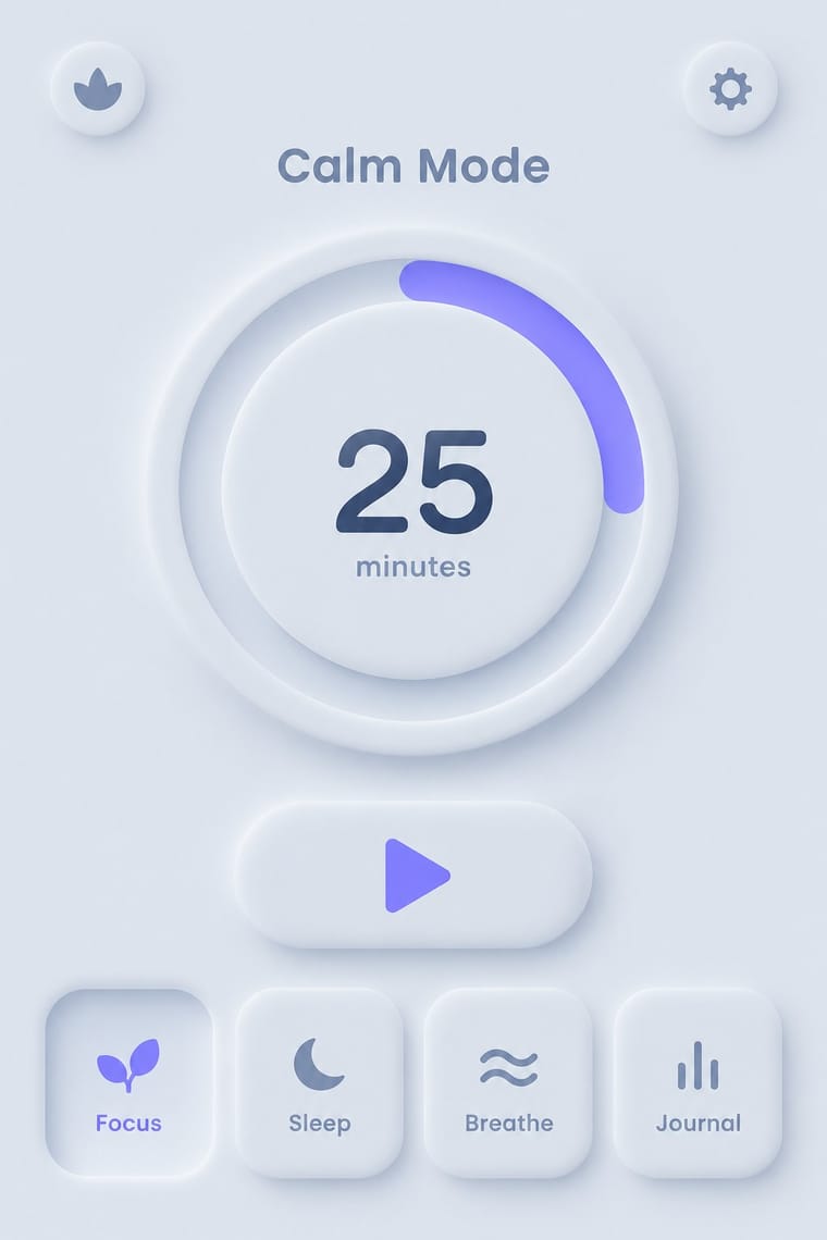
Neumorphism's borderless soft relief is the opposite strategy; neo-brutalism's crisp outlines fix its contrast and affordance problems.
01
What each style brings
Each part of the design comes from the style with the stronger say in it, and each style gives at least two.
Neo-Brutalism Neumorphism
- Type from Neo-Brutalism
- Colour from Neo-Brutalism
-
Neumorphism avoids full polychrome: this is where the two pull against each other, which is the point of the contrast.
- Form from Neumorphism
- Composition from Neo-Brutalism
- Surface from Neumorphism
-
Neo-Brutalism avoids soft extrusion: this is where the two pull against each other, which is the point of the contrast.
02
The type
Open fonts standing in for each style’s own type, which is often hand-drawn or commercial.
Text · Neumorphism
A short-lived interface trend in which controls are extruded from, or pressed into, a background of the same colour and modelled only by paired soft shadows. Sparked by Alexander Plyuto's 2019 Dribbble banking-app concept and named on UX Collective, it revived skeuomorphic tactility in a monochrome, minimal form, then faded quickly over its weak contrast and poor accessibility.
Jost; Neumorphism used Poppins and Nunito
03
The colours
The ground and leading colours come from Neo-Brutalism, with a counter-accent from Neumorphism. The ink reads on the ground at 4.5:1 or more.
Neo-Brutalism Neumorphism
-
#fffdf5ground · 36% -
#000000ink · 14% -
#ffc900accent · 18% -
#6c63ffaccent · 14% -
#23a094accent · 10% -
#a3b1c6accent · 8%
As CSS
:root {
  --ground: #fffdf5;
  --ink: #000000;
  --accent-1: #ffc900;
  --accent-2: #6c63ff;
  --accent-3: #23a094;
  --accent-4: #a3b1c6;
  --font-display: "Space Grotesk", sans-serif;
  --font-text: "Jost", sans-serif;
}
04
The two styles
05
More combinations
With Neo-Brutalism
- Dark Tech Minimalism Contrasts · Beside sleek dark SaaS pages neo-brutalism reads as indie and human; choose it when a brand should feel approachable rather than premium.
- Pop Art Graphics Pairs well · Fill hard-shadowed cards with Pop Art's Ben-Day dots and comic outlines for a printed-ephemera feel.
- Memphis Design Pairs well · Pull Memphis squiggles, terrazzo dots and clashing pastels into the boxes for extra 1980s energy.
- DTC 'Blanding' / Millennial Minimalism Contrasts · The post-blanding swing: thick outlines, clashing brights and hard shadows are the quickest way out of pastel sameness.
- Claymorphism & Soft 3D Contrasts · Neo-brutalism's black outlines and hard, unblurred offset shadows are the crisp counterpart to clay's soft blurred ones; borrow a solid outline for focus states when the inflated cards need sharper edges.
With Neumorphism
- Minimalist Graphic Design Pairs well · Neumorphic relief only reads in near-empty layouts; apply minimalist restraint so a few controls carry the whole surface.
- HfG Ulm Systematic Design Pairs well · Model controls on Braun-style product design from the Ulm tradition: knobs, sliders and grilles that look moulded from one material.
- Material Design Contrasts · Material's crisp, directional elevation shadows are the accessible answer to neumorphism's ambiguous soft relief; compare both when tuning shadow contrast.
- Claymorphism & Soft 3D Contrasts · Neumorphism presses monochrome controls out of a same-coloured surface with paired outer shadows; claymorphism inflates them into separately coloured objects that cast one drop shadow, so switch to it when soft relief loses contrast and every control starts to look like a button.
- Skeuomorphic UI Pairs well · Neumorphism keeps the light source and extrusion but drops the textures; borrow one material cue to give soft UI more character.