Style combination · Contrasts
DTC 'Blanding' × Neo-Brutalism
The post-blanding swing: thick outlines, clashing brights and hard shadows are the quickest way out of pastel sameness.
01
What each style brings
Each part of the design comes from the style with the stronger say in it, and each style gives at least two.
DTC 'Blanding' / Millennial Minimalism Neo-Brutalism
- Type from DTC 'Blanding'
- Colour from DTC 'Blanding'
- Form from Neo-Brutalism
- Composition from DTC 'Blanding'
- Surface from Neo-Brutalism
02
The type
Open fonts standing in for each style’s own type, which is often hand-drawn or commercial.
Display · DTC 'Blanding'
Wow
Hanken Grotesk, standing in for Circular (Laurenz Brunner, Lineto, 2013)
Text · Neo-Brutalism
A friendly, commercial descendant of web brutalism that keeps its blunt boxes but adds candy colour: thick black outlines, hard unblurred offset shadows, flat saturated fills and chunky sans-serif type on conventional, usable layouts. Popularised by Gumroad's 2021 rebrand and named 'neubrutalism' around 2022, it spread across startup, creator-economy and indie product sites.
Space Grotesk; Neo-Brutalism used Space Grotesk and Archivo Black
03
The colours
The ground and leading colours come from DTC 'Blanding', with a counter-accent from Neo-Brutalism. The ink reads on the ground at 4.5:1 or more.
DTC 'Blanding' / Millennial Minimalism Neo-Brutalism
-
#faf7f2ground · 36% -
#2b2b2bink · 14% -
#d27c5daccent · 18% -
#ffc900accent · 14% -
#f4cfc8accent · 10% -
#23a094accent · 8%
As CSS
:root {
  --ground: #faf7f2;
  --ink: #2b2b2b;
  --accent-1: #d27c5d;
  --accent-2: #ffc900;
  --accent-3: #f4cfc8;
  --accent-4: #23a094;
  --font-display: "Hanken Grotesk", sans-serif;
  --font-text: "Space Grotesk", sans-serif;
}
04
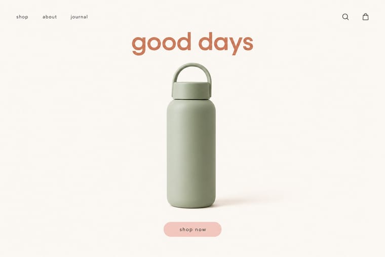
The two styles
05
More combinations
With DTC 'Blanding'
- Scandinavian Functionalism Pairs well · Shares a warm, domestic restraint; borrow Nordic materials and craft photography to give a pastel system more texture and credibility.
- Neoclassical Book Typography Contrasts · Luxury's other reduction: a single Didone wordmark signals heritage where the lowercase sans signals approachability.
- Corporate Memphis Pairs well · Its illustration-led sibling; add a few flat vector figures when seamless-backdrop photography alone feels too cold.
- Minimalist Graphic Design Contrasts · Its austere parent: swap pastel and chatty copy back to monochrome and silence when a brand needs authority rather than friendliness.
- Natural Wine Label Art Contrasts · Blanding sells a frictionless, agency-made brand in lowercase geometric sans and pastels; the natural wine label sells a person through an untrained drawing. Use the contrast to decide whether a product should feel designed or made.
- Hipster Artisanal Revival Contrasts · Where this dressed new firms as old ones, blanding dressed them as frictionless and new, with lowercase geometric sans, pastels and white space; set the two side by side to place a brand between heritage and novelty.
- Guochao (China-Chic National Trend) Contrasts · Western direct-to-consumer brands strip identity to pastel sans-serif minimalism; guochao sells ornament and heritage instead, so use one to test the other.
- Muji No-Brand Design (Mujirushi Ryohin) Contrasts · Shares the plain sans and isolated product but replaces its friendly pastel persona and funded brand voice with anonymity.
With Neo-Brutalism
- Neumorphism Contrasts · Neumorphism's borderless soft relief is the opposite strategy; neo-brutalism's crisp outlines fix its contrast and affordance problems.
- Dark Tech Minimalism Contrasts · Beside sleek dark SaaS pages neo-brutalism reads as indie and human; choose it when a brand should feel approachable rather than premium.
- Pop Art Graphics Pairs well · Fill hard-shadowed cards with Pop Art's Ben-Day dots and comic outlines for a printed-ephemera feel.
- Memphis Design Pairs well · Pull Memphis squiggles, terrazzo dots and clashing pastels into the boxes for extra 1980s energy.
- Claymorphism & Soft 3D Contrasts · Neo-brutalism's black outlines and hard, unblurred offset shadows are the crisp counterpart to clay's soft blurred ones; borrow a solid outline for focus states when the inflated cards need sharper edges.