Style combination · Pairs well
Neo-Brutalism × Pop Art Graphics
Lift Pop's thick black outlines and flat primaries into UI cards and buttons for a confident, comic-strip interface.
Fill hard-shadowed cards with Pop Art's Ben-Day dots and comic outlines for a printed-ephemera feel.
01
What each style brings
Each part of the design comes from the style with the stronger say in it, and each style gives at least two.
Neo-Brutalism Pop Art Graphics
- Type from Neo-Brutalism
- Colour from Pop Art Graphics
- Form from Neo-Brutalism
- Composition from Neo-Brutalism
- Surface from Pop Art Graphics
02
The type
Open fonts standing in for each style’s own type, which is often hand-drawn or commercial.
Text · Pop Art Graphics
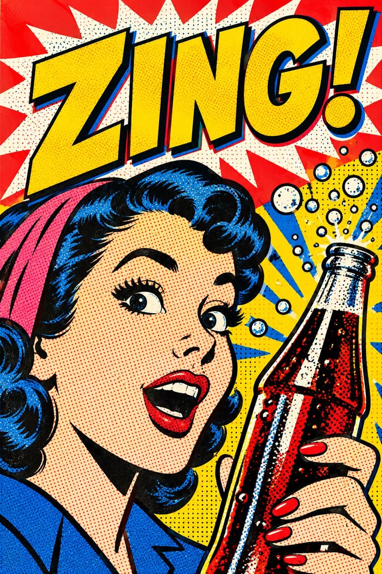
Pop turned the commercial imagery of post-war consumer culture (comics, packaging, celebrity photographs and advertising) into both its subject and its method. Images are appropriated, enlarged, flattened and repeated; colour is bright and unmodulated; and the printing process itself, from Ben-Day dots to off-register silkscreen, is left visible as a sign of mass production.
Archivo; Pop Art Graphics used Comic-book hand lettering and Franklin Gothic
03
The colours
The ground and leading colours come from Pop Art Graphics, with a counter-accent from Neo-Brutalism. The ink reads on the ground at 4.5:1 or more.
Neo-Brutalism Pop Art Graphics
-
#fbf8f0ground · 36% -
#111111ink · 14% -
#ffd400accent · 18% -
#e10600accent · 14% -
#23a094accent · 10% -
#0057b8accent · 8%
As CSS
:root {
  --ground: #fbf8f0;
  --ink: #111111;
  --accent-1: #ffd400;
  --accent-2: #e10600;
  --accent-3: #23a094;
  --accent-4: #0057b8;
  --font-display: "Space Grotesk", sans-serif;
  --font-text: "Archivo", sans-serif;
}
04
The two styles
05
More combinations
With Neo-Brutalism
- Neumorphism Contrasts · Neumorphism's borderless soft relief is the opposite strategy; neo-brutalism's crisp outlines fix its contrast and affordance problems.
- Dark Tech Minimalism Contrasts · Beside sleek dark SaaS pages neo-brutalism reads as indie and human; choose it when a brand should feel approachable rather than premium.
- Memphis Design Pairs well · Pull Memphis squiggles, terrazzo dots and clashing pastels into the boxes for extra 1980s energy.
- DTC 'Blanding' / Millennial Minimalism Contrasts · The post-blanding swing: thick outlines, clashing brights and hard shadows are the quickest way out of pastel sameness.
- Claymorphism & Soft 3D Contrasts · Neo-brutalism's black outlines and hard, unblurred offset shadows are the crisp counterpart to clay's soft blurred ones; borrow a solid outline for focus states when the inflated cards need sharper edges.
With Pop Art Graphics
- International Typographic Style Contrasts · Set one loud appropriated Pop image inside a strict grid with a neutral grotesque so the irony reads as deliberate rather than chaotic.
- Ma & Wabi-sabi Aesthetics Contrasts · Where Pop multiplies glossy commodities, wabi-sabi values the single worn object; use one to puncture the mood of the other.
- Guna Mola Pairs well · Guna women redraw brand logos and cartoons (RCA Victor, Bullwinkle) in reverse appliqué; let that act of translation inspire Pop work, but buy or commission molas rather than imitating them.
- Risograph & Indie Print Culture Pairs well · Print Ben-Day dot screens in fluorescent pink and yellow riso inks to give Pop's mass-media imagery a small-run, handmade warmth.
- Screenprinted Gig & Alt-Movie Poster Pairs well · Shepard Fairey called Kozik 'the punk rock Warhol'; take Pop's appropriated cartoons and halftones and give them a gig poster's single idea and hand-lettered title.
- Finnish Bold Print (Marimekko Modernism) Pairs well · Contemporaries in saturated flat colour at a giant scale; borrow pop's isolated, enlarged object for a poster, but drop its halftone and irony to keep Marimekko's sincerity.
- Superflat Contrasts · Both turn commodities into art; take Pop's repetition and frontal commodity but swap its halftone and off-register silkscreen for Superflat's smooth vector fills and anime characters, so the print process disappears.
- Woodland School (Legend Painting) Contrasts · Both arrived in screenprint with flat colour behind a black line in the 1960s and 70s, but Pop quotes consumer images with irony and halftone, while Woodland prints carry legend and vision with none of either.