Style combination · Pairs well
Hong Kong Neon × Vaporwave
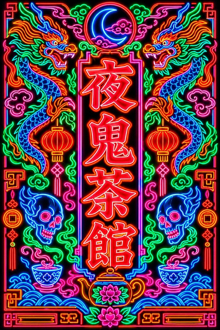
Vaporwave and cyberpunk borrowed Kowloon neon as scenery; use real Beiwei forms and trade emblems instead of random East Asian characters to give a neon palette substance.
01
What each style brings
Each part of the design comes from the style with the stronger say in it, and each style gives at least two.
Hong Kong Neon & Beiwei Shop-Sign Lettering Vaporwave
- Type from Hong Kong Neon
- Colour from Hong Kong Neon
- Form from Vaporwave
- Composition from Hong Kong Neon
- Surface from Vaporwave
02
The type
Open fonts standing in for each style’s own type, which is often hand-drawn or commercial.
Display · Hong Kong Neon
Souvenir
Shippori Mincho, standing in for Beiwei kaishu (Northern Wei stele-style regular script), as written by Au Kin-kung
Text · Hong Kong Neon
The night-time signscape of Hong Kong's Kowloon streets. Shop names written by commercial calligraphers in Beiwei kaishu, a square, heavy, chisel-edged script descended from Northern Wei stone steles, were bent by neon makers into glass tube and cantilevered over the road. Vertical Chinese, horizontal English, double-line borders and trade emblems such as the pawnshop's bat and coin stack into a dense canyon of light, thinned by signboard controls since the 2000s.
Shippori Mincho; Hong Kong Neon used Beiwei kaishu (Northern Wei stele-style regular script), as written by Au Kin-kung and Zansyu (Adonian Chan, Trilingua), digital Beiwei revival
03
The colours
The ground and leading colours come from Hong Kong Neon, with a counter-accent from Vaporwave. The ink reads on the ground at 4.5:1 or more.
Hong Kong Neon & Beiwei Shop-Sign Lettering Vaporwave
-
#0d0d14ground · 36% -
#39ff88ink · 14% -
#ff8a1faccent · 18% -
#01cdfeaccent · 14% -
#ff2a3daccent · 10% -
#05ffa1accent · 8%
As CSS
:root {
  --ground: #0d0d14;
  --ink: #39ff88;
  --accent-1: #ff8a1f;
  --accent-2: #01cdfe;
  --accent-3: #ff2a3d;
  --accent-4: #05ffa1;
  --font-display: "Shippori Mincho", serif;
  --font-text: "Shippori Mincho", serif;
}
04
The two styles
05
More combinations
With Hong Kong Neon
- Out-of-Square Hangul Typography Contrasts · Set stele-derived Beiwei brush strokes against monoline geometric Hangul modules to show two opposite ways of modernising East Asian lettering.
- Minimalist Graphic Design Contrasts · Isolate one neon character on a black field to turn the crowded street into a single emblem, then reintroduce density step by step.
- Googie & Atomic Age Pairs well · Googie starbursts and Kowloon calligraphy are parallel 1950s neon vernaculars; mix a tube-drawn emblem with Beiwei characters for a mid-century night-market identity.
- Hand-Painted Signage & Vernacular Lettering Pairs well · Its daylight relative: carry a Beiwei signboard's characters onto a painted fascia with drop shadows so a shop reads the same by day and by night.
- Synthwave / Outrun Pairs well · Real neon-tube shop lettering gives synthwave's painted glow a street-level counterpart for night-market, bar or club identities; use real Beiwei forms and credit the sign-makers rather than dressing the scene in random Chinese characters.
- Hong Kong East–West Graphic Modernism Contrasts · The same city's street lettering: set dense, glowing Beiwei signboards against a white-space bilingual lockup to choose between vernacular and institutional Hong Kong.
- Edo-moji Commercial Lettering (Kanteiryū, Yose-moji, Sumō-ji) Contrasts · Both are East Asian commercial sign hands, but Beiwei kaishu is square and chisel-cut in coloured light on a night sky while Edo-moji is rounded, swollen black ink on paper; compare them to choose between a chiselled and a plump brush voice.
- Polish Cold War Neon (PRL Neonisation) Contrasts · Both bend shop names into glass tube against the night, but Kowloon's calligraphers stacked heavy Beiwei characters on signs projecting over a crowded commercial street, while Poland's planners placed one light openwork sign per roof or facade in one or two trade colours; compare them to choose between a canyon of competing signs and a single emblem on the skyline.
With Vaporwave
- International Typographic Style Contrasts · Swiss objectivity is vaporwave's antithesis; a strict grid can frame its chaos for editorial or music-packaging use.
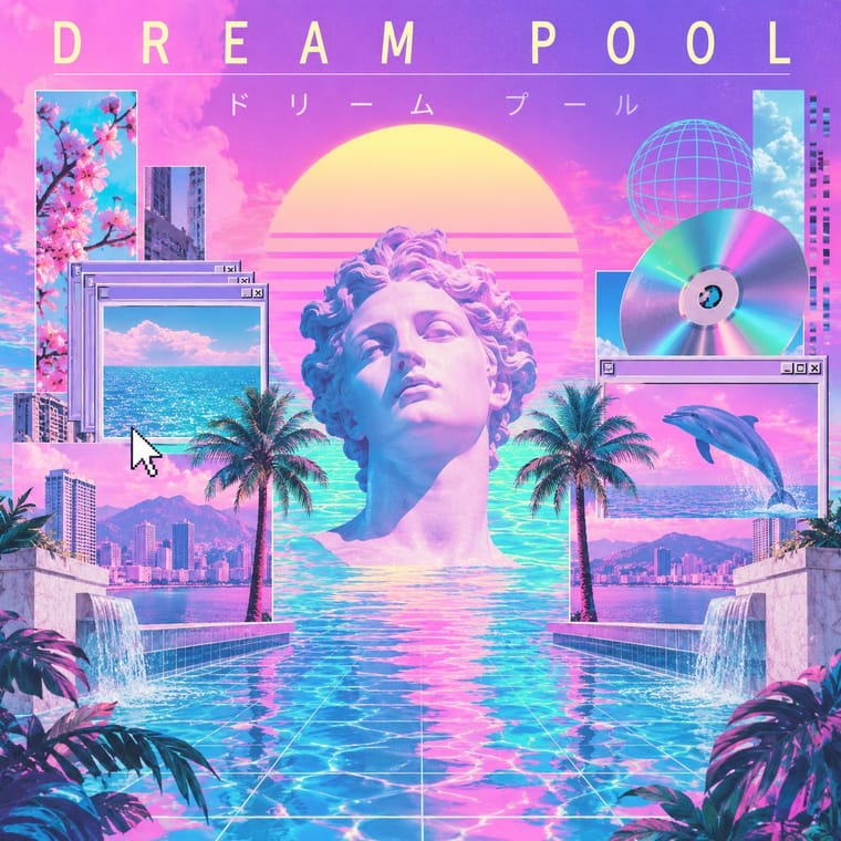
- Bitmap & Pixel Graphics Pairs well · Use pixel fonts, dithered gradients and Windows-style dialog boxes as framing devices for vaporwave collages.
- Memphis Design Pairs well · Memphis terrazzo, squiggles and pastel laminates ground vaporwave's busts and grids in genuine 1980s decorative language.
- Ma & Wabi-sabi Aesthetics Contrasts · Wabi-sabi's natural imperfection and quiet earth tones are the analogue counterpoint to vaporwave's synthetic, plastic nostalgia.
- Generative-AI Image Aesthetic Pairs well · Vaporwave's ironic distance is the antidote to AI's earnest polish; frame generated images as found kitsch to make the artificiality the point.
- Frutiger Aero Pairs well · Both trade on mid-2000s tech nostalgia; mix Aero bubbles and skies with vaporwave's pastel 3D for retro-internet campaigns.
- Weirdcore & Dreamcore Contrasts · Tanni's genealogy starts with vaporwave's spectral reuse of web imagery; vaporwave collages pastel consumer debris, busts and Japanese text with ironic luxury, while weirdcore empties the frame and drops the joke. Keep the found picture but swap the bust for a vacant playground to move from irony to unease.
- Early Web Vernacular Pairs well · Vaporwave already mines this archive; combine tiled backgrounds and default fonts with its pastel 3D for nostalgic net art.