Style combination · Pairs well
Hand-Painted Signage × Hong Kong Neon
Its daylight relative: carry a Beiwei signboard's characters onto a painted fascia with drop shadows so a shop reads the same by day and by night.
Mix them and make something Hand-Painted Signage Hong Kong Neon
01
What each style brings
Each part of the design comes from the style with the stronger say in it, and each style gives at least two.
Hand-Painted Signage & Vernacular Lettering Hong Kong Neon & Beiwei Shop-Sign Lettering
- Type from Hong Kong Neon
- Colour from Hong Kong Neon
- Form from Hand-Painted Signage
- Composition from Hong Kong Neon
- Surface from Hand-Painted Signage
02
The type
Open fonts standing in for each style’s own type, which is often hand-drawn or commercial.
Display · Hong Kong Neon
Together
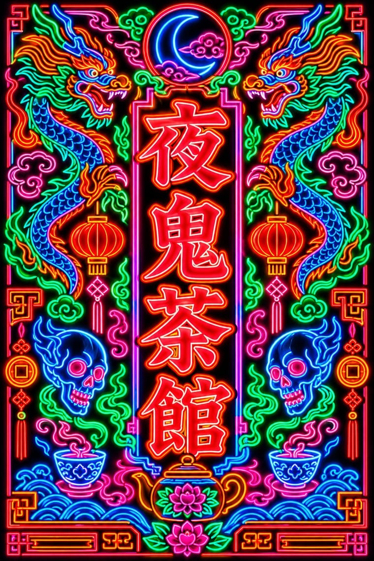
Shippori Mincho, standing in for Beiwei kaishu (Northern Wei stele-style regular script), as written by Au Kin-kung
Text · Hand-Painted Signage
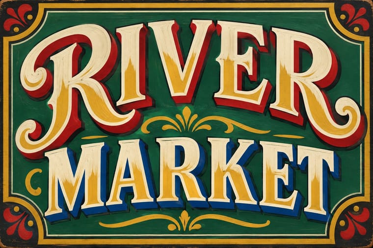
Letters painted by trained sign writers on fascias, windows, walls, vehicles and showcards, from Victorian gold leaf on glass to Mexican rótulos, Indian bazaar boards and Ghanaian barbershop signs. Brush-built letters with shading, drop shadows and outlines are fitted to the panel and mixed in a few styles for hierarchy, valuing legibility at a distance and the painter's flourish; vinyl displaced the craft in the 1980s and it has revived since the 2010s.
Oswald; Hand-Painted Signage used One-stroke casual (showcard) alphabet and Block and Egyptian sign writers' letters
03
The colours
The ground and leading colours come from Hong Kong Neon, with a counter-accent from Hand-Painted Signage. The ink reads on the ground at 4.5:1 or more.
Hand-Painted Signage & Vernacular Lettering Hong Kong Neon & Beiwei Shop-Sign Lettering
-
#0d0d14ground · 36% -
#39ff88ink · 14% -
#ff8a1faccent · 18% -
#c99a2eaccent · 14% -
#ff2a3daccent · 10% -
#b8262baccent · 8%
As CSS
:root {
  --ground: #0d0d14;
  --ink: #39ff88;
  --accent-1: #ff8a1f;
  --accent-2: #c99a2e;
  --accent-3: #ff2a3d;
  --accent-4: #b8262b;
  --font-display: "Shippori Mincho", serif;
  --font-text: "Oswald", sans-serif;
}
04
The two styles
05
More combinations
With Hand-Painted Signage
- Victorian Letterpress & Wood Type Pairs well · Sign writers and type founders traded letterforms; set a wood-type headline and finish it with painted shadows and outlines.
- West African Barbershop & Hair Salon Signs Pairs well · West African barbershop boards are the sign writer's catalogue genre; pair a painted name panel with a grid of numbered hairstyle portraits for a shop menu that reads from the street.
- Graffiti & Hip-Hop Graphics Pairs well · Graffiti writers inherited the sign painter's outlines and drop shadows; pair a disciplined sign alphabet with a wildstyle tag for contrast of control.
- Flat Design Contrasts · Against flat, machine-perfect UI, one hand-painted wordmark signals human craft; keep everything else flat so it stands out.
- Fileteado Porteño Pairs well · Add filete scrolls and bevelled shading to plain painted lettering for a richer, Buenos Aires-style sign.
- Roman-like Thai Typography (modern loopless Thai) Contrasts · A hand-painted shopfront sign, in looped letters or broad-nib Naris, beside a flat loopless headline shows the shift from the letterer's hand to dry transfer and digital type that Manop Srisomporn himself made.
- Generative & Dynamic Identities Contrasts · Hand-painted lettering's one-off irregularity is the human counterpart to algorithmic variation; mix the two only with clear intent.
- Italian Painted Film Poster (Rome Studios) Pairs well · Shares the painted-on-site lettering craft; borrow its bold hand-lettering for the title block.
With Hong Kong Neon
- Out-of-Square Hangul Typography Contrasts · Set stele-derived Beiwei brush strokes against monoline geometric Hangul modules to show two opposite ways of modernising East Asian lettering.
- Minimalist Graphic Design Contrasts · Isolate one neon character on a black field to turn the crowded street into a single emblem, then reintroduce density step by step.
- Googie & Atomic Age Pairs well · Googie starbursts and Kowloon calligraphy are parallel 1950s neon vernaculars; mix a tube-drawn emblem with Beiwei characters for a mid-century night-market identity.
- Vaporwave Pairs well · Vaporwave and cyberpunk borrowed Kowloon neon as scenery; use real Beiwei forms and trade emblems instead of random East Asian characters to give a neon palette substance.
- Synthwave / Outrun Pairs well · Real neon-tube shop lettering gives synthwave's painted glow a street-level counterpart for night-market, bar or club identities; use real Beiwei forms and credit the sign-makers rather than dressing the scene in random Chinese characters.
- Hong Kong East–West Graphic Modernism Contrasts · The same city's street lettering: set dense, glowing Beiwei signboards against a white-space bilingual lockup to choose between vernacular and institutional Hong Kong.
- Edo-moji Commercial Lettering (Kanteiryū, Yose-moji, Sumō-ji) Contrasts · Both are East Asian commercial sign hands, but Beiwei kaishu is square and chisel-cut in coloured light on a night sky while Edo-moji is rounded, swollen black ink on paper; compare them to choose between a chiselled and a plump brush voice.
- Polish Cold War Neon (PRL Neonisation) Contrasts · Both bend shop names into glass tube against the night, but Kowloon's calligraphers stacked heavy Beiwei characters on signs projecting over a crowded commercial street, while Poland's planners placed one light openwork sign per roof or facade in one or two trade colours; compare them to choose between a canyon of competing signs and a single emblem on the skyline.