Style combination · Contrasts
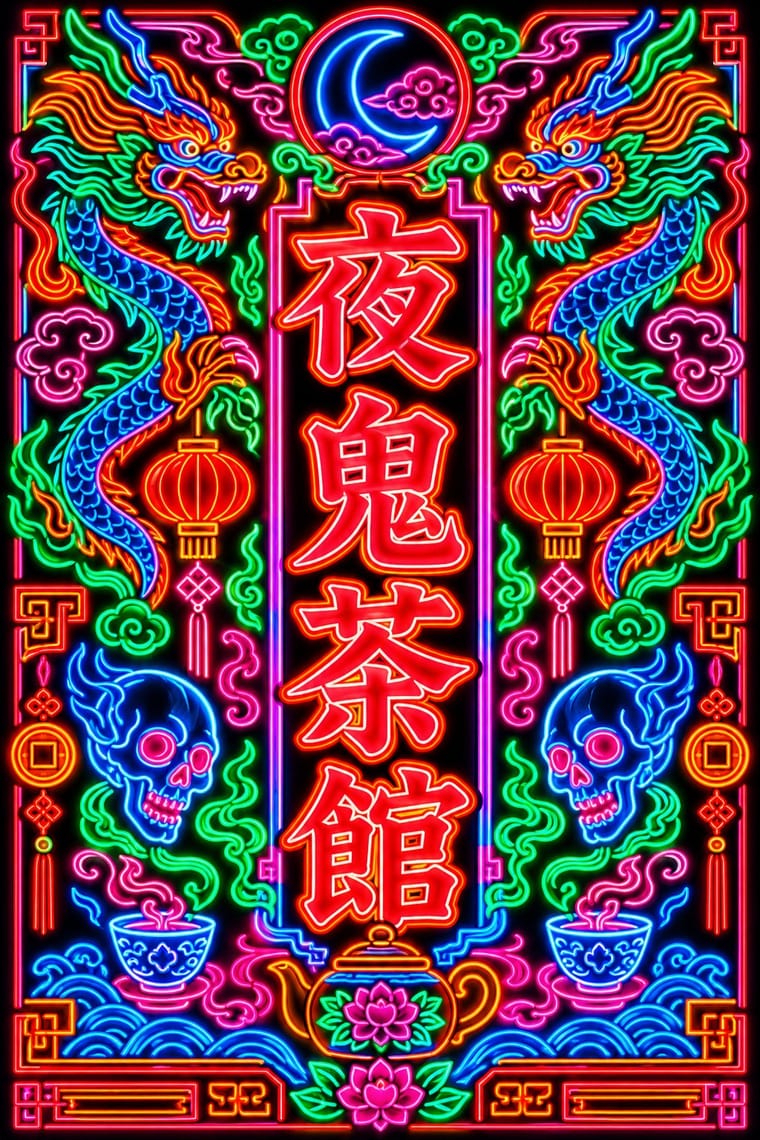
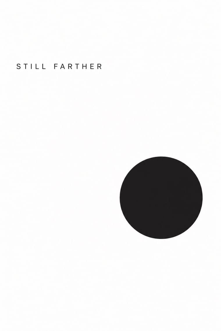
Hong Kong Neon × Minimalist Graphic Design
Isolate one neon character on a black field to turn the crowded street into a single emblem, then reintroduce density step by step.
Mix them and make something Hong Kong Neon Minimalist Graphic Design
01
What each style brings
Each part of the design comes from the style with the stronger say in it, and each style gives at least two.
Hong Kong Neon & Beiwei Shop-Sign Lettering Minimalist Graphic Design
- Type from Hong Kong Neon
- Colour from Hong Kong Neon
-
Minimalist Graphic Design avoids fluorescent & neon: this is where the two pull against each other, which is the point of the contrast.
- Form from Minimalist Graphic Design
- Composition from Minimalist Graphic Design
-
Hong Kong Neon avoids generous white space: this is where the two pull against each other, which is the point of the contrast.
- Surface from Hong Kong Neon
-
02
The type
Open fonts standing in for each style’s own type, which is often hand-drawn or commercial.
Display · Hong Kong Neon
Calm
Shippori Mincho, standing in for Beiwei kaishu (Northern Wei stele-style regular script), as written by Au Kin-kung
Text · Minimalist Graphic Design
Modernism reduced to its barest means, informed by 1960s Minimal art and Japanese emptiness: one image or line of type, vast white or neutral space, a monochrome or near-monochrome palette and meticulous typographic detail. From ECM record sleeves to Muji and Apple packaging, it signals quality, calm and confidence by withholding rather than adding.
Inter; Minimalist Graphic Design used Helvetica Neue and Akzidenz-Grotesk
03
The colours
The ground and leading colours come from Hong Kong Neon, with a counter-accent from Minimalist Graphic Design. The ink reads on the ground at 4.5:1 or more.
Hong Kong Neon & Beiwei Shop-Sign Lettering Minimalist Graphic Design
-
#0d0d14ground · 36% -
#39ff88ink · 14% -
#ff8a1faccent · 18% -
#d9d6d0accent · 14% -
#ff2a3daccent · 10% -
#3d7bffaccent · 8%
As CSS
:root {
  --ground: #0d0d14;
  --ink: #39ff88;
  --accent-1: #ff8a1f;
  --accent-2: #d9d6d0;
  --accent-3: #ff2a3d;
  --accent-4: #3d7bff;
  --font-display: "Shippori Mincho", serif;
  --font-text: "Inter", sans-serif;
}
04
The two styles
05
More combinations
With Hong Kong Neon
- Out-of-Square Hangul Typography Contrasts · Set stele-derived Beiwei brush strokes against monoline geometric Hangul modules to show two opposite ways of modernising East Asian lettering.
- Googie & Atomic Age Pairs well · Googie starbursts and Kowloon calligraphy are parallel 1950s neon vernaculars; mix a tube-drawn emblem with Beiwei characters for a mid-century night-market identity.
- Hand-Painted Signage & Vernacular Lettering Pairs well · Its daylight relative: carry a Beiwei signboard's characters onto a painted fascia with drop shadows so a shop reads the same by day and by night.
- Vaporwave Pairs well · Vaporwave and cyberpunk borrowed Kowloon neon as scenery; use real Beiwei forms and trade emblems instead of random East Asian characters to give a neon palette substance.
- Synthwave / Outrun Pairs well · Real neon-tube shop lettering gives synthwave's painted glow a street-level counterpart for night-market, bar or club identities; use real Beiwei forms and credit the sign-makers rather than dressing the scene in random Chinese characters.
- Hong Kong East–West Graphic Modernism Contrasts · The same city's street lettering: set dense, glowing Beiwei signboards against a white-space bilingual lockup to choose between vernacular and institutional Hong Kong.
- Edo-moji Commercial Lettering (Kanteiryū, Yose-moji, Sumō-ji) Contrasts · Both are East Asian commercial sign hands, but Beiwei kaishu is square and chisel-cut in coloured light on a night sky while Edo-moji is rounded, swollen black ink on paper; compare them to choose between a chiselled and a plump brush voice.
- Polish Cold War Neon (PRL Neonisation) Contrasts · Both bend shop names into glass tube against the night, but Kowloon's calligraphers stacked heavy Beiwei characters on signs projecting over a crowded commercial street, while Poland's planners placed one light openwork sign per roof or facade in one or two trade colours; compare them to choose between a canyon of competing signs and a single emblem on the skyline.
With Minimalist Graphic Design
- ECM Sleeve Aesthetic (Munich) Pairs well · ECM's record sleeves carry the same reduction into music since 1970: one corresponding image, a few lines of small type and a great deal of silence; borrow their wintry photograph and tiny type when a minimal layout needs mood rather than system.
- Ma & Wabi-sabi Aesthetics Pairs well · Add one imperfect texture or natural material so the emptiness feels contemplative rather than sterile.
- Memphis Design Contrasts · Memphis's clashing patterns are the antidote to minimal reticence; a single Memphis accent makes a minimal layout playful.
- Dark Tech Minimalism Pairs well · Invert the palette to near-black and keep the same reduction for a contemporary technology register.
- Neo-Andean Architecture (Cholets) Contrasts · Its exact opposite on ornament and colour; one symmetrical fluorescent panel in a white, empty layout reads as a loud statement of identity.
- Neoclassical Book Typography Pairs well · Set a single Didone headline in minimalism's empty, monochrome field for the classic luxury-fashion register.
- Renaissance Book Typography Pairs well · Keep classical page proportions and a humanist serif but strip the ornament to give minimal layouts warmth and authority.
- Afrobeat Sleeve Art Contrasts · Its exact opposite on density; a single minimal element on a Lemi-style sleeve stands out sharply, and vice versa.