Style combination · Contrasts
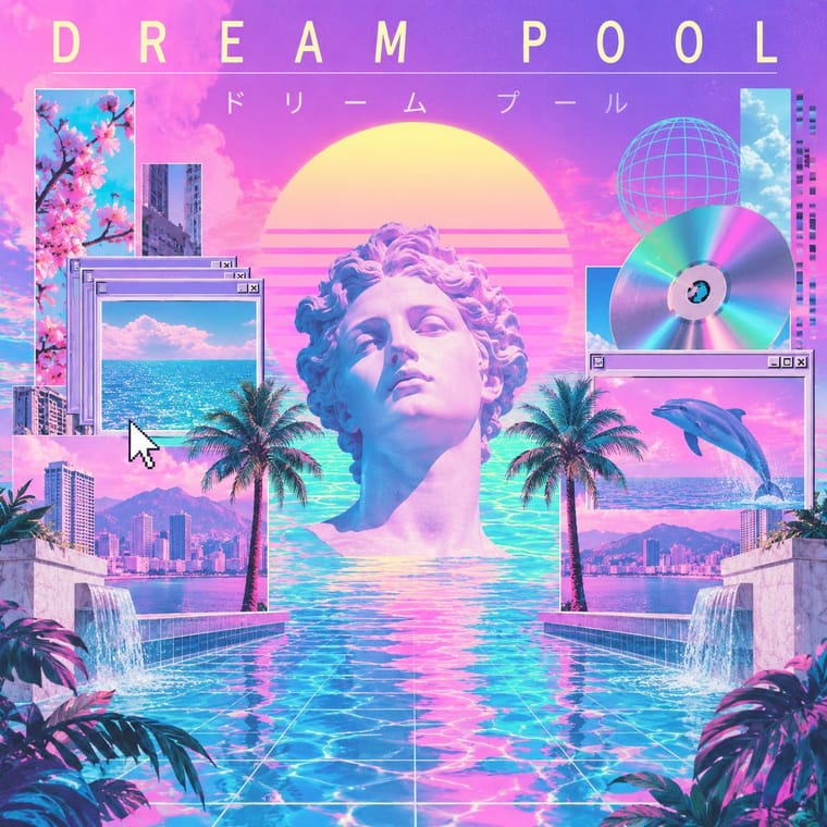
International Typographic Style × Vaporwave
Swiss objectivity is vaporwave's antithesis; a strict grid can frame its chaos for editorial or music-packaging use.
Mix them and make something International Typographic Style Vaporwave
01
What each style brings
Each part of the design comes from the style with the stronger say in it, and each style gives at least two.
International Typographic Style Vaporwave
- Type from Vaporwave
-
International Typographic Style avoids eclectic mixing: this is where the two pull against each other, which is the point of the contrast.
- Colour from International Typographic Style
- Form from International Typographic Style
- Composition from International Typographic Style
- Surface from Vaporwave
02
The type
Open fonts standing in for each style’s own type, which is often hand-drawn or commercial.
Text · International Typographic Style
A post-war refinement of the New Typography in which the mathematical grid, objective photography and neo-grotesque sans-serifs were used to communicate with clarity and neutrality. Taught at the Basel and Zurich schools, it became the default language of international corporate and institutional communication.
Inter; International Typographic Style used Akzidenz-Grotesk and Helvetica
03
The colours
The ground and leading colours come from International Typographic Style, with a counter-accent from Vaporwave. The ink reads on the ground at 4.5:1 or more.
International Typographic Style Vaporwave
-
#f2f0e9ground · 36% -
#111111ink · 14% -
#e1251baccent · 18% -
#01cdfeaccent · 14% -
#1f4e9caccent · 10% -
#b967ffaccent · 8%
As CSS
:root {
  --ground: #f2f0e9;
  --ink: #111111;
  --accent-1: #e1251b;
  --accent-2: #01cdfe;
  --accent-3: #1f4e9c;
  --accent-4: #b967ff;
  --font-display: "Syncopate", sans-serif;
  --font-text: "Inter", sans-serif;
}
04
The two styles

05
More combinations
With International Typographic Style
- Art Nouveau Contrasts · Ornamental curves against an orthogonal grid make a strong deliberate tension.
- Brutalist Web Design Pairs well · Strip the grid to raw HTML defaults to get a rawer, contemporary take on Swiss honesty.
- Psychedelic Poster Contrasts · Its exact opposite on legibility; borrow one swirling element to break a too-cold Swiss layout.
- Japanese Postwar Modernism Pairs well · Add Japanese restraint and emblematic colour fields to the grid for warmth without losing order.
- American Traditional Tattoo Flash Contrasts · Rational grid and sans-serif against sentimental, hand-lettered emblems: one flash motif on a Swiss layout makes a sharp contrast.
- Graffiti & Hip-Hop Graphics Contrasts · Put a single tag or throw-up over a strict Swiss grid to stage the clash between institutional order and a street voice.
- Pop Art Graphics Contrasts · Set one loud appropriated Pop image inside a strict grid with a neutral grotesque so the irony reads as deliberate rather than chaotic.
- Italian Painted Film Poster (Rome Studios) Contrasts · Grid, restraint and photographic objectivity are the opposite of a crowded painted montage.
With Vaporwave
- Bitmap & Pixel Graphics Pairs well · Use pixel fonts, dithered gradients and Windows-style dialog boxes as framing devices for vaporwave collages.
- Memphis Design Pairs well · Memphis terrazzo, squiggles and pastel laminates ground vaporwave's busts and grids in genuine 1980s decorative language.
- Ma & Wabi-sabi Aesthetics Contrasts · Wabi-sabi's natural imperfection and quiet earth tones are the analogue counterpoint to vaporwave's synthetic, plastic nostalgia.
- Generative-AI Image Aesthetic Pairs well · Vaporwave's ironic distance is the antidote to AI's earnest polish; frame generated images as found kitsch to make the artificiality the point.
- Frutiger Aero Pairs well · Both trade on mid-2000s tech nostalgia; mix Aero bubbles and skies with vaporwave's pastel 3D for retro-internet campaigns.
- Weirdcore & Dreamcore Contrasts · Tanni's genealogy starts with vaporwave's spectral reuse of web imagery; vaporwave collages pastel consumer debris, busts and Japanese text with ironic luxury, while weirdcore empties the frame and drops the joke. Keep the found picture but swap the bust for a vacant playground to move from irony to unease.
- Early Web Vernacular Pairs well · Vaporwave already mines this archive; combine tiled backgrounds and default fonts with its pastel 3D for nostalgic net art.
- City Pop Illustration Contrasts · Nagai's resorts fed vaporwave, which collages palms and pools with busts, dialog boxes and glitches as ironic consumer debris; choose city pop when the place should be painted sincerely, whole and uncluttered.