Style combination · Pairs well
Frutiger Aero × Vaporwave
Both trade on mid-2000s tech nostalgia; mix Aero bubbles and skies with vaporwave's pastel 3D for retro-internet campaigns.
01
What each style brings
Each part of the design comes from the style with the stronger say in it, and each style gives at least two.
Frutiger Aero Vaporwave
- Type from Vaporwave
- Colour from Frutiger Aero
- Form from Frutiger Aero
- Composition from Vaporwave
- Surface from Frutiger Aero
02
The type
Open fonts standing in for each style’s own type, which is often hand-drawn or commercial.
Text · Frutiger Aero
The glossy, optimistic look of consumer technology from the mid-2000s to the early 2010s, retrospectively named in 2017 by the Consumer Aesthetics Research Institute after Windows Vista's Aero interface and Adrian Frutiger's humanist sans. Translucent glass panels, glossy orbs and buttons, water droplets, bubbles, auroras, green fields and blue skies fused technology with clean nature, set in airy humanist sans-serifs.
Fira Sans; Frutiger Aero used Frutiger and Segoe UI
03
The colours
The ground and leading colours come from Frutiger Aero, with a counter-accent from Vaporwave. The ink reads on the ground at 4.5:1 or more.
Frutiger Aero Vaporwave
-
#f5fbffground · 36% -
#0b5fa5ink · 14% -
#22c3c9accent · 18% -
#01cdfeaccent · 14% -
#4fb3e8accent · 10% -
#05ffa1accent · 8%
As CSS
:root {
  --ground: #f5fbff;
  --ink: #0b5fa5;
  --accent-1: #22c3c9;
  --accent-2: #01cdfe;
  --accent-3: #4fb3e8;
  --accent-4: #05ffa1;
  --font-display: "Syncopate", sans-serif;
  --font-text: "Fira Sans", sans-serif;
}
04
The two styles
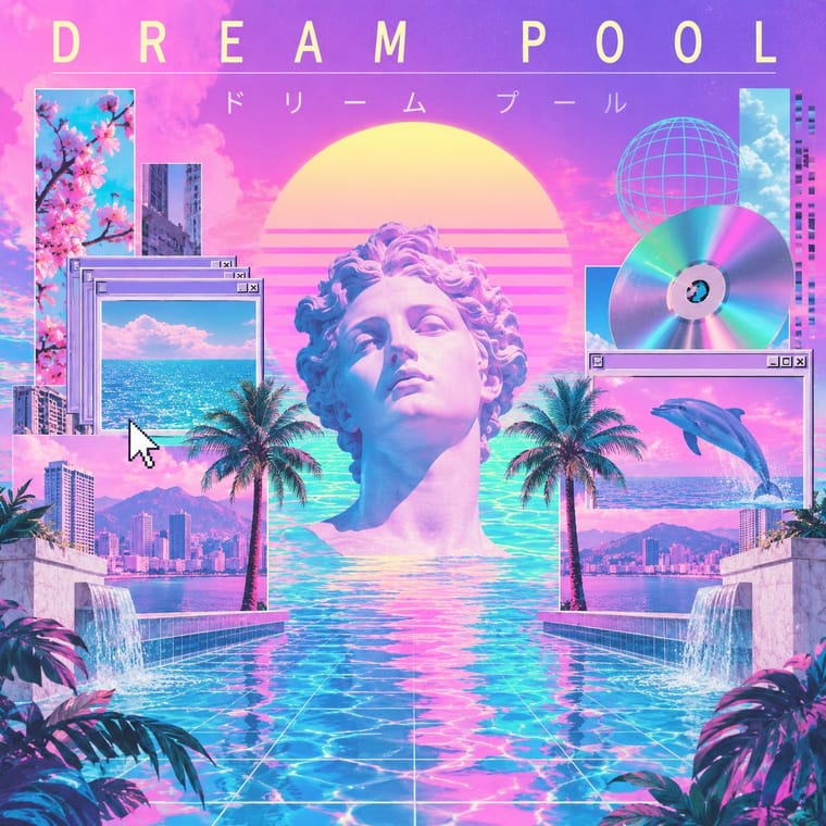
05
More combinations
With Frutiger Aero
- Brutalist Web Design Contrasts · Raw HTML against bubbly gloss is a sharp foil for ironic or nostalgic web projects.
- Glassmorphism Pairs well · Glassmorphism is its flatter heir; reintroduce a touch of Aero gloss and nature photography to warm up frosted-glass UI.
- Flat Design Contrasts · Flat design was the reaction that ended it; toggle gloss against flat to signal ‘then and now’ in retro tech work.
- Forum Signature Art (Sig & C4D Render Graphics) Contrasts · The same years' glossy, light and airy interface look against the sig's dark, smudged depth.
- Skeuomorphic UI Pairs well · Share gloss and depth; combine Aero's glass and nature with skeuomorphic objects for convincing 2000s-nostalgia interfaces.
- Punk & DIY Zine Contrasts · Glossy optimism is everything punk rejects; one torn xerox fragment on an aero gradient reads as instant sabotage.
- Solarpunk Contrasts · Both pair green nature with optimistic technology, but Aero renders it as glossy stock photography, bubbles and glass for a product; choose solarpunk for painted, handmade, lived-in places and shared infrastructure.
- Glitch Art & Datamosh Graphics Contrasts · Aero's glossy, seamless interface is the frictionless technology glitch art questions; corrupt one Aero-style screen to show what the gloss hides.
With Vaporwave
- International Typographic Style Contrasts · Swiss objectivity is vaporwave's antithesis; a strict grid can frame its chaos for editorial or music-packaging use.
- Bitmap & Pixel Graphics Pairs well · Use pixel fonts, dithered gradients and Windows-style dialog boxes as framing devices for vaporwave collages.
- Memphis Design Pairs well · Memphis terrazzo, squiggles and pastel laminates ground vaporwave's busts and grids in genuine 1980s decorative language.
- Ma & Wabi-sabi Aesthetics Contrasts · Wabi-sabi's natural imperfection and quiet earth tones are the analogue counterpoint to vaporwave's synthetic, plastic nostalgia.
- Generative-AI Image Aesthetic Pairs well · Vaporwave's ironic distance is the antidote to AI's earnest polish; frame generated images as found kitsch to make the artificiality the point.
- Weirdcore & Dreamcore Contrasts · Tanni's genealogy starts with vaporwave's spectral reuse of web imagery; vaporwave collages pastel consumer debris, busts and Japanese text with ironic luxury, while weirdcore empties the frame and drops the joke. Keep the found picture but swap the bust for a vacant playground to move from irony to unease.
- Early Web Vernacular Pairs well · Vaporwave already mines this archive; combine tiled backgrounds and default fonts with its pastel 3D for nostalgic net art.
- City Pop Illustration Contrasts · Nagai's resorts fed vaporwave, which collages palms and pools with busts, dialog boxes and glitches as ironic consumer debris; choose city pop when the place should be painted sincerely, whole and uncluttered.