Style combination · Contrasts
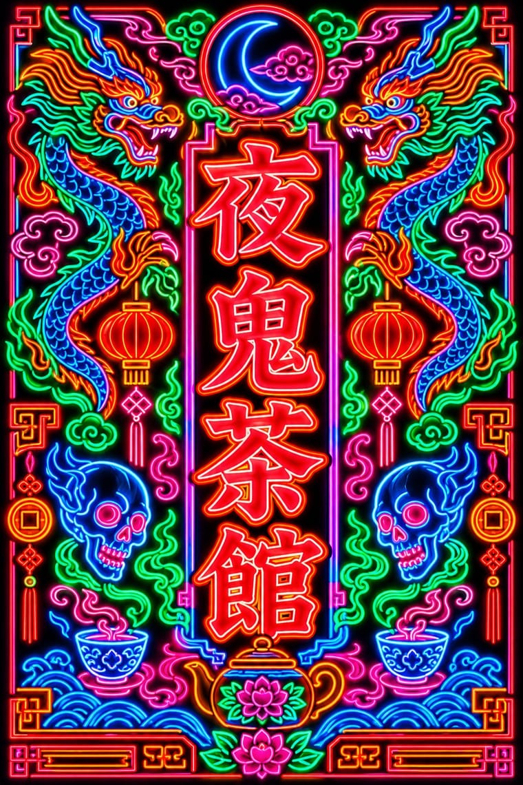
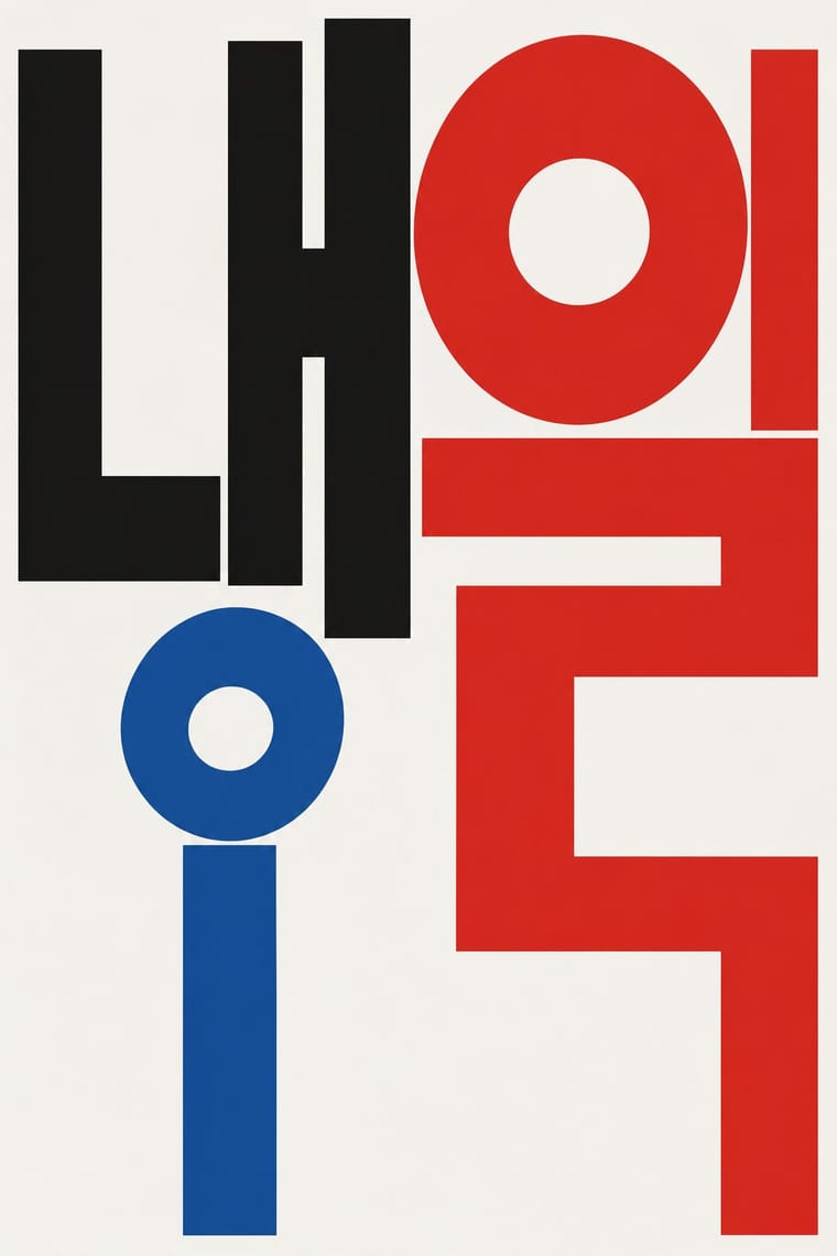
Hong Kong Neon × Out-of-Square Hangul Typography
Set stele-derived Beiwei brush strokes against monoline geometric Hangul modules to show two opposite ways of modernising East Asian lettering.
Beiwei's chisel-edged, stele-derived brush script is the opposite of monoline geometric jamo; set the two side by side to show calligraphic against constructed East Asian lettering.
Mix them and make something Hong Kong Neon Out-of-Square Hangul Typography
01
What each style brings
Each part of the design comes from the style with the stronger say in it, and each style gives at least two.
Hong Kong Neon & Beiwei Shop-Sign Lettering Out-of-Square Hangul Typography
- Type from Out-of-Square Hangul Typography
- Colour from Hong Kong Neon
- Form from Out-of-Square Hangul Typography
- Composition from Hong Kong Neon
- Surface from Hong Kong Neon
-
02
The type
Open fonts standing in for each style’s own type, which is often hand-drawn or commercial.
Display · Out-of-Square Hangul Typography
Fiesta
Syne; Out-of-Square Hangul Typography used Ahn Sang-soo typeface and Isang-che, Mir-che and Mano-che
Text · Hong Kong Neon
The night-time signscape of Hong Kong's Kowloon streets. Shop names written by commercial calligraphers in Beiwei kaishu, a square, heavy, chisel-edged script descended from Northern Wei stone steles, were bent by neon makers into glass tube and cantilevered over the road. Vertical Chinese, horizontal English, double-line borders and trade emblems such as the pawnshop's bat and coin stack into a dense canyon of light, thinned by signboard controls since the 2000s.
Shippori Mincho; Hong Kong Neon used Beiwei kaishu (Northern Wei stele-style regular script), as written by Au Kin-kung and Zansyu (Adonian Chan, Trilingua), digital Beiwei revival
03
The colours
The ground and leading colours come from Hong Kong Neon, with a counter-accent from Out-of-Square Hangul Typography. The ink reads on the ground at 4.5:1 or more.
Hong Kong Neon & Beiwei Shop-Sign Lettering Out-of-Square Hangul Typography
-
#0d0d14ground · 36% -
#39ff88ink · 14% -
#ff8a1faccent · 18% -
#f2c12eaccent · 14% -
#ff2a3daccent · 10% -
#d7261eaccent · 8%
As CSS
:root {
  --ground: #0d0d14;
  --ink: #39ff88;
  --accent-1: #ff8a1f;
  --accent-2: #f2c12e;
  --accent-3: #ff2a3d;
  --accent-4: #d7261e;
  --font-display: "Syne", sans-serif;
  --font-text: "Shippori Mincho", serif;
}
04
The two styles
05
More combinations
With Hong Kong Neon
- Minimalist Graphic Design Contrasts · Isolate one neon character on a black field to turn the crowded street into a single emblem, then reintroduce density step by step.
- Googie & Atomic Age Pairs well · Googie starbursts and Kowloon calligraphy are parallel 1950s neon vernaculars; mix a tube-drawn emblem with Beiwei characters for a mid-century night-market identity.
- Hand-Painted Signage & Vernacular Lettering Pairs well · Its daylight relative: carry a Beiwei signboard's characters onto a painted fascia with drop shadows so a shop reads the same by day and by night.
- Vaporwave Pairs well · Vaporwave and cyberpunk borrowed Kowloon neon as scenery; use real Beiwei forms and trade emblems instead of random East Asian characters to give a neon palette substance.
- Synthwave / Outrun Pairs well · Real neon-tube shop lettering gives synthwave's painted glow a street-level counterpart for night-market, bar or club identities; use real Beiwei forms and credit the sign-makers rather than dressing the scene in random Chinese characters.
- Hong Kong East–West Graphic Modernism Contrasts · The same city's street lettering: set dense, glowing Beiwei signboards against a white-space bilingual lockup to choose between vernacular and institutional Hong Kong.
- Edo-moji Commercial Lettering (Kanteiryū, Yose-moji, Sumō-ji) Contrasts · Both are East Asian commercial sign hands, but Beiwei kaishu is square and chisel-cut in coloured light on a night sky while Edo-moji is rounded, swollen black ink on paper; compare them to choose between a chiselled and a plump brush voice.
- Polish Cold War Neon (PRL Neonisation) Contrasts · Both bend shop names into glass tube against the night, but Kowloon's calligraphers stacked heavy Beiwei characters on signs projecting over a crowded commercial street, while Poland's planners placed one light openwork sign per roof or facade in one or two trade colours; compare them to choose between a canyon of competing signs and a single emblem on the skyline.
With Out-of-Square Hangul Typography
- International Typographic Style Pairs well · Place a modular out-of-square headline on a strict Swiss grid so the hanging, irregular syllables read as deliberate against an ordered page.
- Emigre & Early Digital Type Pairs well · Both turned a constructed alphabet into a magazine laboratory in the 1980s; set an Emigre-era Latin face beside an out-of-square Hangul face for a bilingual experimental spread.
- Chaekgeori & Minhwa Screen Painting Pairs well · Munjado builds a character from pictures and out-of-square Hangul builds pictures from letters; combine them for a Korean identity that spans folk painting and modern type.
- Roman-like Thai Typography (modern loopless Thai) Pairs well · Both modernise an Asian script by dropping a defining convention, the square cell in Hangul and the head loop in Thai; set them together for a pan-Asian modern type specimen or festival identity.
- Seoul Independent Graphic Design (Small-Studio Scene) Pairs well · Ahn Sang-soo freed Hangul from the square in 1985, and Sulki & Min have gone further back, to Cho Young-jae's 1976 proposal to restructure Hangul for typewriters, a study they say has rarely been discussed with the depth it deserves, and to the origins of unsquared Hangul; set a hanging, de-squared headline in a centred one-colour poster to join the generations.
- Korean Commercial Calligraphy (Kaelligeurapi) Contrasts · Both free Hangul from the equal square, but Ahn Sang-soo constructs monoline jamo as a reusable typeface while kaelligeurapi writes each word once with the brush; choose between a system and a signature.
- Newtro (Korean New-Retro) Contrasts · Set the modernist, geometric de-squared Hangul of Ahn Sang-soo against newtro's revived brush and cursive label lettering to show two ideas of fashionable Hangul.
- Song–Ming Woodblock Book Typography (Songti / Mincho) Contrasts · Ahn Sang-soo's typeface broke exactly the equal square that Myeongjo keeps; run Myeongjo body text under out-of-square headings to stage tradition against experiment.