Style combination · Pairs well
Early Web Vernacular × Vaporwave
Vaporwave already mines this archive; combine tiled backgrounds and default fonts with its pastel 3D for nostalgic net art.
01
What each style brings
Each part of the design comes from the style with the stronger say in it, and each style gives at least two.
Early Web Vernacular Vaporwave
- Type from Early Web Vernacular
- Colour from Early Web Vernacular
- Form from Early Web Vernacular
- Composition from Vaporwave
- Surface from Vaporwave
02
The type
Open fonts standing in for each style’s own type, which is often hand-drawn or commercial.
Text · Vaporwave
An internet-born microgenre and visual aesthetic that remixes the debris of late-20th-century consumer culture (Windows 95 dialogs, classical busts, palm trees, mall interiors, Japanese text, early 3D renders) in pastel pinks and cyans. Emerging around 2011 from records by James Ferraro, Daniel Lopatin and Vektroid, it is at once nostalgic homage and deadpan critique of corporate optimism.
Shippori Mincho; Vaporwave used Full-width Latin text and Japanese katakana in MS Gothic / MS Mincho
03
The colours
The ground and leading colours come from Early Web Vernacular, with a counter-accent from Vaporwave. The ink reads on the ground at 4.5:1 or more.
Early Web Vernacular Vaporwave
-
#000080ground · 36% -
#00ff00ink · 14% -
#0000ffaccent · 18% -
#01cdfeaccent · 14% -
#ff00ffaccent · 10% -
#05ffa1accent · 8%
As CSS
:root {
  --ground: #000080;
  --ink: #00ff00;
  --accent-1: #0000ff;
  --accent-2: #01cdfe;
  --accent-3: #ff00ff;
  --accent-4: #05ffa1;
  --font-display: "Newsreader", serif;
  --font-text: "Shippori Mincho", serif;
}
04
The two styles
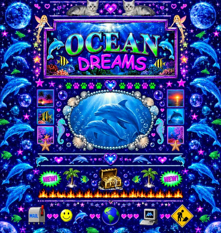
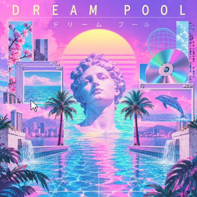
05
More combinations
With Early Web Vernacular
- Material Design Contrasts · Material's systematic spacing and elevation are everything the amateur web lacked; use it as the ‘after’ to this ‘before’.
- International Typographic Style Contrasts · A single centred Comic Sans headline on a Swiss grid makes a sharp, funny statement about taste and authority.
- Brutalist Web Design Pairs well · Drop the GIFs but keep raw HTML defaults and visible structure for a contemporary, knowingly unpolished site.
- Media-Player & Desktop Skins (Winamp-Era Skinning) Pairs well · The same amateur, communal web of the late 1990s; pair a skin with a fan homepage for a full period set.
- Weirdcore & Dreamcore Pairs well · Frame a weirdcore still in an old browser window, a default dialog box or a low-resolution GIF to make its debt to the amateur early web explicit; keep the window empty rather than crowding it with the early web's badges and counters.
- Flash Vector Cartoon (Newgrounds-Era Web Animation) Pairs well · Its native habitat: put the cartoon in a cluttered portal page of banners and visitor counters for the full dial-up context.
- Japanese Dense Web Design Contrasts · This grew from the early web's link directories and table layouts, but the early web was amateur bricolage on dark tiled grounds, while this is a professional convention on white in system gothics; borrow its column discipline to tame a GeoCities pastiche.
- Emigre & Early Digital Type Pairs well · Low-resolution type and layered layouts carry naturally into table-based web pages and GIF graphics.
With Vaporwave
- International Typographic Style Contrasts · Swiss objectivity is vaporwave's antithesis; a strict grid can frame its chaos for editorial or music-packaging use.
- Bitmap & Pixel Graphics Pairs well · Use pixel fonts, dithered gradients and Windows-style dialog boxes as framing devices for vaporwave collages.
- Memphis Design Pairs well · Memphis terrazzo, squiggles and pastel laminates ground vaporwave's busts and grids in genuine 1980s decorative language.
- Ma & Wabi-sabi Aesthetics Contrasts · Wabi-sabi's natural imperfection and quiet earth tones are the analogue counterpoint to vaporwave's synthetic, plastic nostalgia.
- Generative-AI Image Aesthetic Pairs well · Vaporwave's ironic distance is the antidote to AI's earnest polish; frame generated images as found kitsch to make the artificiality the point.
- Frutiger Aero Pairs well · Both trade on mid-2000s tech nostalgia; mix Aero bubbles and skies with vaporwave's pastel 3D for retro-internet campaigns.
- Weirdcore & Dreamcore Contrasts · Tanni's genealogy starts with vaporwave's spectral reuse of web imagery; vaporwave collages pastel consumer debris, busts and Japanese text with ironic luxury, while weirdcore empties the frame and drops the joke. Keep the found picture but swap the bust for a vacant playground to move from irony to unease.
- City Pop Illustration Contrasts · Nagai's resorts fed vaporwave, which collages palms and pools with busts, dialog boxes and glitches as ironic consumer debris; choose city pop when the place should be painted sincerely, whole and uncluttered.