Style combination · Pairs well
Bitmap × Vaporwave
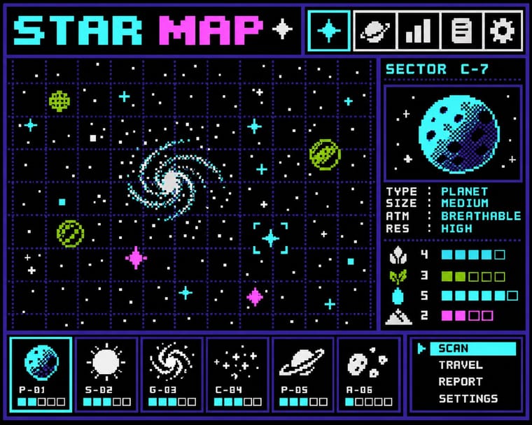
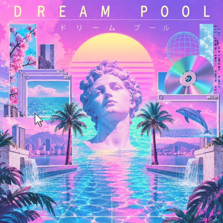
Use pixel fonts, dithered gradients and Windows-style dialog boxes as framing devices for vaporwave collages.
01
What each style brings
Each part of the design comes from the style with the stronger say in it, and each style gives at least two.
Bitmap & Pixel Graphics Vaporwave
- Type from Bitmap
- Colour from Vaporwave
-
Bitmap avoids gradients: this is where the two pull against each other.
- Form from Bitmap
- Composition from Bitmap
- Surface from Vaporwave
02
The type
Open fonts standing in for each style’s own type, which is often hand-drawn or commercial.
Text · Vaporwave
An internet-born microgenre and visual aesthetic that remixes the debris of late-20th-century consumer culture (Windows 95 dialogs, classical busts, palm trees, mall interiors, Japanese text, early 3D renders) in pastel pinks and cyans. Emerging around 2011 from records by James Ferraro, Daniel Lopatin and Vektroid, it is at once nostalgic homage and deadpan critique of corporate optimism.
Shippori Mincho; Vaporwave used Full-width Latin text and Japanese katakana in MS Gothic / MS Mincho
03
The colours
The ground and leading colours come from Vaporwave, with a counter-accent from Bitmap. The ink reads on the ground at 4.5:1 or more.
Bitmap & Pixel Graphics Vaporwave
-
#1a1040ground · 36% -
#fffb96ink · 14% -
#01cdfeaccent · 18% -
#9bbc0faccent · 14% -
#05ffa1accent · 10% -
#55ffffaccent · 8%
As CSS
:root {
  --ground: #1a1040;
  --ink: #fffb96;
  --accent-1: #01cdfe;
  --accent-2: #9bbc0f;
  --accent-3: #05ffa1;
  --accent-4: #55ffff;
  --font-display: "Pixelify Sans", monospace;
  --font-text: "Shippori Mincho", serif;
}
04
The two styles
05
More combinations
With Bitmap
- Andean Woven Graphic Systems Pairs well · The woven cell of Andean tapestry is a pre-digital pixel grid; draw pixel icons with its stepped diagonals, but credit weaving communities rather than copying their motifs.
- Skeuomorphic UI Contrasts · Photoreal leather and glass are the opposite pole of 1-bit honesty; jump from one to the other to tell a story of interface history.
- International Typographic Style Pairs well · Snap pixel type and icons to a strict Swiss grid for a rational, screen-native take on modernist order.
- Art Nouveau Contrasts · Whiplash curves cannot survive a coarse pixel grid; staging that clash makes a memorable, deliberately jagged ornament.
- Kawaii Design Pairs well · Sprite-scale characters and kawaii roundness merge naturally; keep the palette limited so pixel mascots stay crisp.
- Demoscene Graphics (Cracktros, Demos & Text-Mode Art) Contrasts · Bitmap graphics is the legible, flat pixel of icons, sprites and system fonts; scene graphics spend the same pixels on chrome, gradients and motion for show. Pick the icon grid for an interface and the scene logo for a title screen.
- Square Kufic (Bannāʾī) Pairs well · Both build letters from square units, and Sakkal compares building bricks to large pixels; set a bitmap Latin wordmark on the same cell size as a square-Kufic mark for a bilingual identity, but keep sacred formulas out of jokey, game-like pixel contexts.
- Isometric Pixel Art Contrasts · Same hand-placed pixels, but front-on icons and sprites under hardware limits against a crammed, full-colour 2:1 city made as a picture.
With Vaporwave
- International Typographic Style Contrasts · Swiss objectivity is vaporwave's antithesis; a strict grid can frame its chaos for editorial or music-packaging use.
- Memphis Design Pairs well · Memphis terrazzo, squiggles and pastel laminates ground vaporwave's busts and grids in genuine 1980s decorative language.
- Ma & Wabi-sabi Aesthetics Contrasts · Wabi-sabi's natural imperfection and quiet earth tones are the analogue counterpoint to vaporwave's synthetic, plastic nostalgia.
- Generative-AI Image Aesthetic Pairs well · Vaporwave's ironic distance is the antidote to AI's earnest polish; frame generated images as found kitsch to make the artificiality the point.
- Frutiger Aero Pairs well · Both trade on mid-2000s tech nostalgia; mix Aero bubbles and skies with vaporwave's pastel 3D for retro-internet campaigns.
- Weirdcore & Dreamcore Contrasts · Tanni's genealogy starts with vaporwave's spectral reuse of web imagery; vaporwave collages pastel consumer debris, busts and Japanese text with ironic luxury, while weirdcore empties the frame and drops the joke. Keep the found picture but swap the bust for a vacant playground to move from irony to unease.
- Early Web Vernacular Pairs well · Vaporwave already mines this archive; combine tiled backgrounds and default fonts with its pastel 3D for nostalgic net art.
- City Pop Illustration Contrasts · Nagai's resorts fed vaporwave, which collages palms and pools with busts, dialog boxes and glitches as ironic consumer debris; choose city pop when the place should be painted sincerely, whole and uncluttered.