Style combination · Contrasts
Edo-moji Commercial Lettering × Hong Kong Neon
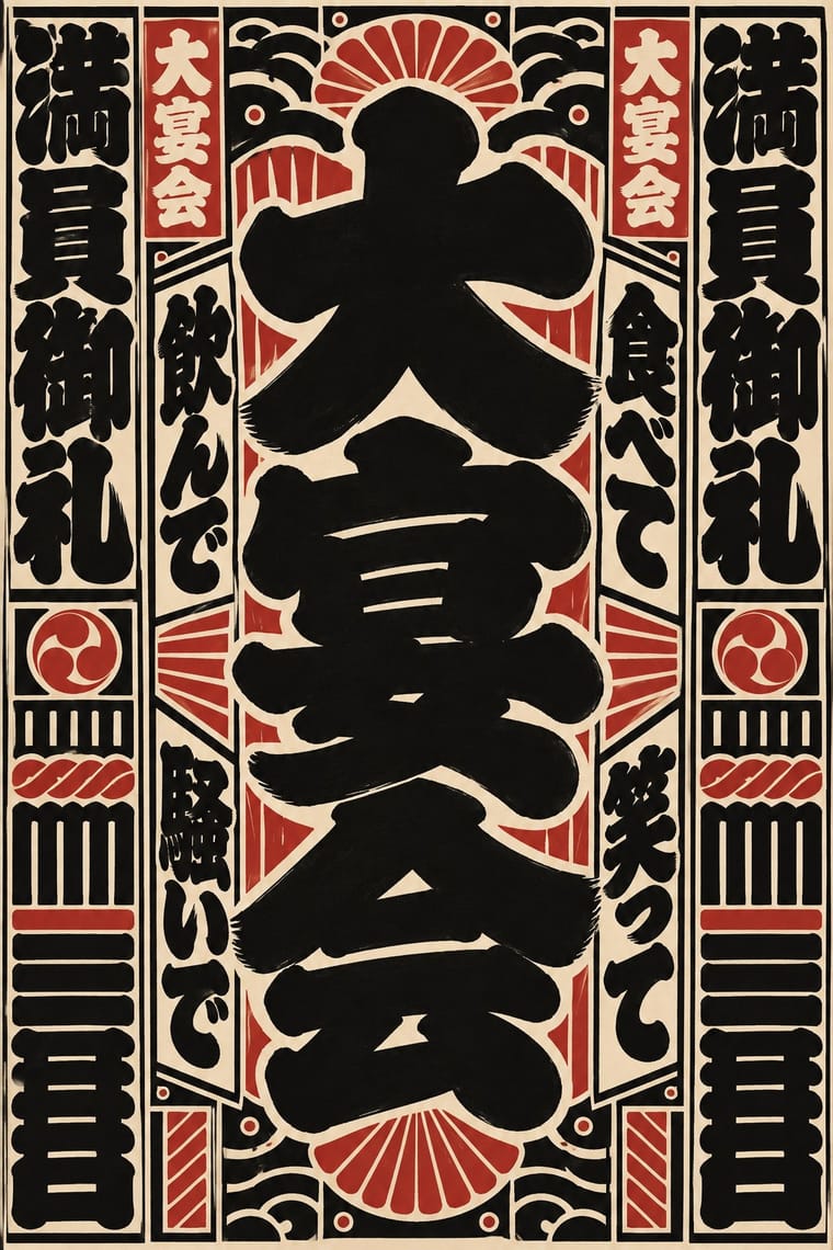
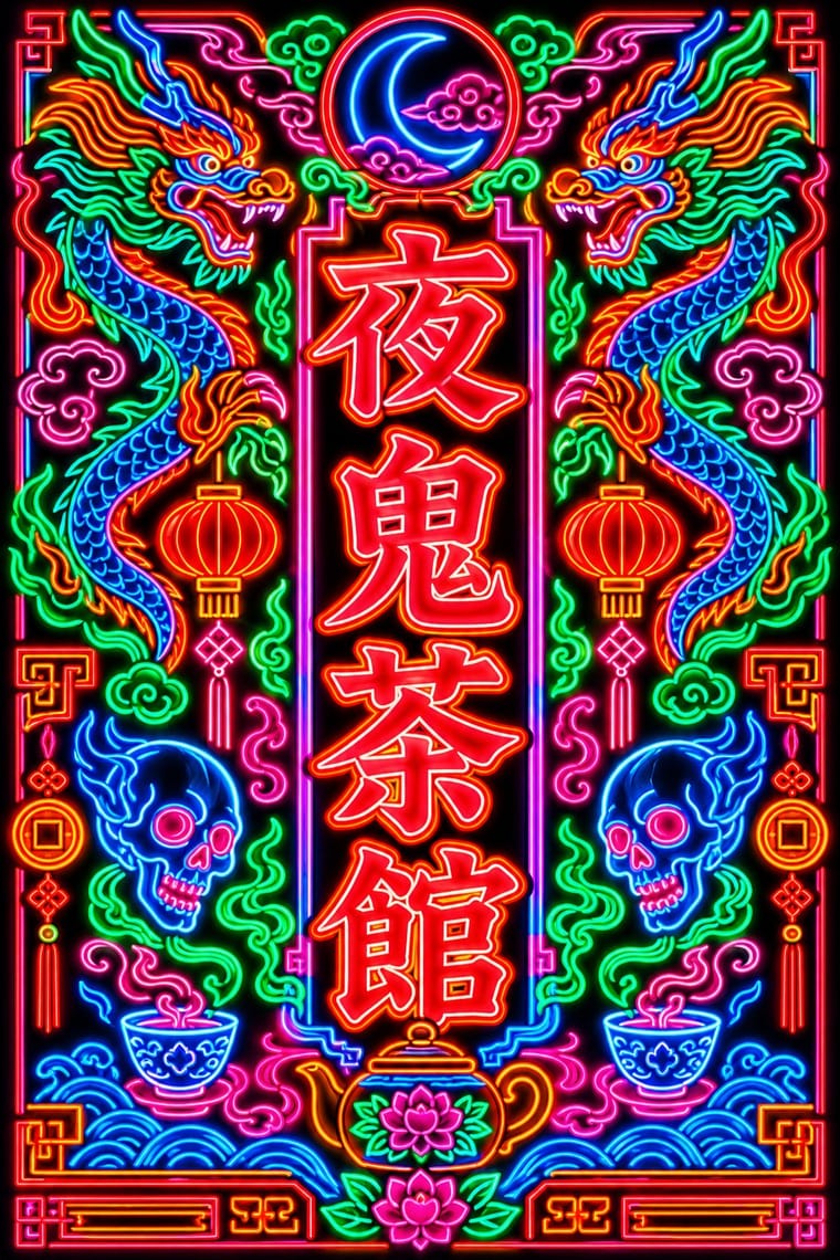
Both are East Asian commercial sign hands, but Beiwei kaishu is square and chisel-cut in coloured light on a night sky while Edo-moji is rounded, swollen black ink on paper; compare them to choose between a chiselled and a plump brush voice.
Mix them and make something Edo-moji Commercial Lettering Hong Kong Neon
01
What each style brings
Each part of the design comes from the style with the stronger say in it, and each style gives at least two.
Edo-moji Commercial Lettering (Kanteiryū, Yose-moji, Sumō-ji) Hong Kong Neon & Beiwei Shop-Sign Lettering
- Type from Hong Kong Neon
- Colour from Hong Kong Neon
-
Edo-moji Commercial Lettering avoids fluorescent & neon: this is where the two pull against each other, which is the point of the contrast.
- Form from Edo-moji Commercial Lettering
- Composition from Edo-moji Commercial Lettering
- Surface from Edo-moji Commercial Lettering
02
The type
Open fonts standing in for each style’s own type, which is often hand-drawn or commercial.
Display · Hong Kong Neon
Together
Shippori Mincho, standing in for Beiwei kaishu (Northern Wei stele-style regular script), as written by Au Kin-kung
Text · Edo-moji Commercial Lettering
The fat, ink-heavy brush hands that Edo's professional sign and bill writers made for the city's entertainments: Kanteiryū for kabuki signboards and playbills from 1779, yose-moji for rakugo halls, sumō-ji for sumo ranking sheets, and squarish kago-moji for votive name slips. The stage and sumo hands swell each stroke until little white is left and pack the columns tight, which theatre writers took as a charm for a full house, so a name reads from far off. Kabuki, rakugo and sumo still write in them.
Newsreader; Edo-moji Commercial Lettering used Kanteiryū (勘亭流, shibai-moji) and Yose-moji (寄席文字)
03
The colours
The ground and leading colours come from Hong Kong Neon, with a counter-accent from Edo-moji Commercial Lettering. The ink reads on the ground at 4.5:1 or more.
Edo-moji Commercial Lettering (Kanteiryū, Yose-moji, Sumō-ji) Hong Kong Neon & Beiwei Shop-Sign Lettering
-
#0d0d14ground · 36% -
#39ff88ink · 14% -
#ff8a1faccent · 18% -
#b8312aaccent · 14% -
#ff2a3daccent · 10% -
#d8c8a0accent · 8%
As CSS
:root {
  --ground: #0d0d14;
  --ink: #39ff88;
  --accent-1: #ff8a1f;
  --accent-2: #b8312a;
  --accent-3: #ff2a3d;
  --accent-4: #d8c8a0;
  --font-display: "Shippori Mincho", serif;
  --font-text: "Newsreader", serif;
}
Use it with care
Edo-moji Commercial Lettering (Kanteiryū, Yose-moji, Sumō-ji): These are living professional hands: Kanteiryū is written by kabuki calligraphers, yose-moji is taught by the Tachibana school, and sumō-ji is the trained duty of the Japan Sumo Association's gyōji, so commission or credit those writers instead of passing off a font as their work. Senjafuda are votive slips left at shrines and temples and the banzuke's 蒙御免 is a formula of sumo tradition; do not print real shrine names, performers' names or rankings as decoration, and draw characters with their real meanings rather than as pseudo-Japanese texture.
04
The two styles
05
More combinations
With Edo-moji Commercial Lettering
- Kamon (Japanese Family Crests) Pairs well · Pair a one-colour mon with a packed column of kago-moji or yose-moji for a curtain, label or name card that carries both the house sign and the house name; both reduce to one ink and survive dyeing, painting and printing.
- Victorian Letterpress & Wood Type Contrasts · Victorian playbills crowded a sheet with many wood-type faces; Edo-moji playbills reached the same crowded pull with one hand drawn by a single writer. Choose between eclectic mixing and one consistent hand.
- Ma & Wabi-sabi Aesthetics Contrasts · Wabi-sabi lets one rough brush mark sit in empty space; Edo-moji fills the character and the page to wish for a full house. Use the clash to decide whether a Japanese identity should whisper or call out to the street.
- Song–Ming Woodblock Book Typography (Songti / Mincho) Contrasts · The Mincho book letter is thin, upright and set in an airy ruled grid for long reading; Edo-moji is fat, packed and made for a name read from far off. Pair a Mincho text block with an Edo-moji title for a programme or menu.
- Ukiyo-e Woodblock Prints Pairs well · Kabuki actor prints and picture playbills shared Edo's theatre world with Kanteiryū; set a flat, keylined actor figure under a Kanteiryū title for a theatre poster that sounds the same note in picture and letter.
- Hand-Painted Signage & Vernacular Lettering Pairs well · Both are trade-specific hands written by professional sign writers; combine an Edo-moji name with a Western sign-writer's Roman for a bilingual shopfront, keeping the Japanese hand solid black and without drop shadows.
- Showa Modern Commercial Art and Zuan-moji Pairs well · Both treat lettering as drawn design; fill an Edo-moji-style heavy brush shape with Showa modern flat geometry.
- Serizawa Katazome and Mingei Stencil-Dye Graphics Contrasts · Edo-moji crams heavy brush letters for the theatre and the street; Serizawa cuts open, airy letters that share the cloth with pictures.
With Hong Kong Neon
- Out-of-Square Hangul Typography Contrasts · Set stele-derived Beiwei brush strokes against monoline geometric Hangul modules to show two opposite ways of modernising East Asian lettering.
- Minimalist Graphic Design Contrasts · Isolate one neon character on a black field to turn the crowded street into a single emblem, then reintroduce density step by step.
- Googie & Atomic Age Pairs well · Googie starbursts and Kowloon calligraphy are parallel 1950s neon vernaculars; mix a tube-drawn emblem with Beiwei characters for a mid-century night-market identity.
- Hand-Painted Signage & Vernacular Lettering Pairs well · Its daylight relative: carry a Beiwei signboard's characters onto a painted fascia with drop shadows so a shop reads the same by day and by night.
- Vaporwave Pairs well · Vaporwave and cyberpunk borrowed Kowloon neon as scenery; use real Beiwei forms and trade emblems instead of random East Asian characters to give a neon palette substance.
- Synthwave / Outrun Pairs well · Real neon-tube shop lettering gives synthwave's painted glow a street-level counterpart for night-market, bar or club identities; use real Beiwei forms and credit the sign-makers rather than dressing the scene in random Chinese characters.
- Hong Kong East–West Graphic Modernism Contrasts · The same city's street lettering: set dense, glowing Beiwei signboards against a white-space bilingual lockup to choose between vernacular and institutional Hong Kong.
- Polish Cold War Neon (PRL Neonisation) Contrasts · Both bend shop names into glass tube against the night, but Kowloon's calligraphers stacked heavy Beiwei characters on signs projecting over a crowded commercial street, while Poland's planners placed one light openwork sign per roof or facade in one or two trade colours; compare them to choose between a canyon of competing signs and a single emblem on the skyline.