Style combination · Contrasts
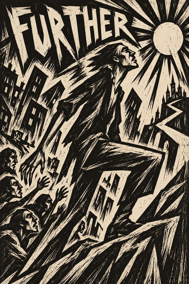
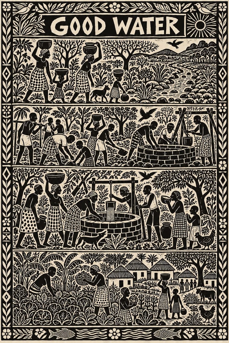
Expressionist Woodcut Graphics × Rorke's Drift Linocut
Both gouge black relief prints, but the Brücke woodcut distorts one anguished figure on tilted axes, while Rorke's Drift spreads a whole story across calm, packed bands; pick by whether the image should confess or narrate.
Mix them and make something Expressionist Woodcut Graphics Rorke's Drift Linocut
01
What each style brings
Each part of the design comes from the style with the stronger say in it, and each style gives at least two.
Expressionist Woodcut Graphics Rorke's Drift Linocut
- Type from Expressionist Woodcut Graphics
- Colour from Rorke's Drift Linocut
- Form from Expressionist Woodcut Graphics
- Composition from Rorke's Drift Linocut
- Surface from Expressionist Woodcut Graphics
02
The type
Open fonts standing in for each style’s own type, which is often hand-drawn or commercial.
Display · Expressionist Woodcut Graphics
Halo
Archivo Black, standing in for Heavy grotesque and Fraktur journal mastheads
Text · Rorke's Drift Linocut
The prints of the Lutheran art centre that Swedish teachers Peder and Ulla Gowenius started at Ceza Hospital in 1962 and moved to Rorke's Drift in 1963: under apartheid, which denied Black South Africans formal fine-art education, the chief training ground for many Black artists. Azaria Mbatha, John Muafangejo, Charles Nkosi and others cut black-and-white linocuts of Bible stories, Zulu and Kwanyama history and daily life, often crowded into horizontal bands with every gap filled by figures, foliage and pattern. Muafangejo added titles, dedications and commentary in the print itself.
Archivo; Rorke's Drift Linocut used Hand-cut title in the block and Hand-cut captions and slogans
03
The colours
The ground and leading colours come from Rorke's Drift Linocut, with a counter-accent from Expressionist Woodcut Graphics. The ink reads on the ground at 4.5:1 or more.
Expressionist Woodcut Graphics Rorke's Drift Linocut
-
#f6f1e3ground · 36% -
#151210ink · 14% -
#d9cfb8accent · 18% -
#d9932faccent · 14% -
#c8432baccent · 10% -
#2c4a8caccent · 8%
As CSS
:root {
  --ground: #f6f1e3;
  --ink: #151210;
  --accent-1: #d9cfb8;
  --accent-2: #d9932f;
  --accent-3: #c8432b;
  --accent-4: #2c4a8c;
  --font-display: "Archivo Black", sans-serif;
  --font-text: "Archivo", sans-serif;
}
Use it with care
Rorke's Drift Linocut: These prints are the work of named Black South African and Namibian artists, many still in copyright with the artists or their estates, made under apartheid at a Lutheran mission centre. Rankin and Hobbs call the 'typical' Rorke's Drift print a construct that the market pushed artists to comply with; the centre also made etchings, aquatints, colour relief prints and screenprints, so treat this banded black-and-white linocut as one face of a diverse school, not the whole of it. Borrow the system (hand-cut black-and-white relief, banded narrative, words in the block), not a particular print, a named artist's figures or Muafangejo's lettering hand. Do not label generated work 'naive' or 'tribal' African art: when Clement Greenberg judged Art South Africa Today in 1975, Rorke's Drift artists were displayed in a 'catch all' section for representational and 'naive' works. Do not invent Zulu or Kwanyama ritual, Christian scenes or struggle martyrs as decoration: picture the subject the brief supplies in its own community's terms. Never add an artist's signature, edition number or a Rorke's Drift or ELC inscription to generated work, and never present a generated image as a Rorke's Drift print.
04
The two styles
05
More combinations
With Expressionist Woodcut Graphics
- Art Nouveau Contrasts · The parent's smooth whiplash and floral harmony is exactly what the gouge splinters; use one against the other to stage order breaking down.
- Punk & DIY Zine Pairs well · Hand-cut jagged letters and one cheap ink suit gig posters and zines that want anger without photocopy clichés.
- Plakatstil / Sachplakat Contrasts · Same country and years: Bernhard's calm flat object poster against an anguished Brücke woodcut shows commercial clarity versus inner expression.
- Taller de Gráfica Popular Pairs well · Both gouge black-and-white relief images; add TGP's legible headlines and social subjects to steady expressionist distortion for a public message.
- Chinese Modern Woodcut Movement Pairs well · Lu Xun's movement learned from Kollwitz and Masereel; set the two side by side to show subjective anguish turning into collective resistance.
- Simplicissimus Satirical Style (Munich) Contrasts · Both distort the figure in protest, but Expressionist prints gouge it from the woodblock with angular, raw marks; Simplicissimus keeps a clean brush contour and flat tints, and adds a punchline.
- Argentine Adventure Historieta (Oesterheld–Breccia) Pairs well · Breccia's white scraped out of a black ground looks like the gouge of a Brücke woodcut; borrow the woodcut's jagged hand-cut capitals for a historieta title page or cover, and keep the comic's panels and captions inside.
- Hungarian Revolutionary Poster Pairs well · Kinchin sees 'a burgeoning taste for Futurist and Expressionist design' in the MA circle's exhibition poster (Bortnyik); add a gouged, splintered edge to the red body when the hero should look anguished rather than triumphant.
With Rorke's Drift Linocut
- South African Resistance Poster Contrasts · Same country, overlapping and then following it (1978–1994): screenprinted slogans and emblems for mass protest against small, hand-printed editions that tell a story; use the poster to mobilise and the linocut to bear witness.
- Ethiopian Ge'ez Manuscript & Haräg Illumination Pairs well · Another African Christian narrative art told in stacked registers; compare the two to set a Bible story in an African world, keeping Rorke's Drift to one ink and the carved line.
- Literatura de Cordel Woodcut Pairs well · Two traditions of small black relief pictures of devotional and popular stories; add cordel's letterpress title block when a banded Rorke's Drift-style narrative must sit on a booklet cover.
- Lubok Popular Print Pairs well · Close to it in the atlas, after cordel: the Russian popular print also cuts words and pictures into one block and tells devotional and folk stories; take lubok's hand colouring when a Rorke's Drift-style narrative needs warmth beyond black and white.
- Taller de Gráfica Popular Pairs well · Both made the black-and-white relief print a workshop art of social witness; borrow TGP's single legible image when a Rorke's Drift-style band of scenes needs one headline picture.
- Kinngait (Cape Dorset) Inuit Printmaking Contrasts · Two mid-century workshops where a community with no printmaking tradition began cutting blocks with an outside teacher: Rorke's Drift crowds a black-and-white story into banded scenes, Kinngait usually isolates one figure in colour on open paper; choose by whether the image should narrate or present.
- Torres Strait Islander Linocut Contrasts · Both pack a black linocut to the edges and grew from a teaching studio, but Rorke's Drift stacks Bible and history scenes in horizontal bands, while Torres Strait prints let sea beings and stars interlock in one field of minaral; pick bands to narrate in order, the open field to show a cosmos.
- Tingatinga Painting Contrasts · Rorke's Drift cuts dense black-and-white narrative bands; Tingatinga floats a few glossy, many-coloured animals on one ground. Use the contrast between carved monochrome story and painted colour field.