Style combination · Contrasts
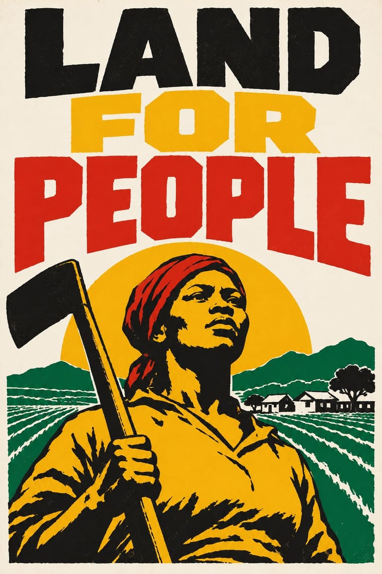
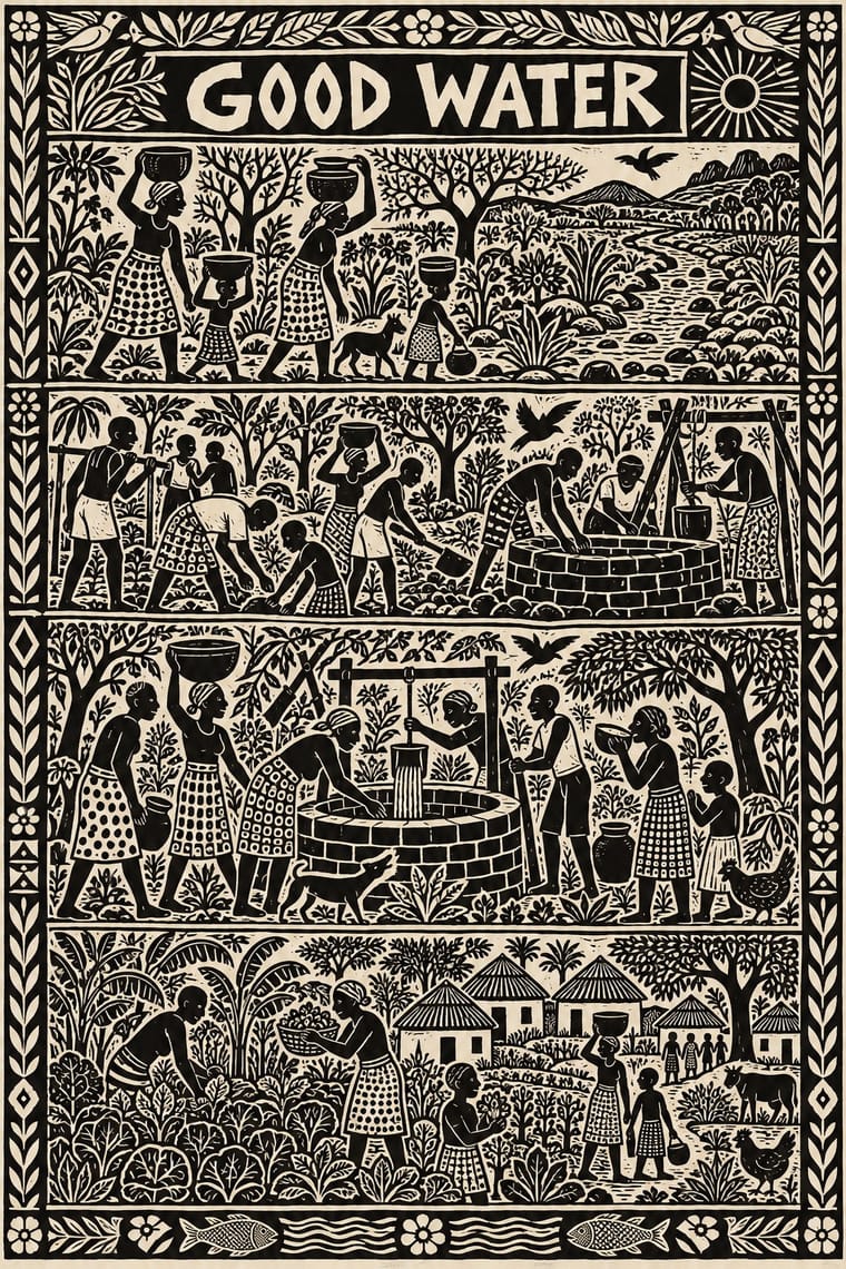
South African Resistance Poster × Rorke's Drift Linocut
Same country, overlapping and then following it (1978–1994): screenprinted slogans and emblems for mass protest against small, hand-printed editions that tell a story; use the poster to mobilise and the linocut to bear witness.
Mix them and make something South African Resistance Poster Rorke's Drift Linocut
01
What each style brings
Each part of the design comes from the style with the stronger say in it, and each style gives at least two.
South African Resistance Poster Rorke's Drift Linocut
- Type from South African Resistance Poster
- Colour from South African Resistance Poster
- Form from South African Resistance Poster
- Composition from Rorke's Drift Linocut
- Surface from Rorke's Drift Linocut
02
The type
Open fonts standing in for each style’s own type, which is often hand-drawn or commercial.
Display · South African Resistance Poster
Wake
Allerta Stencil, standing in for Hand-cut stencil capitals
Text · Rorke's Drift Linocut
The prints of the Lutheran art centre that Swedish teachers Peder and Ulla Gowenius started at Ceza Hospital in 1962 and moved to Rorke's Drift in 1963: under apartheid, which denied Black South Africans formal fine-art education, the chief training ground for many Black artists. Azaria Mbatha, John Muafangejo, Charles Nkosi and others cut black-and-white linocuts of Bible stories, Zulu and Kwanyama history and daily life, often crowded into horizontal bands with every gap filled by figures, foliage and pattern. Muafangejo added titles, dedications and commentary in the print itself.
Archivo; Rorke's Drift Linocut used Hand-cut title in the block and Hand-cut captions and slogans
03
The colours
The ground and leading colours come from South African Resistance Poster, with a counter-accent from Rorke's Drift Linocut. The ink reads on the ground at 4.5:1 or more.
South African Resistance Poster Rorke's Drift Linocut
-
#f4f1e8ground · 36% -
#141414ink · 14% -
#f2b51daccent · 18% -
#d9cfb8accent · 14% -
#d7261eaccent · 10% -
#007a4daccent · 8%
As CSS
:root {
  --ground: #f4f1e8;
  --ink: #141414;
  --accent-1: #f2b51d;
  --accent-2: #d9cfb8;
  --accent-3: #d7261e;
  --accent-4: #007a4d;
  --font-display: "Allerta Stencil", sans-serif;
  --font-text: "Archivo", sans-serif;
}
Use it with care
South African Resistance Poster: The photograph of the dying Hector Pieterson (Sam Nzima, 16 June 1976) and the portraits of detainees and the dead show real people whose families and communities still remember them, and ANC, UDF and COSATU colours and the spear and shield are the marks of living organisations. Use them with context and permission rather than as generic protest styling.
Rorke's Drift Linocut: These prints are the work of named Black South African and Namibian artists, many still in copyright with the artists or their estates, made under apartheid at a Lutheran mission centre. Rankin and Hobbs call the 'typical' Rorke's Drift print a construct that the market pushed artists to comply with; the centre also made etchings, aquatints, colour relief prints and screenprints, so treat this banded black-and-white linocut as one face of a diverse school, not the whole of it. Borrow the system (hand-cut black-and-white relief, banded narrative, words in the block), not a particular print, a named artist's figures or Muafangejo's lettering hand. Do not label generated work 'naive' or 'tribal' African art: when Clement Greenberg judged Art South Africa Today in 1975, Rorke's Drift artists were displayed in a 'catch all' section for representational and 'naive' works. Do not invent Zulu or Kwanyama ritual, Christian scenes or struggle martyrs as decoration: picture the subject the brief supplies in its own community's terms. Never add an artist's signature, edition number or a Rorke's Drift or ELC inscription to generated work, and never present a generated image as a Rorke's Drift print.
04
The two styles
05
More combinations
With South African Resistance Poster
- Cuban Revolutionary Poster (OSPAAAL & ICAIC) Contrasts · State-funded Cuban posters are polychrome and conceptual where these are literal, text-heavy and cheap; pick by whether the audience needs an idea or an instruction.
- WPA Silkscreen Posters Pairs well · Another public-service silkscreen culture of flat inks and plain capitals; borrow its calmer layout when a meeting poster needs to inform rather than shout.
- Atelier Populaire (May '68 Screenprint Poster) Pairs well · Both chose hand-made silkscreen because it was cheap, quick and teachable to non-artists; borrow the struggle posters' organisation emblems and second ink when a campaign must stay recognisable beyond one day's slogan.
- Extinction Rebellion Graphics Pairs well · Both are cheap workshop prints with heavy capitals and an organisation's emblem; XR adds a centrally specified twelve-colour kit where the struggle posters kept to one to three hand-cut inks.
- Drum Magazine & Sophiatown Photojournalism Contrasts · The later South African struggle poster argues with screenprinted slogans, emblems and drawn figures; Drum argued through candid photography and urban glamour inside a commercial magazine.
- See Red Women's Workshop Feminist Screenprints Pairs well · Community silkscreen for movements; add its heavy slogans and organisation emblems to See Red's drawn everyday scenes.
- South African Vernacular Design (Ijusi) Contrasts · The struggle posters spoke with one voice in two or three inks; Ijusi, after 1994, mixes many voices, languages and colours. Quote the stencilled slogans as history, not as decoration.
- Minjung Woodcut Graphics (Korean People's Art) Pairs well · Exact contemporaries in another democracy struggle; set a carved figure beside community screenprint colour for solidarity graphics.
With Rorke's Drift Linocut
- Expressionist Woodcut Graphics Contrasts · Both gouge black relief prints, but the Brücke woodcut distorts one anguished figure on tilted axes, while Rorke's Drift spreads a whole story across calm, packed bands; pick by whether the image should confess or narrate.
- Ethiopian Ge'ez Manuscript & Haräg Illumination Pairs well · Another African Christian narrative art told in stacked registers; compare the two to set a Bible story in an African world, keeping Rorke's Drift to one ink and the carved line.
- Literatura de Cordel Woodcut Pairs well · Two traditions of small black relief pictures of devotional and popular stories; add cordel's letterpress title block when a banded Rorke's Drift-style narrative must sit on a booklet cover.
- Lubok Popular Print Pairs well · Close to it in the atlas, after cordel: the Russian popular print also cuts words and pictures into one block and tells devotional and folk stories; take lubok's hand colouring when a Rorke's Drift-style narrative needs warmth beyond black and white.
- Taller de Gráfica Popular Pairs well · Both made the black-and-white relief print a workshop art of social witness; borrow TGP's single legible image when a Rorke's Drift-style band of scenes needs one headline picture.
- Kinngait (Cape Dorset) Inuit Printmaking Contrasts · Two mid-century workshops where a community with no printmaking tradition began cutting blocks with an outside teacher: Rorke's Drift crowds a black-and-white story into banded scenes, Kinngait usually isolates one figure in colour on open paper; choose by whether the image should narrate or present.
- Torres Strait Islander Linocut Contrasts · Both pack a black linocut to the edges and grew from a teaching studio, but Rorke's Drift stacks Bible and history scenes in horizontal bands, while Torres Strait prints let sea beings and stars interlock in one field of minaral; pick bands to narrate in order, the open field to show a cosmos.
- Tingatinga Painting Contrasts · Rorke's Drift cuts dense black-and-white narrative bands; Tingatinga floats a few glossy, many-coloured animals on one ground. Use the contrast between carved monochrome story and painted colour field.