Style combination · Pairs well
Expressionist Woodcut Graphics × Taller de Gráfica Popular
Both gouge black-and-white relief images; add TGP's legible headlines and social subjects to steady expressionist distortion for a public message.
Mix them and make something Expressionist Woodcut Graphics Taller de Gráfica Popular
01
What each style brings
Each part of the design comes from the style with the stronger say in it, and each style gives at least two.
Expressionist Woodcut Graphics Taller de Gráfica Popular
- Type from Expressionist Woodcut Graphics
- Colour from Taller de Gráfica Popular
- Form from Expressionist Woodcut Graphics
- Composition from Expressionist Woodcut Graphics
- Surface from Taller de Gráfica Popular
02
The type
Open fonts standing in for each style’s own type, which is often hand-drawn or commercial.
Display · Expressionist Woodcut Graphics
Noise
Archivo Black, standing in for Heavy grotesque and Fraktur journal mastheads
Text · Taller de Gráfica Popular
A Mexico City printmaking collective founded in 1937 around Leopoldo Méndez, Pablo O'Higgins and Luis Arenal to put art at the service of popular and anti-fascist struggles. Heir to Posada's broadsides, it produced cheap linocut, woodcut and lithographic posters, leaflets, portfolios and books: dense black-and-white images of workers, peasants and revolutionary history, often captioned with bold letterpress headlines.
Inter; Taller de Gráfica Popular used Condensed wood-type gothic headlines and Hand-cut linocut lettering
03
The colours
The ground and leading colours come from Taller de Gráfica Popular, with a counter-accent from Expressionist Woodcut Graphics. The ink reads on the ground at 4.5:1 or more.
Expressionist Woodcut Graphics Taller de Gráfica Popular
-
#f0e8d6ground · 36% -
#151515ink · 14% -
#c0392baccent · 18% -
#d9932faccent · 14% -
#d9c39aaccent · 10% -
#8a6e4baccent · 8%
As CSS
:root {
  --ground: #f0e8d6;
  --ink: #151515;
  --accent-1: #c0392b;
  --accent-2: #d9932f;
  --accent-3: #d9c39a;
  --accent-4: #8a6e4b;
  --font-display: "Archivo Black", sans-serif;
  --font-text: "Inter", sans-serif;
}
04
The two styles
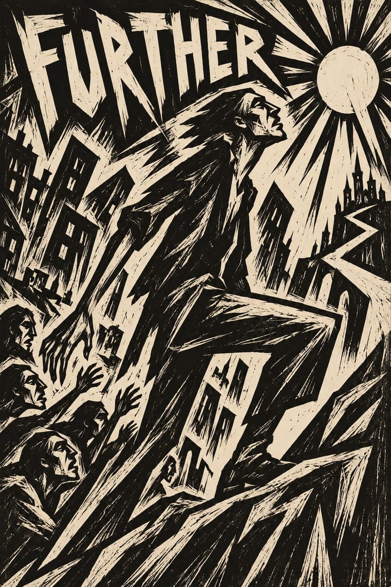
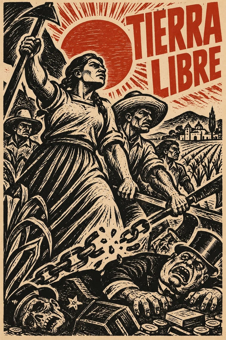
05
More combinations
With Expressionist Woodcut Graphics
- Art Nouveau Contrasts · The parent's smooth whiplash and floral harmony is exactly what the gouge splinters; use one against the other to stage order breaking down.
- Punk & DIY Zine Pairs well · Hand-cut jagged letters and one cheap ink suit gig posters and zines that want anger without photocopy clichés.
- Plakatstil / Sachplakat Contrasts · Same country and years: Bernhard's calm flat object poster against an anguished Brücke woodcut shows commercial clarity versus inner expression.
- Chinese Modern Woodcut Movement Pairs well · Lu Xun's movement learned from Kollwitz and Masereel; set the two side by side to show subjective anguish turning into collective resistance.
- Simplicissimus Satirical Style (Munich) Contrasts · Both distort the figure in protest, but Expressionist prints gouge it from the woodblock with angular, raw marks; Simplicissimus keeps a clean brush contour and flat tints, and adds a punchline.
- Argentine Adventure Historieta (Oesterheld–Breccia) Pairs well · Breccia's white scraped out of a black ground looks like the gouge of a Brücke woodcut; borrow the woodcut's jagged hand-cut capitals for a historieta title page or cover, and keep the comic's panels and captions inside.
- Hungarian Revolutionary Poster Pairs well · Kinchin sees 'a burgeoning taste for Futurist and Expressionist design' in the MA circle's exhibition poster (Bortnyik); add a gouged, splintered edge to the red body when the hero should look anguished rather than triumphant.
- Rorke's Drift Linocut Contrasts · Both gouge black relief prints, but the Brücke woodcut distorts one anguished figure on tilted axes, while Rorke's Drift spreads a whole story across calm, packed bands; pick by whether the image should confess or narrate.
With Taller de Gráfica Popular
- Punk & DIY Zine Pairs well · Both favour cheap, direct, monochrome reproduction; a linocut figure with photocopied type gives protest graphics hand-made urgency.
- Cuban Revolutionary Poster (OSPAAAL & ICAIC) Pairs well · Combine TGP's black linocut figures with Cuban flat colour for politically engaged posters with a hand-made Latin American lineage.
- Art Deco Contrasts · Glossy Deco glamour versus gouged, populist black and white: use the contrast to separate luxury from solidarity.
- Chinese Modern Woodcut Movement Pairs well · China's 1930s–40s woodcut movement ran in parallel with the TGP; combine the two black-line traditions for prints about labour and resistance across continents.
- Minjung Woodcut Graphics (Korean People's Art) Contrasts · Nearest in the atlas, and the closest Mexican print lineage to the Mexican Muralism that MMCA names as a source: both cut black-line people's prints for movements, but TGP sets condensed Latin capitals and lithographs, while Minjung prints carry short Hangul slogans and dancing, ritual-derived figures, and are scaled up to geolgae banners.
- Brazilian Concrete Design Contrasts · Mexico's figurative, militant linocuts are Latin America's other modernism; contrast them to choose between abstraction and narrative.
- Vicente Rojo & Mexican Editorial Modernism Pairs well · Rojo set Leopoldo Méndez's engravings in the Revista de la Universidad de México (no. 3, 1971); a black linocut framed by fine rules on a white page joins Mexico City's militant print culture to its editorial modernism.
- Mexican Popular Graphics (Posada) Pairs well · The TGP took Posada as its ancestor; combine his calavera satire with linocut political posters for socially engaged print.