Style combination · Pairs well
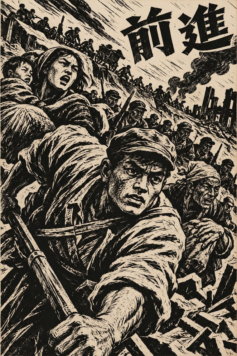
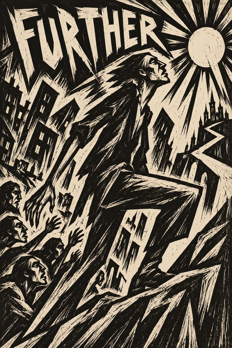
Chinese Modern Woodcut Movement × Expressionist Woodcut Graphics
Lu Xun's movement learned from Kollwitz and Masereel; set the two side by side to show subjective anguish turning into collective resistance.
Its parent: borrow the German gouge and distortion, then point them outward at a shared cause instead of inner anguish.
Mix them and make something Chinese Modern Woodcut Movement Expressionist Woodcut Graphics
01
What each style brings
Each part of the design comes from the style with the stronger say in it, and each style gives at least two.
Chinese Modern Woodcut Movement Expressionist Woodcut Graphics
- Type from Expressionist Woodcut Graphics
- Colour from Expressionist Woodcut Graphics
- Form from Expressionist Woodcut Graphics
- Composition from Chinese Modern Woodcut Movement
- Surface from Chinese Modern Woodcut Movement
02
The type
Open fonts standing in for each style’s own type, which is often hand-drawn or commercial.
Display · Expressionist Woodcut Graphics
Loud
Archivo Black, standing in for Heavy grotesque and Fraktur journal mastheads
Text · Chinese Modern Woodcut Movement
The leftist print movement launched by Lu Xun's 1931 Shanghai woodcut workshop, which made the self-cut black-and-white woodcut China's art of national crisis and revolution. Young artists learned from Käthe Kollwitz, Frans Masereel and Soviet woodcuts to gouge close-up, diagonal images of workers, refugees and resistance for journals, books and travelling exhibitions; in Yan'an after 1942 they adopted New Year print outlines and colour for peasant audiences.
Shippori Mincho; Chinese Modern Woodcut Movement used Hand-cut Chinese characters carved into the block and Brush-written kaishu titles on journal and book covers
03
The colours
The ground and leading colours come from Expressionist Woodcut Graphics, with a counter-accent from Chinese Modern Woodcut Movement. The ink reads on the ground at 4.5:1 or more.
Chinese Modern Woodcut Movement Expressionist Woodcut Graphics
-
#ede4cfground · 36% -
#151311ink · 14% -
#d9932faccent · 18% -
#c8432baccent · 14% -
#2c4a8caccent · 10% -
#6e8b57accent · 8%
As CSS
:root {
  --ground: #ede4cf;
  --ink: #151311;
  --accent-1: #d9932f;
  --accent-2: #c8432b;
  --accent-3: #2c4a8c;
  --accent-4: #6e8b57;
  --font-display: "Archivo Black", sans-serif;
  --font-text: "Shippori Mincho", serif;
}
04
The two styles
05
More combinations
With Chinese Modern Woodcut Movement
- Shanghai Modern & Yuefenpai Contrasts · Same city, same decade: airbrushed calendar glamour against gouged black refugees shows two opposite promises of modern China.
- Taller de Gráfica Popular Pairs well · Mexico and China built woodcut movements in the same years for the same publics; mix their imagery for internationalist solidarity prints.
- Nianhua & Chinese Folk Print Pairs well · Yan'an artists fused the two; add New Year print outline and flat colour to a woodcut when warmth matters more than shock.
- Republican Chinese Book Cover Design (Lu Xun & Tao Yuanqing) Pairs well · Lu Xun launched the woodcut movement in 1931 and edited woodcut books such as Yinyu ji; a black carved print on a pale cover with a drawn title joins the two.
- Lianhuanhua Picture-Story Books Pairs well · Woodcut picture-stories and lianhuanhua share the one-image-per-page sequence; mix carved frames with drawn ones for documentary storytelling.
- Minjung Woodcut Graphics (Korean People's Art) Pairs well · MMCA names it as a source; keep its self-cut black line but trade the gouged diagonal shock for Minjung's frontal, dancing figures.
With Expressionist Woodcut Graphics
- Art Nouveau Contrasts · The parent's smooth whiplash and floral harmony is exactly what the gouge splinters; use one against the other to stage order breaking down.
- Punk & DIY Zine Pairs well · Hand-cut jagged letters and one cheap ink suit gig posters and zines that want anger without photocopy clichés.
- Plakatstil / Sachplakat Contrasts · Same country and years: Bernhard's calm flat object poster against an anguished Brücke woodcut shows commercial clarity versus inner expression.
- Taller de Gráfica Popular Pairs well · Both gouge black-and-white relief images; add TGP's legible headlines and social subjects to steady expressionist distortion for a public message.
- Simplicissimus Satirical Style (Munich) Contrasts · Both distort the figure in protest, but Expressionist prints gouge it from the woodblock with angular, raw marks; Simplicissimus keeps a clean brush contour and flat tints, and adds a punchline.
- Argentine Adventure Historieta (Oesterheld–Breccia) Pairs well · Breccia's white scraped out of a black ground looks like the gouge of a Brücke woodcut; borrow the woodcut's jagged hand-cut capitals for a historieta title page or cover, and keep the comic's panels and captions inside.
- Hungarian Revolutionary Poster Pairs well · Kinchin sees 'a burgeoning taste for Futurist and Expressionist design' in the MA circle's exhibition poster (Bortnyik); add a gouged, splintered edge to the red body when the hero should look anguished rather than triumphant.
- Rorke's Drift Linocut Contrasts · Both gouge black relief prints, but the Brücke woodcut distorts one anguished figure on tilted axes, while Rorke's Drift spreads a whole story across calm, packed bands; pick by whether the image should confess or narrate.