Style combination · Contrasts
Expressionist Woodcut Graphics × Plakatstil
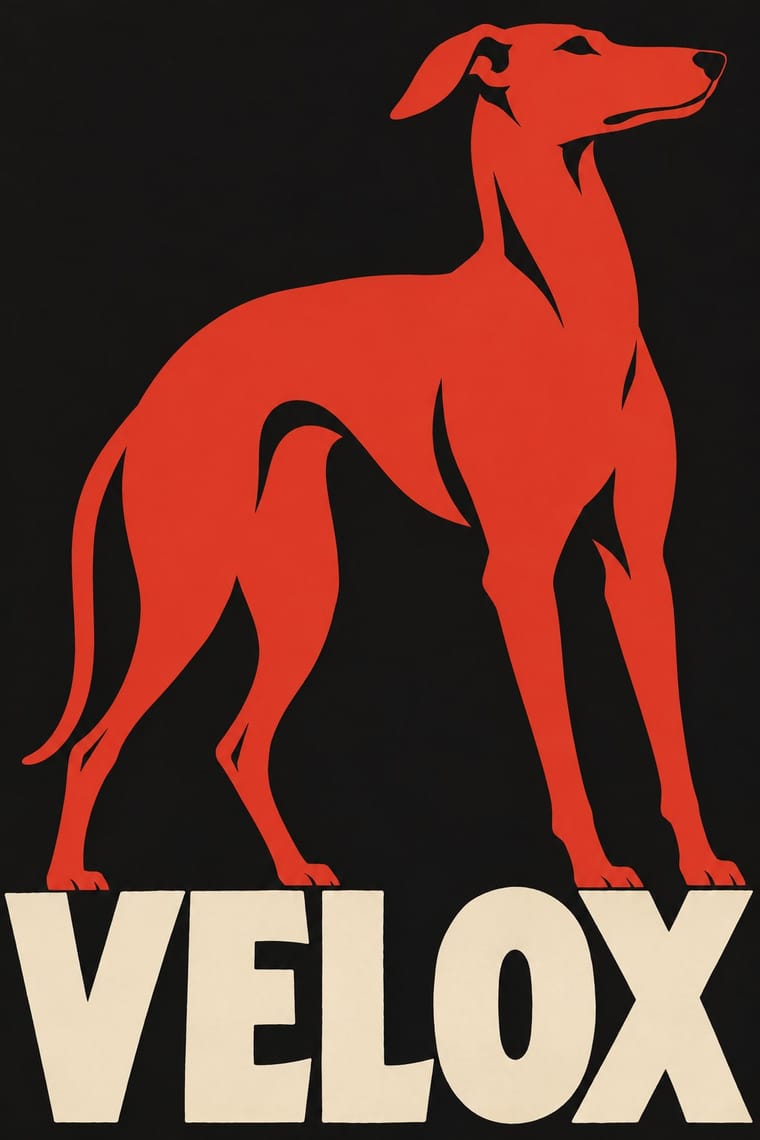
Same country and years: Bernhard's calm flat object poster against an anguished Brücke woodcut shows commercial clarity versus inner expression.
Mix them and make something Expressionist Woodcut Graphics Plakatstil
01
What each style brings
Each part of the design comes from the style with the stronger say in it, and each style gives at least two.
Expressionist Woodcut Graphics Plakatstil / Sachplakat
- Type from Expressionist Woodcut Graphics
- Colour from Plakatstil
- Form from Expressionist Woodcut Graphics
- Composition from Plakatstil
- Surface from Expressionist Woodcut Graphics
02
The type
Open fonts standing in for each style’s own type, which is often hand-drawn or commercial.
Display · Expressionist Woodcut Graphics
No!
Archivo Black, standing in for Heavy grotesque and Fraktur journal mastheads
Text · Plakatstil
The German 'object poster' launched by Lucian Bernhard's Priester match poster and printed by Berlin's Hollerbaum & Schmidt. It strips the advertisement to a single product rendered in flat, saturated colour and the brand name in bold hand-drawn letters on a plain ground, so the message registers instantly from a passing tram or across the street.
Oswald; Plakatstil used Lucian Bernhard's hand-drawn block lettering and Block
03
The colours
The ground and leading colours come from Plakatstil, with a counter-accent from Expressionist Woodcut Graphics. The ink reads on the ground at 4.5:1 or more.
Expressionist Woodcut Graphics Plakatstil / Sachplakat
-
#151515ground · 36% -
#efe5cfink · 14% -
#d2382baccent · 18% -
#d9932faccent · 14% -
#24418faccent · 10% -
#2f5d3aaccent · 8%
As CSS
:root {
  --ground: #151515;
  --ink: #efe5cf;
  --accent-1: #d2382b;
  --accent-2: #d9932f;
  --accent-3: #24418f;
  --accent-4: #2f5d3a;
  --font-display: "Archivo Black", sans-serif;
  --font-text: "Oswald", sans-serif;
}
04
The two styles
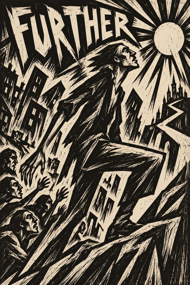
05
More combinations
With Expressionist Woodcut Graphics
- Art Nouveau Contrasts · The parent's smooth whiplash and floral harmony is exactly what the gouge splinters; use one against the other to stage order breaking down.
- Punk & DIY Zine Pairs well · Hand-cut jagged letters and one cheap ink suit gig posters and zines that want anger without photocopy clichés.
- Taller de Gráfica Popular Pairs well · Both gouge black-and-white relief images; add TGP's legible headlines and social subjects to steady expressionist distortion for a public message.
- Chinese Modern Woodcut Movement Pairs well · Lu Xun's movement learned from Kollwitz and Masereel; set the two side by side to show subjective anguish turning into collective resistance.
- Simplicissimus Satirical Style (Munich) Contrasts · Both distort the figure in protest, but Expressionist prints gouge it from the woodblock with angular, raw marks; Simplicissimus keeps a clean brush contour and flat tints, and adds a punchline.
- Argentine Adventure Historieta (Oesterheld–Breccia) Pairs well · Breccia's white scraped out of a black ground looks like the gouge of a Brücke woodcut; borrow the woodcut's jagged hand-cut capitals for a historieta title page or cover, and keep the comic's panels and captions inside.
- Hungarian Revolutionary Poster Pairs well · Kinchin sees 'a burgeoning taste for Futurist and Expressionist design' in the MA circle's exhibition poster (Bortnyik); add a gouged, splintered edge to the red body when the hero should look anguished rather than triumphant.
- Rorke's Drift Linocut Contrasts · Both gouge black relief prints, but the Brücke woodcut distorts one anguished figure on tilted axes, while Rorke's Drift spreads a whole story across calm, packed bands; pick by whether the image should confess or narrate.
With Plakatstil
- Corporate Identity Modernism Pairs well · Its brand-name-plus-object formula prefigures logo-led identity; pair it with a modernist grid for confident product campaigns.
- Victorian Letterpress & Wood Type Contrasts · Against a crowded multi-face bill, one object and one word show how much attention reduction can win.
- Flat Design Pairs well · Sachplakat is the ancestor of the flat product hero; borrow its single-object discipline to sharpen app and packaging graphics.
- Art Nouveau Contrasts · It was conceived against Jugendstil ornament; set a bare object poster beside a floral frame to dramatise clarity versus decoration.
- Basel Object Poster (Swiss Sachplakat) Contrasts · Its parent and nearest relative: Berlin's Sachplakat flattens the product into a silhouette in two to four flat colours with heavy block lettering, while Basel paints the same single object in full light and shadow, glass and tweed included. Choose Basel when the material of the product should sell it.
- Vietnamese Propaganda Poster (Tranh cổ động) Pairs well · Both reduce the message to one flat figure or object and hand-drawn words; use Plakatstil's plain ground to calm a busy red poster.
- Beggarstaffs Poster (Nicholson & Pryde) Pairs well · Bernhard and Hohlwein later made the flat silhouette and plain lettering a commercial system; Plakatstil is a later descendant, not a source.
- London Transport Design Contrasts · The Sachplakat reduced every poster to one object and a brand name, while Pick let each artist choose a different picture inside a fixed frame; use the contrast to decide between one formula and a curated plurality.