Style combination · Contrasts
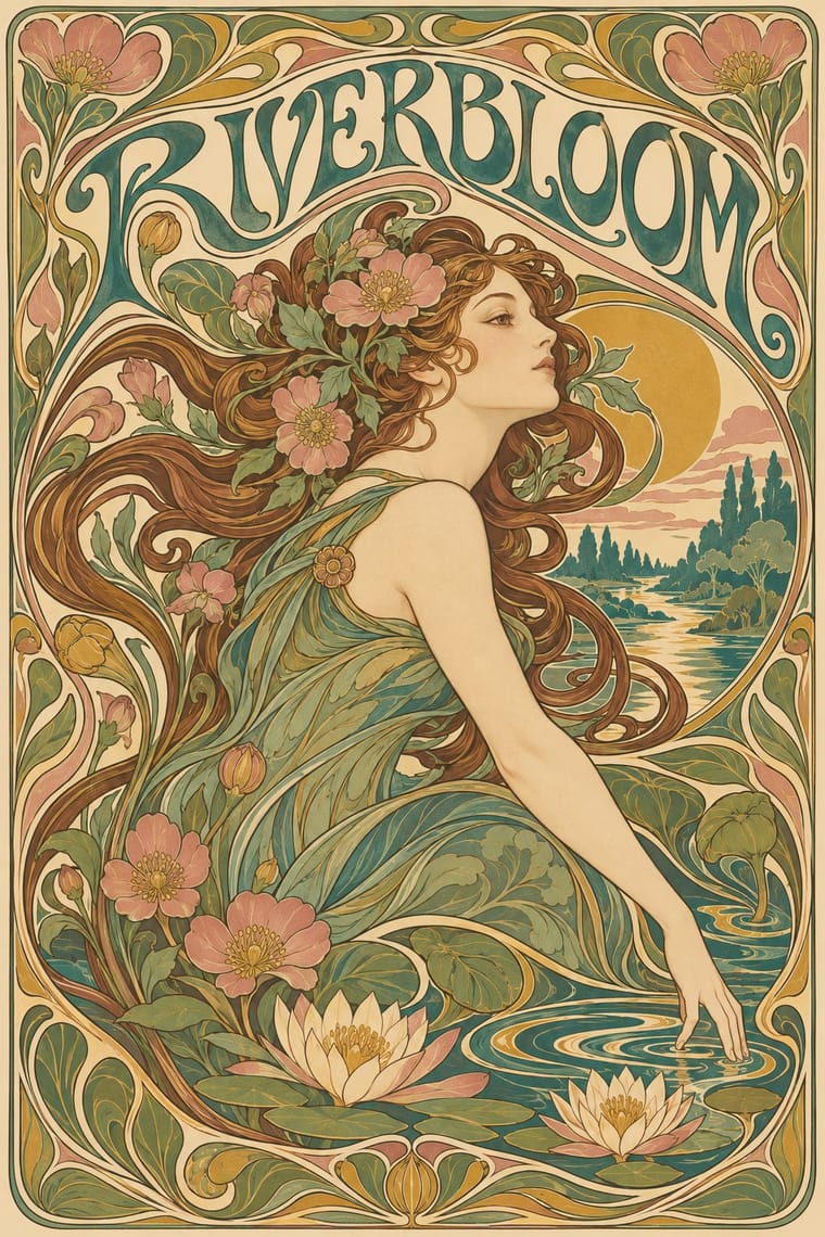
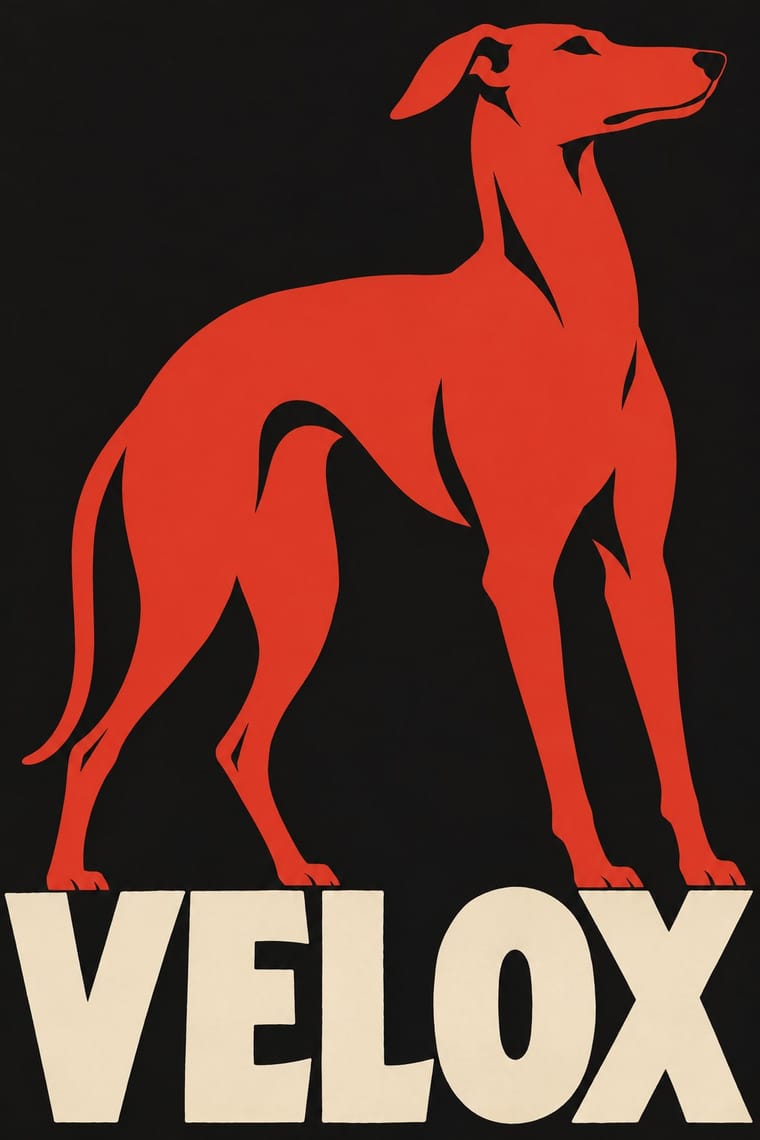
Art Nouveau × Plakatstil
It was conceived against Jugendstil ornament; set a bare object poster beside a floral frame to dramatise clarity versus decoration.
01
What each style brings
Each part of the design comes from the style with the stronger say in it, and each style gives at least two.
Art Nouveau Plakatstil / Sachplakat
- Type from Art Nouveau
- Colour from Plakatstil
- Form from Art Nouveau
-
Plakatstil avoids whiplash line: this is where the two pull against each other, which is the point of the contrast.
- Composition from Plakatstil
- Surface from Art Nouveau
02
The type
Open fonts standing in for each style’s own type, which is often hand-drawn or commercial.
Text · Plakatstil
The German 'object poster' launched by Lucian Bernhard's Priester match poster and printed by Berlin's Hollerbaum & Schmidt. It strips the advertisement to a single product rendered in flat, saturated colour and the brand name in bold hand-drawn letters on a plain ground, so the message registers instantly from a passing tram or across the street.
Oswald; Plakatstil used Lucian Bernhard's hand-drawn block lettering and Block
03
The colours
The ground and leading colours come from Plakatstil, with a counter-accent from Art Nouveau. The ink reads on the ground at 4.5:1 or more.
Art Nouveau Plakatstil / Sachplakat
-
#151515ground · 36% -
#efe5cfink · 14% -
#d2382baccent · 18% -
#c9a24baccent · 14% -
#3f7a75accent · 10% -
#24418faccent · 8%
As CSS
:root {
  --ground: #151515;
  --ink: #efe5cf;
  --accent-1: #d2382b;
  --accent-2: #c9a24b;
  --accent-3: #3f7a75;
  --accent-4: #24418f;
  --font-display: "Federant", sans-serif;
  --font-text: "Oswald", sans-serif;
}
04
The two styles
05
More combinations
With Art Nouveau
- Fileteado Porteño Pairs well · Fileteado's acanthus scrolls share the whiplash; combine them for ornate, hand-made lettering frames.
- International Typographic Style Contrasts · Ornamental curves against an orthogonal grid make a strong deliberate tension; let one botanical flourish break a cold grid.
- Psychedelic Poster Pairs well · San Francisco poster artists lifted Mucha's figures and whiplash wholesale; push the curves into saturated, vibrating colour for a 1960s-flavoured revival.
- Russian Constructivism Contrasts · Organic sensuality versus machine-age diagonals: use the opposition to stage nature against industry.
- Vienna Secession Contrasts · Set French whiplash against the Viennese square to show the turn from organic to geometric ornament within one decorative idiom.
- Skønvirke (Danish Art Nouveau, Bindesbøll) Contrasts · Shares the hand-lettering and abundance but swaps the whiplash line and the female figure for blunt abstract masses; set side by side they show the heavy Danish variant.
- Expressionist Woodcut Graphics Contrasts · The parent's smooth whiplash and floral harmony is exactly what the gouge splinters; use one against the other to stage order breaking down.
- Beggarstaffs Poster (Nicholson & Pryde) Contrasts · Its curving floral line is the opposite of cut masses; set side by side to show how much a poster can drop.
With Plakatstil
- Corporate Identity Modernism Pairs well · Its brand-name-plus-object formula prefigures logo-led identity; pair it with a modernist grid for confident product campaigns.
- Victorian Letterpress & Wood Type Contrasts · Against a crowded multi-face bill, one object and one word show how much attention reduction can win.
- Flat Design Pairs well · Sachplakat is the ancestor of the flat product hero; borrow its single-object discipline to sharpen app and packaging graphics.
- Basel Object Poster (Swiss Sachplakat) Contrasts · Its parent and nearest relative: Berlin's Sachplakat flattens the product into a silhouette in two to four flat colours with heavy block lettering, while Basel paints the same single object in full light and shadow, glass and tweed included. Choose Basel when the material of the product should sell it.
- Vietnamese Propaganda Poster (Tranh cổ động) Pairs well · Both reduce the message to one flat figure or object and hand-drawn words; use Plakatstil's plain ground to calm a busy red poster.
- Beggarstaffs Poster (Nicholson & Pryde) Pairs well · Bernhard and Hohlwein later made the flat silhouette and plain lettering a commercial system; Plakatstil is a later descendant, not a source.
- London Transport Design Contrasts · The Sachplakat reduced every poster to one object and a brand name, while Pick let each artist choose a different picture inside a fixed frame; use the contrast to decide between one formula and a curated plurality.
- Simplicissimus Satirical Style (Munich) Pairs well · The NDB places Heine's posters at the start of the new poster style: borrow the Sachplakat's single object and bold block lettering for a satirical poster that keeps Simplicissimus's flat silhouette and red-on-black.