Style combination · Contrasts
London Transport Design × Plakatstil
The Sachplakat reduced every poster to one object and a brand name, while Pick let each artist choose a different picture inside a fixed frame; use the contrast to decide between one formula and a curated plurality.
Mix them and make something London Transport Design Plakatstil
01
What each style brings
Each part of the design comes from the style with the stronger say in it, and each style gives at least two.
London Transport Design Plakatstil / Sachplakat
- Type from London Transport Design
- Colour from Plakatstil
- Form from London Transport Design
- Composition from Plakatstil
- Surface from Plakatstil
02
The type
Open fonts standing in for each style’s own type, which is often hand-drawn or commercial.
Display · London Transport Design
Grid
Fira Sans, standing in for Edward Johnston's Underground sans (1916): two weights, ordinary and a capitals-only bold, with capitals on Roman square-capital proportions and diagonally set square dots on i and j; condensed letters followed for bus destination displays
Text · Plakatstil
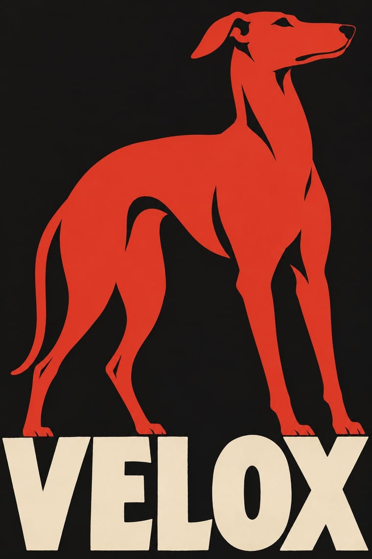
The German 'object poster' launched by Lucian Bernhard's Priester match poster and printed by Berlin's Hollerbaum & Schmidt. It strips the advertisement to a single product rendered in flat, saturated colour and the brand name in bold hand-drawn letters on a plain ground, so the message registers instantly from a passing tram or across the street.
Oswald; Plakatstil used Lucian Bernhard's hand-drawn block lettering and Block
03
The colours
The ground and leading colours come from Plakatstil, with a counter-accent from London Transport Design. The ink reads on the ground at 4.5:1 or more.
London Transport Design Plakatstil / Sachplakat
-
#151515ground · 36% -
#efe5cfink · 14% -
#d2382baccent · 18% -
#e3b23caccent · 14% -
#24418faccent · 10% -
#2f5d3aaccent · 8%
As CSS
:root {
  --ground: #151515;
  --ink: #efe5cf;
  --accent-1: #d2382b;
  --accent-2: #e3b23c;
  --accent-3: #24418f;
  --accent-4: #2f5d3a;
  --font-display: "Fira Sans", sans-serif;
  --font-text: "Oswald", sans-serif;
}
Use it with care
London Transport Design: The roundel is a registered trade mark of Transport for London, which licenses it: draw your own emblem rather than reproducing it. New Johnston, used exclusively by TfL, and its 2016 successor Johnston100, which TfL commissioned from Monotype, are TfL's corporate typefaces; Johnston's 1916 design has been out of copyright since 2015, and for the historic letter use P22 Underground, the revival the London Transport Museum licensed to P22, or another humanist sans, not TfL's fonts. Some commissions served empire, such as Bawden's poster for the 1924 British Empire Exhibition, which the V&A describes as imperial propaganda that included human displays; do not reuse that imagery as neutral nostalgia.
04
The two styles
05
More combinations
With London Transport Design
- Isotype Pictorial Statistics Pairs well · Contemporary inventions of the public information graphic; pair Beck's schematic network with Neurath's counted pictograms for maps and statistics that share one flat, rational language.
- Corporate Identity Modernism Contrasts · The post-war corporate identity programmes kept the idea of one system across every touchpoint but swapped Johnston's humanist sans for neo-grotesques and the many commissioned artists for a standards manual; choose London Transport for a warm public voice, corporate modernism for neutral uniformity.
- Vorticism & BLAST Typography Pairs well · Set a Vorticist field of angular planes under calm, evenly spaced lettering for a poster that has machine-age energy but still reads as a public service.
- Hauntology & Ghost Box Design Pairs well · Borrow the logic of a public-service programme (fixed elements, a roundel, varied pictures within one system) to give an invented hauntological institution a believable house style.
- British Road Signage (Kinneir & Calvert) Contrasts · Pick's Underground also held one public system together with a sans and a few colours, but surrounded it with commissioned artists' posters; the road signs allow no art at all, so choose London Transport when a system needs a cultural voice and the road signs when it must only inform.
- Legible City Wayfinding (Heads-Up Pedestrian Maps) Pairs well · The parent: Legible London is a TfL system in TfL's New Johnston that extends the Underground's single-system idea from stations to the streets between them; borrow the discipline of one family repeated everywhere.
- Penguin Paperback Design (Three Bands to the Marber Grid) Pairs well · Both are British systems with a fixed emblem and a Johnston-to-Gill humanist sans; pair London Transport's commissioned pictorial art with Penguin's genre colour bands when one identity has to carry many varied items.
- Schematic Transit Diagram (Beck Tube Map Idiom) Pairs well · Set the diagram inside the wider transport identity of roundel, lettering and posters.
With Plakatstil
- Corporate Identity Modernism Pairs well · Its brand-name-plus-object formula prefigures logo-led identity; pair it with a modernist grid for confident product campaigns.
- Victorian Letterpress & Wood Type Contrasts · Against a crowded multi-face bill, one object and one word show how much attention reduction can win.
- Flat Design Pairs well · Sachplakat is the ancestor of the flat product hero; borrow its single-object discipline to sharpen app and packaging graphics.
- Art Nouveau Contrasts · It was conceived against Jugendstil ornament; set a bare object poster beside a floral frame to dramatise clarity versus decoration.
- Basel Object Poster (Swiss Sachplakat) Contrasts · Its parent and nearest relative: Berlin's Sachplakat flattens the product into a silhouette in two to four flat colours with heavy block lettering, while Basel paints the same single object in full light and shadow, glass and tweed included. Choose Basel when the material of the product should sell it.
- Vietnamese Propaganda Poster (Tranh cổ động) Pairs well · Both reduce the message to one flat figure or object and hand-drawn words; use Plakatstil's plain ground to calm a busy red poster.
- Beggarstaffs Poster (Nicholson & Pryde) Pairs well · Bernhard and Hohlwein later made the flat silhouette and plain lettering a commercial system; Plakatstil is a later descendant, not a source.
- Simplicissimus Satirical Style (Munich) Pairs well · The NDB places Heine's posters at the start of the new poster style: borrow the Sachplakat's single object and bold block lettering for a satirical poster that keeps Simplicissimus's flat silhouette and red-on-black.