Style combination · Pairs well
Corporate Identity Modernism × Plakatstil
Its brand-name-plus-object formula prefigures logo-led identity; pair it with a modernist grid for confident product campaigns.
Mix them and make something Corporate Identity Modernism Plakatstil
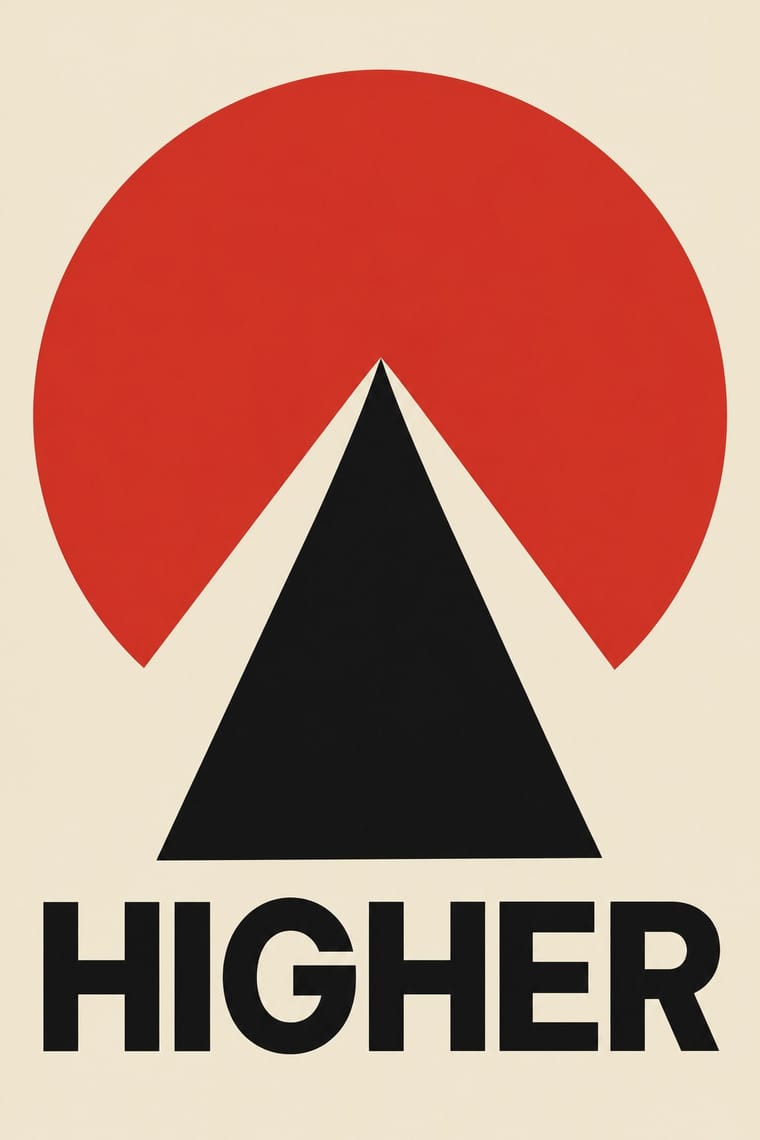
01
What each style brings
Each part of the design comes from the style with the stronger say in it, and each style gives at least two.
Corporate Identity Modernism Plakatstil / Sachplakat
- Type from Corporate Identity Modernism
- Colour from Plakatstil
- Form from Corporate Identity Modernism
- Composition from Corporate Identity Modernism
- Surface from Plakatstil
02
The type
Open fonts standing in for each style’s own type, which is often hand-drawn or commercial.
Text · Plakatstil
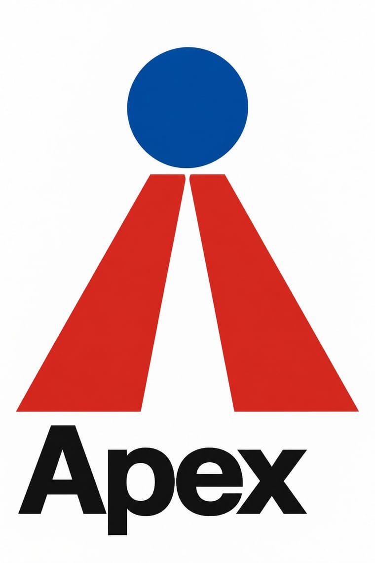
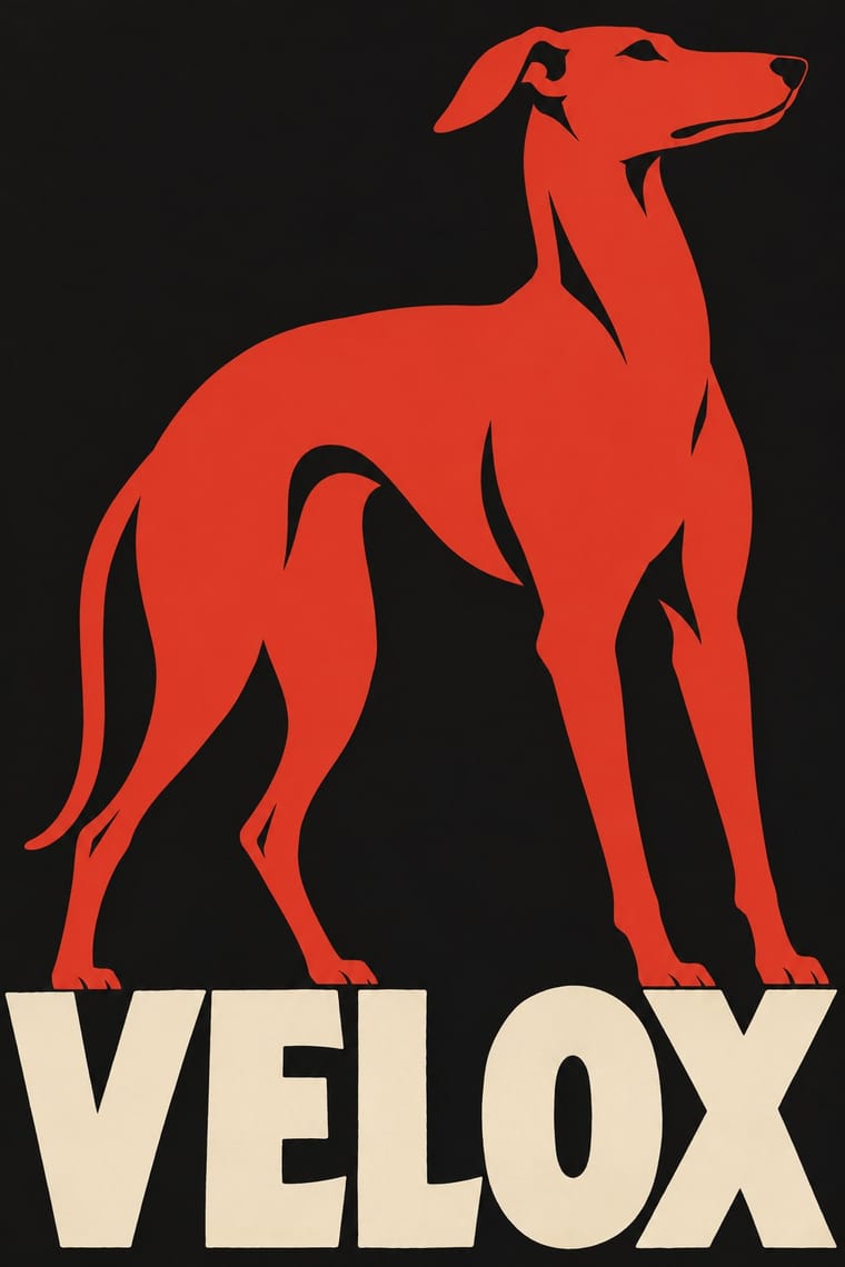
The German 'object poster' launched by Lucian Bernhard's Priester match poster and printed by Berlin's Hollerbaum & Schmidt. It strips the advertisement to a single product rendered in flat, saturated colour and the brand name in bold hand-drawn letters on a plain ground, so the message registers instantly from a passing tram or across the street.
Oswald; Plakatstil used Lucian Bernhard's hand-drawn block lettering and Block
03
The colours
The ground and leading colours come from Plakatstil, with a counter-accent from Corporate Identity Modernism. The ink reads on the ground at 4.5:1 or more.
Corporate Identity Modernism Plakatstil / Sachplakat
-
#151515ground · 36% -
#efe5cfink · 14% -
#d2382baccent · 18% -
#e3b23caccent · 14% -
#0a4fa0accent · 10% -
#2f5d3aaccent · 8%
As CSS
:root {
  --ground: #151515;
  --ink: #efe5cf;
  --accent-1: #d2382b;
  --accent-2: #e3b23c;
  --accent-3: #0a4fa0;
  --accent-4: #2f5d3a;
  --font-display: "Inter Tight", sans-serif;
  --font-text: "Oswald", sans-serif;
}
04
The two styles
05
More combinations
With Corporate Identity Modernism
- Corporate Memphis Contrasts · Its successor trades abstract authority for rubbery friendliness; compare the two to decide how institutional or human a brand should feel.
- Generative & Dynamic Identities Pairs well · Keep the manual's mark, colour and grid as constants and let generative rules vary one parameter, so the system still reads as one company.
- Flat Design Pairs well · Flat UI inherits these reductive marks; reuse their clear-space and colour-code discipline when scaling icons across screens.
- Punk & DIY Zine Contrasts · Punk's ransom-note lettering is the anti-manual; one torn, xeroxed element against a corporate grid reads instantly as critique.
- Risograph & Indie Print Culture Contrasts · Exact Pantone-matched corporate colour is the opposite of riso's drifting inks; use the contrast to signal independence.
- Contemporary Arabic & Dual-Script Type Design Pairs well · Roll a matched Arabic–Latin family through a standards manual so both scripts carry the identity with equal authority.
- Milanese Industrial Modernism (Olivetti, Pirelli, Studio Boggeri) Contrasts · American corporate identity policed one mark through a manual, while Milan let artists vary the language; compare the two when deciding how strict a brand system should be.
- European Heraldry Pairs well · A coat of arms already is an identity defined by a specification rather than one drawing, applied to seals, banners, buildings and documents; Finnish municipal arms of the 1950s show how its flat two-tincture discipline reads as a modern mark, so use blazon-like rules to write a logo that can be redrawn without losing itself.
With Plakatstil
- Victorian Letterpress & Wood Type Contrasts · Against a crowded multi-face bill, one object and one word show how much attention reduction can win.
- Flat Design Pairs well · Sachplakat is the ancestor of the flat product hero; borrow its single-object discipline to sharpen app and packaging graphics.
- Art Nouveau Contrasts · It was conceived against Jugendstil ornament; set a bare object poster beside a floral frame to dramatise clarity versus decoration.
- Basel Object Poster (Swiss Sachplakat) Contrasts · Its parent and nearest relative: Berlin's Sachplakat flattens the product into a silhouette in two to four flat colours with heavy block lettering, while Basel paints the same single object in full light and shadow, glass and tweed included. Choose Basel when the material of the product should sell it.
- Vietnamese Propaganda Poster (Tranh cổ động) Pairs well · Both reduce the message to one flat figure or object and hand-drawn words; use Plakatstil's plain ground to calm a busy red poster.
- Beggarstaffs Poster (Nicholson & Pryde) Pairs well · Bernhard and Hohlwein later made the flat silhouette and plain lettering a commercial system; Plakatstil is a later descendant, not a source.
- London Transport Design Contrasts · The Sachplakat reduced every poster to one object and a brand name, while Pick let each artist choose a different picture inside a fixed frame; use the contrast to decide between one formula and a curated plurality.
- Simplicissimus Satirical Style (Munich) Pairs well · The NDB places Heine's posters at the start of the new poster style: borrow the Sachplakat's single object and bold block lettering for a satirical poster that keeps Simplicissimus's flat silhouette and red-on-black.