Style combination · Pairs well
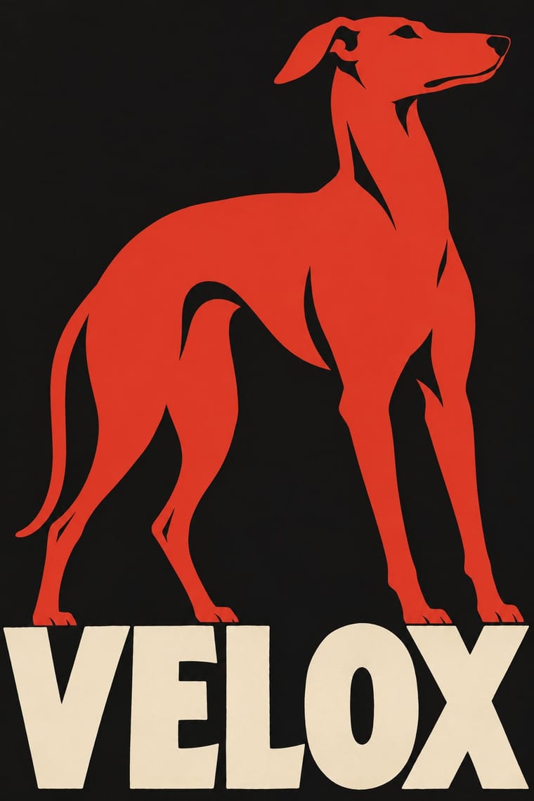
Plakatstil × Vietnamese Propaganda Poster
Both reduce the message to one flat figure or object and hand-drawn words; use Plakatstil's plain ground to calm a busy red poster.
Mix them and make something Plakatstil Vietnamese Propaganda Poster
01
What each style brings
Each part of the design comes from the style with the stronger say in it, and each style gives at least two.
Plakatstil / Sachplakat Vietnamese Propaganda Poster (Tranh cổ động)
- Type from Plakatstil
- Colour from Plakatstil
- Form from Vietnamese Propaganda Poster
- Composition from Plakatstil
- Surface from Vietnamese Propaganda Poster
02
The type
Open fonts standing in for each style’s own type, which is often hand-drawn or commercial.
Display · Plakatstil
Notice
Big Shoulders, standing in for Lucian Bernhard's hand-drawn block lettering
Text · Vietnamese Propaganda Poster
The state poster art of Vietnam from the 1945 August Revolution to today. Where Soviet and Chinese socialist realism model heroic figures in full colour, Vietnamese posters flatten soldiers, militia women, farmers, weapons and crops into silhouettes and blocky planes in one to three tones, usually red, yellow and black. Originals were cut in wood during the resistance, then hand-painted in gouache or tempera, often over stencils, with a slogan in Quốc ngữ capitals.
Archivo; Vietnamese Propaganda Poster used Hand-painted Quốc ngữ condensed sans capitals with stacked diacritics and Stencilled block capitals for slogan bands
03
The colours
The ground and leading colours come from Plakatstil, with a counter-accent from Vietnamese Propaganda Poster. The ink reads on the ground at 4.5:1 or more.
Plakatstil / Sachplakat Vietnamese Propaganda Poster (Tranh cổ động)
-
#151515ground · 36% -
#efe5cfink · 14% -
#d2382baccent · 18% -
#f3c623accent · 14% -
#24418faccent · 10% -
#2f5d3aaccent · 8%
As CSS
:root {
  --ground: #151515;
  --ink: #efe5cf;
  --accent-1: #d2382b;
  --accent-2: #f3c623;
  --accent-3: #24418f;
  --accent-4: #2f5d3a;
  --font-display: "Big Shoulders", sans-serif;
  --font-text: "Archivo", sans-serif;
}
Use it with care
Vietnamese Propaganda Poster (Tranh cổ động): These are state propaganda of a one-party government that still commissions them, and wartime sheets celebrate shooting down American aircraft and defeating enemy soldiers; present them as historical sources with context, not as kitsch decor. Many posters sold to tourists are recent repaintings or reproductions, so date and attribute carefully, and keep Vietnamese diacritics intact in any slogan.
04
The two styles
05
More combinations
With Plakatstil
- Corporate Identity Modernism Pairs well · Its brand-name-plus-object formula prefigures logo-led identity; pair it with a modernist grid for confident product campaigns.
- Victorian Letterpress & Wood Type Contrasts · Against a crowded multi-face bill, one object and one word show how much attention reduction can win.
- Flat Design Pairs well · Sachplakat is the ancestor of the flat product hero; borrow its single-object discipline to sharpen app and packaging graphics.
- Art Nouveau Contrasts · It was conceived against Jugendstil ornament; set a bare object poster beside a floral frame to dramatise clarity versus decoration.
- Basel Object Poster (Swiss Sachplakat) Contrasts · Its parent and nearest relative: Berlin's Sachplakat flattens the product into a silhouette in two to four flat colours with heavy block lettering, while Basel paints the same single object in full light and shadow, glass and tweed included. Choose Basel when the material of the product should sell it.
- Beggarstaffs Poster (Nicholson & Pryde) Pairs well · Bernhard and Hohlwein later made the flat silhouette and plain lettering a commercial system; Plakatstil is a later descendant, not a source.
- London Transport Design Contrasts · The Sachplakat reduced every poster to one object and a brand name, while Pick let each artist choose a different picture inside a fixed frame; use the contrast to decide between one formula and a curated plurality.
- Simplicissimus Satirical Style (Munich) Pairs well · The NDB places Heine's posters at the start of the new poster style: borrow the Sachplakat's single object and bold block lettering for a satirical poster that keeps Simplicissimus's flat silhouette and red-on-black.
With Vietnamese Propaganda Poster
- Risograph & Indie Print Culture Pairs well · Two or three flat inks, stencil texture and copy variation translate directly to Riso for contemporary prints in this idiom.
- Socialist Realist Propaganda Poster Contrasts · Its parent models figures in gradients and depth; flatten the same heroic subject into two tones to see what the Vietnamese poster gains in punch.
- Cuban Revolutionary Poster (OSPAAAL & ICAIC) Pairs well · OSPAAAL made solidarity posters for Vietnam in the same flat-colour, single-image mode; combine them for internationalist campaigns.
- Đông Hồ & Hàng Trống Folk Prints Pairs well · Give Đông Hồ's plump figures and earth palette hand-painted Quốc ngữ capitals from the poster tradition for a Vietnamese campaign that feels festive rather than martial.