Style combination · Contrasts
Cuban Tobacco Lithography × Hipster Artisanal Revival
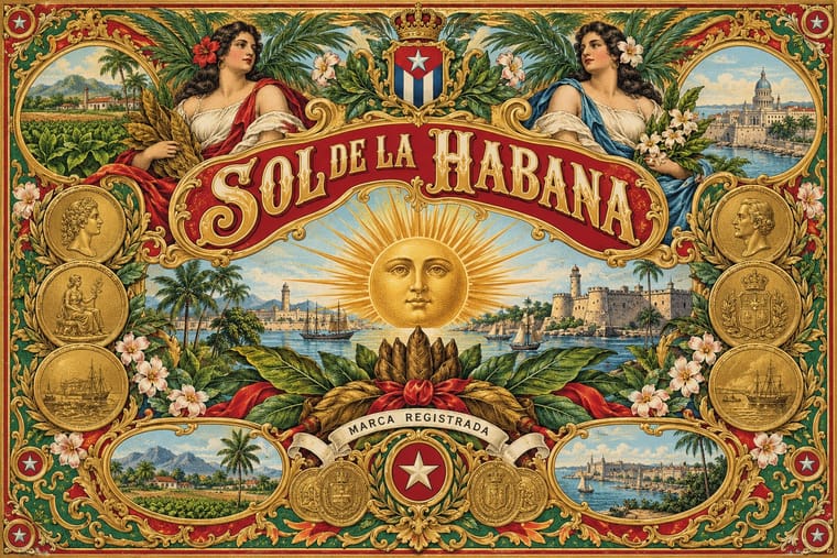
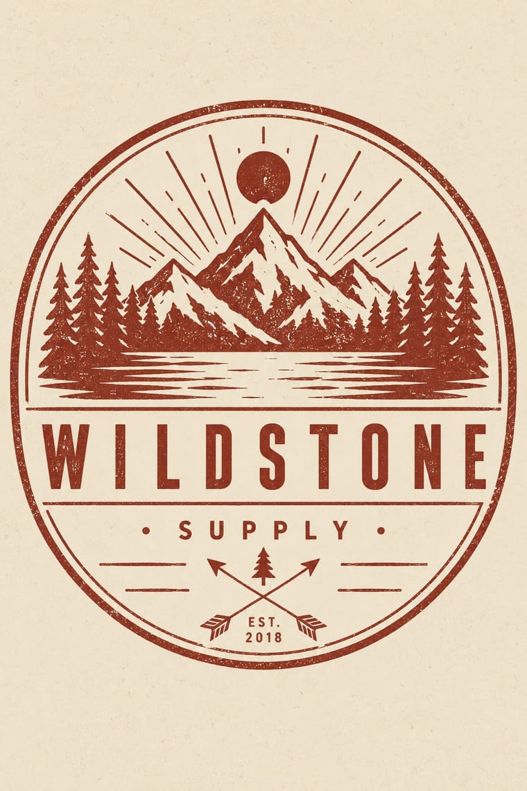
The craft-boom badge borrows the medal, the banner and the 'Est.' date in one ink on kraft; go back to the Havana label's full colour, bronze gold and embossing when a heritage brand needs real opulence rather than a quotation of it.
Mix them and make something Cuban Tobacco Lithography Hipster Artisanal Revival
01
What each style brings
Each part of the design comes from the style with the stronger say in it, and each style gives at least two.
Cuban Tobacco Lithography (Habilitaciones & Marquillas) Hipster Artisanal Revival
- Type from Cuban Tobacco Lithography
- Colour from Hipster Artisanal Revival
-
Cuban Tobacco Lithography avoids monochrome: this is where the two pull against each other, which is the point of the contrast.
- Form from Cuban Tobacco Lithography
-
Hipster Artisanal Revival avoids abundant decoration: this is where the two pull against each other, which is the point of the contrast.
- Composition from Cuban Tobacco Lithography
- Surface from Hipster Artisanal Revival
02
The type
Open fonts standing in for each style’s own type, which is often hand-drawn or commercial.
Display · Cuban Tobacco Lithography
Souvenir
Elsie; Cuban Tobacco Lithography used Shaded, outlined and inline display capitals drawn by the lithographers and marquistas on the stone; J. R. Bermúdez (La imagen constante, 2000, quoted by Calzadilla) credits their wide repertoire of letters and ornaments with influencing type founders and sign painters and Brand and factory names on banners, ribbons and cartouches
Text · Hipster Artisanal Revival
The trade-mark look of the 2007–2018 craft boom, which dressed new coffee roasters, breweries and stationers as nineteenth- and early-twentieth-century firms. A centred one-ink badge holds a line-drawn icon, crossed arrows or an X with words in its quadrants, a triangle and an 'Est.' date for a firm a year old, in tracked sans capitals and a flowing script on kraft, cream or chalkboard. Stock 'Hipster Badges' made it a template; by 2012–13 trend reports and parodies called it overdone, and by 2018 it had matured into colourless, detailed monoline badges that left the arrows and scripts behind.
Jost; Hipster Artisanal Revival used Wisdom Script (James T. Edmondson, Lost Type, 2011), originally drawn for the 'Woods of Wisdom' poster series and Brothers (John Downer, Emigre, 1999), after a turn-of-the-century chromolithographed Cole Brothers circus letterhead
03
The colours
The ground and leading colours come from Hipster Artisanal Revival, with a counter-accent from Cuban Tobacco Lithography. The ink reads on the ground at 4.5:1 or more.
Cuban Tobacco Lithography (Habilitaciones & Marquillas) Hipster Artisanal Revival
-
#f1e8d6ground · 36% -
#1e1c1aink · 14% -
#8e2f25accent · 18% -
#c4a27aaccent · 14% -
#c9a23faccent · 10% -
#9ccbdcaccent · 8%
As CSS
:root {
  --ground: #f1e8d6;
  --ink: #1e1c1a;
  --accent-1: #8e2f25;
  --accent-2: #c4a27a;
  --accent-3: #c9a23f;
  --accent-4: #9ccbdc;
  --font-display: "Elsie", sans-serif;
  --font-text: "Jost", sans-serif;
}
Use it with care
Cuban Tobacco Lithography (Habilitaciones & Marquillas): Many marquillas trade in racist caricature: series such as 'Vida y muerte de la mulata' sexualise mixed-race women and mock Black Cubans in bozal speech, and some labels show enslaved workers on tobacco estates or bare-breasted 'aboriginal' women as exotic decoration; do not reproduce these figures as period charm. Names and dressings such as H. Upmann, Partagás, Punch and Romeo y Julieta are live Habanos trademarks, so draw new marks rather than copying them, and treat images of the Virgen de la Caridad del Cobre, Cuba's patron saint, as devotional, not decorative.
Hipster Artisanal Revival: The hipster fashion and branding of the same years also borrowed pseudo-Native 'tribal' dress: Adrienne Keene's Native Appropriations (2010) answered the fashion for 'hipster headdresses' by noting that eagle feathers 'have to be earned', and in 2012 the Navajo Nation sued Urban Outfitters over goods sold under the 'Navajo' name. Keep to arrows, triangles and trade-mark devices; do not add feathered headdresses, war bonnets or 'tribal' and 'Navajo' patterns as a heritage shorthand.
04
The two styles
05
More combinations
With Cuban Tobacco Lithography
- Shanghai Modern & Yuefenpai Pairs well · Shanghai's calendar posters were also given away by tobacco firms; pair their softly modelled women and ornamental borders with the Havana label's medals and arms for a cross-continental tobacco or spirits heritage line.
- Victorian Letterpress & Wood Type Contrasts · The same century's display capitals, borders and medals, but jobbing print leads with type in one or two flat inks while the Havana label leads with a stone-printed picture in many inks, gold and relief; set them side by side to choose between a loud notice and a luxury seal.
- Belle Époque Lithographic Poster Contrasts · Both are colour lithography of the same decades, but the Paris poster puts one figure on a wall at a distance, while the cigar label packs medals, arms and views into a matched set read in the hand; borrow the poster's single figure when a label grows too crowded.
- Cuban Revolutionary Poster (OSPAAAL & ICAIC) Contrasts · A century later in the same city, ICAIC and OSPAAAL posters used flat silhouettes, few inks and one conceptual image; compare them to see what the revolution's graphics stripped away from Havana's commercial ornament.
- Hand-Painted Signage & Vernacular Lettering Pairs well · The Cuban historian J. R. Bermúdez (quoted by Calzadilla) credits the label lettering with influencing type founders and sign painters; take the shaded, outlined brand capitals off the label and onto a shop window or bar fascia to carry a tobacco-house identity into the street.
- Egyptian Cigarette Packaging (Cairo Tobacco Houses) Pairs well · Borrow the Havana labels' embossed medals and ribbon banners for a richer lid, but keep the Cairo tin's calm pale ground so it does not tip into clutter.
- Spanish Bullfight Poster (Cartel Taurino) Contrasts · Both are lithographic trades of the Spanish-speaking world that print naturalistic paintings, but the Havana label frames allegories, medals and arms in borders within borders around a brand lettered on the stone, while the cartel vignettes one scene and sets a long programme below it in type.
- Plain Tobacco Packaging Contrasts · The gilded, embossed and bordered cigar label is everything a plain pack is forbidden to be; set the two side by side to show how much of tobacco's appeal was carried by ornament alone.
With Hipster Artisanal Revival
- DTC 'Blanding' / Millennial Minimalism Contrasts · Where this dressed new firms as old ones, blanding dressed them as frictionless and new, with lowercase geometric sans, pastels and white space; set the two side by side to place a brand between heritage and novelty.
- Victorian Letterpress & Wood Type Pairs well · Go back to the source: swap the stock badge parts for real jobbing type, printers' rules and stock borders to turn pastiche into the trade print it quotes.
- Risograph & Indie Print Culture Pairs well · The same small-batch maker economy; print the badge in one riso ink on uncoated stock to get real ink grain instead of a distress overlay.
- Flat Design Contrasts · Its contemporary on screen was textureless and many-coloured where this was single-ink and worn; one stamped badge inside a flat interface marks a product as hand-made.
- Hand-Painted Signage & Vernacular Lettering Pairs well · Sign painting revived alongside it; paint the badge on the shop window or chalkboard so the lettering is made by hand instead of aged with a texture filter.
- Phototype Expressive Typography (Lubalin & U&lc) Contrasts · Both pair a script with a geometric sans, but the craft badge tracks its capitals wide in a centred one-ink frame, while Lubalin kerns the same pairing until the letters touch and join. Set one against the other to decide whether the letters should breathe or fuse.
- Cottagecore Contrasts · Shares handmade, small-batch values, but swap its black-and-white urban badges for soft colour and florals to get cottagecore.
- European Heraldry Contrasts · The craft badge borrows heraldry's air of lineage with an 'Est.' date and crossed arrows on kraft paper, while a real coat of arms is a granted or inherited, blazoned identity in strong tinctures; set the two side by side to show the difference between quoting heritage and holding it.