Style combination · Contrasts
Spanish Bullfight Poster × Cuban Tobacco Lithography
Both are lithographic trades of the Spanish-speaking world that print naturalistic paintings, but the Havana label frames allegories, medals and arms in borders within borders around a brand lettered on the stone, while the cartel vignettes one scene and sets a long programme below it in type.
Mix them and make something Spanish Bullfight Poster Cuban Tobacco Lithography
01
What each style brings
Each part of the design comes from the style with the stronger say in it, and each style gives at least two.
Spanish Bullfight Poster (Cartel Taurino) Cuban Tobacco Lithography (Habilitaciones & Marquillas)
- Type from Spanish Bullfight Poster
- Colour from Cuban Tobacco Lithography
- Form from Cuban Tobacco Lithography
- Composition from Cuban Tobacco Lithography
- Surface from Spanish Bullfight Poster
02
The type
Open fonts standing in for each style’s own type, which is often hand-drawn or commercial.
Display · Spanish Bullfight Poster
Amour
Anton, standing in for Mecana (even-stroke slab serif) and heavy condensed grotesque capitals for the matadors' names, printed in black, red or blue
Text · Cuban Tobacco Lithography
The chromolithographed dress of Havana tobacco. Cigar labels were lithographed in one ink from the late 1840s; from about 1860 La Honradez printed its cigarette wrappers (marquillas) in colour in-house: satirical scenes of Cuban life in collectible series, framed by an allegorical border and the firm's emblem. Cigar boxes got a matched set of labels (habilitación): a vista inside the lid, a bofetón over the cigars, edge strips, seals and cigar bands, with medals, royal arms, allegorical women and Havana views in many inks from the 1880s, and gold leaf and stamped relief from about 1890.
Libre Caslon Text; Cuban Tobacco Lithography used Shaded, outlined and inline display capitals drawn by the lithographers and marquistas on the stone; J. R. Bermúdez (La imagen constante, 2000, quoted by Calzadilla) credits their wide repertoire of letters and ornaments with influencing type founders and sign painters and Brand and factory names on banners, ribbons and cartouches
03
The colours
The ground and leading colours come from Cuban Tobacco Lithography, with a counter-accent from Spanish Bullfight Poster. The ink reads on the ground at 4.5:1 or more.
Spanish Bullfight Poster (Cartel Taurino) Cuban Tobacco Lithography (Habilitaciones & Marquillas)
-
#f2e8ccground · 36% -
#4a2e1fink · 14% -
#b51f2eaccent · 18% -
#dcaa34accent · 14% -
#9ccbdcaccent · 10% -
#2e5a3caccent · 8%
As CSS
:root {
  --ground: #f2e8cc;
  --ink: #4a2e1f;
  --accent-1: #b51f2e;
  --accent-2: #dcaa34;
  --accent-3: #9ccbdc;
  --accent-4: #2e5a3c;
  --font-display: "Anton", sans-serif;
  --font-text: "Libre Caslon Text", serif;
}
Use it with care
Spanish Bullfight Poster (Cartel Taurino): Bullfighting is a living but contested practice, opposed by animal-welfare campaigners in Spain and abroad, so borrowing its imagery for unrelated products brings that dispute with it; the painted manolas also belong to a folkloric picture of Andalusia rather than a record of it. Ruano Llopis (d. 1950), Roberto Domingo (d. 1956) and Juan Reus (d. 2003) are still in copyright in Spain, so paint new pictures in the manner rather than reprinting their motifs.
Cuban Tobacco Lithography (Habilitaciones & Marquillas): Many marquillas trade in racist caricature: series such as 'Vida y muerte de la mulata' sexualise mixed-race women and mock Black Cubans in bozal speech, and some labels show enslaved workers on tobacco estates or bare-breasted 'aboriginal' women as exotic decoration; do not reproduce these figures as period charm. Names and dressings such as H. Upmann, Partagás, Punch and Romeo y Julieta are live Habanos trademarks, so draw new marks rather than copying them, and treat images of the Virgen de la Caridad del Cobre, Cuba's patron saint, as devotional, not decorative.
04
The two styles
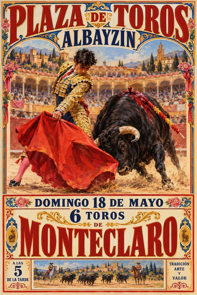
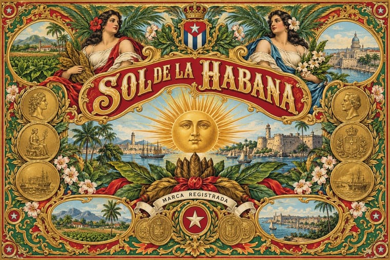
05
More combinations
With Spanish Bullfight Poster
- Hand-Painted Signage & Vernacular Lettering Pairs well · Pair a painted rótulo for a bar or peña with a cartel-style scene and ranked capitals for a festive, local Spanish look.
- Mexican Calendar Chromo (Cromos calendáricos) Contrasts · Both print a commissioned academic oil in quantity and add text afterwards, but the calendar gives the painting the whole sheet with a sponsor band, while the cartel keeps a full ranked programme of ring, bulls and matadors below it.
- Spanish Civil War Poster Contrasts · Josep Renau learned lithography at Ortega's Valencia works while a student; his generation traded the cartel's naturalistic brushwork and long programme for flat, foreshortened figures, diagonal slogans and photomontage.
- International Typographic Style Contrasts · One grotesque, flush left on a grid, against a centred clamour of mixed faces under a painting: use the pair to decide whether a festival programme needs ceremony or clarity.
- Victorian Letterpress & Wood Type Pairs well · The cartel's lower half is a jobbing printer's bill; set its ranked lines of mixed faces and rules under one painted scene to rebuild the two-zone sheet for any festival programme.
- Belle Époque Lithographic Poster Contrasts · Both are colour lithographs for the street, but the Belle Époque artist drew one animated figure and the lettering together on the stone, while the cartel sets a conservative painted scene above a typeset bill it usually keeps apart; borrow the integrated lettering when the programme is short.
- Egyptian Painted Film Poster Contrasts · Both are painted lithographs that announce star performers, but the Egyptian poster collages star heads under huge calligraphic titles, while the cartel paints one scene and names its matadors in set capitals beneath.
With Cuban Tobacco Lithography
- Shanghai Modern & Yuefenpai Pairs well · Shanghai's calendar posters were also given away by tobacco firms; pair their softly modelled women and ornamental borders with the Havana label's medals and arms for a cross-continental tobacco or spirits heritage line.
- Victorian Letterpress & Wood Type Contrasts · The same century's display capitals, borders and medals, but jobbing print leads with type in one or two flat inks while the Havana label leads with a stone-printed picture in many inks, gold and relief; set them side by side to choose between a loud notice and a luxury seal.
- Belle Époque Lithographic Poster Contrasts · Both are colour lithography of the same decades, but the Paris poster puts one figure on a wall at a distance, while the cigar label packs medals, arms and views into a matched set read in the hand; borrow the poster's single figure when a label grows too crowded.
- Hipster Artisanal Revival Contrasts · The craft-boom badge borrows the medal, the banner and the 'Est.' date in one ink on kraft; go back to the Havana label's full colour, bronze gold and embossing when a heritage brand needs real opulence rather than a quotation of it.
- Cuban Revolutionary Poster (OSPAAAL & ICAIC) Contrasts · A century later in the same city, ICAIC and OSPAAAL posters used flat silhouettes, few inks and one conceptual image; compare them to see what the revolution's graphics stripped away from Havana's commercial ornament.
- Hand-Painted Signage & Vernacular Lettering Pairs well · The Cuban historian J. R. Bermúdez (quoted by Calzadilla) credits the label lettering with influencing type founders and sign painters; take the shaded, outlined brand capitals off the label and onto a shop window or bar fascia to carry a tobacco-house identity into the street.
- Egyptian Cigarette Packaging (Cairo Tobacco Houses) Pairs well · Borrow the Havana labels' embossed medals and ribbon banners for a richer lid, but keep the Cairo tin's calm pale ground so it does not tip into clutter.
- Plain Tobacco Packaging Contrasts · The gilded, embossed and bordered cigar label is everything a plain pack is forbidden to be; set the two side by side to show how much of tobacco's appeal was carried by ornament alone.