Style combination · Contrasts
DTC 'Blanding' × Hipster Artisanal Revival
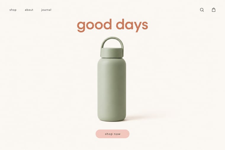
Where this dressed new firms as old ones, blanding dressed them as frictionless and new, with lowercase geometric sans, pastels and white space; set the two side by side to place a brand between heritage and novelty.
Mix them and make something DTC 'Blanding' Hipster Artisanal Revival
01
What each style brings
Each part of the design comes from the style with the stronger say in it, and each style gives at least two.
DTC 'Blanding' / Millennial Minimalism Hipster Artisanal Revival
- Type from DTC 'Blanding'
- Colour from DTC 'Blanding'
-
Hipster Artisanal Revival avoids pastel: this is where the two pull against each other, which is the point of the contrast.
- Form from Hipster Artisanal Revival
- Composition from DTC 'Blanding'
- Surface from Hipster Artisanal Revival
02
The type
Open fonts standing in for each style’s own type, which is often hand-drawn or commercial.
Display · DTC 'Blanding'
Hello
Hanken Grotesk, standing in for Circular (Laurenz Brunner, Lineto, 2013)
Text · Hipster Artisanal Revival
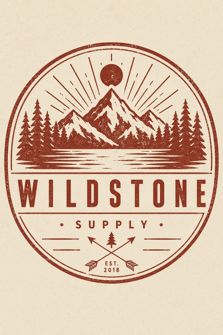
The trade-mark look of the 2007–2018 craft boom, which dressed new coffee roasters, breweries and stationers as nineteenth- and early-twentieth-century firms. A centred one-ink badge holds a line-drawn icon, crossed arrows or an X with words in its quadrants, a triangle and an 'Est.' date for a firm a year old, in tracked sans capitals and a flowing script on kraft, cream or chalkboard. Stock 'Hipster Badges' made it a template; by 2012–13 trend reports and parodies called it overdone, and by 2018 it had matured into colourless, detailed monoline badges that left the arrows and scripts behind.
Jost; Hipster Artisanal Revival used Wisdom Script (James T. Edmondson, Lost Type, 2011), originally drawn for the 'Woods of Wisdom' poster series and Brothers (John Downer, Emigre, 1999), after a turn-of-the-century chromolithographed Cole Brothers circus letterhead
03
The colours
The ground and leading colours come from DTC 'Blanding', with a counter-accent from Hipster Artisanal Revival. The ink reads on the ground at 4.5:1 or more.
DTC 'Blanding' / Millennial Minimalism Hipster Artisanal Revival
-
#faf7f2ground · 36% -
#2b2b2bink · 14% -
#d27c5daccent · 18% -
#8e2f25accent · 14% -
#f4cfc8accent · 10% -
#c4a27aaccent · 8%
As CSS
:root {
  --ground: #faf7f2;
  --ink: #2b2b2b;
  --accent-1: #d27c5d;
  --accent-2: #8e2f25;
  --accent-3: #f4cfc8;
  --accent-4: #c4a27a;
  --font-display: "Hanken Grotesk", sans-serif;
  --font-text: "Jost", sans-serif;
}
Use it with care
Hipster Artisanal Revival: The hipster fashion and branding of the same years also borrowed pseudo-Native 'tribal' dress: Adrienne Keene's Native Appropriations (2010) answered the fashion for 'hipster headdresses' by noting that eagle feathers 'have to be earned', and in 2012 the Navajo Nation sued Urban Outfitters over goods sold under the 'Navajo' name. Keep to arrows, triangles and trade-mark devices; do not add feathered headdresses, war bonnets or 'tribal' and 'Navajo' patterns as a heritage shorthand.
04
The two styles
05
More combinations
With DTC 'Blanding'
- Scandinavian Functionalism Pairs well · Shares a warm, domestic restraint; borrow Nordic materials and craft photography to give a pastel system more texture and credibility.
- Neo-Brutalism Contrasts · The post-blanding swing: thick outlines, clashing brights and hard shadows are the quickest way out of pastel sameness.
- Neoclassical Book Typography Contrasts · Luxury's other reduction: a single Didone wordmark signals heritage where the lowercase sans signals approachability.
- Corporate Memphis Pairs well · Its illustration-led sibling; add a few flat vector figures when seamless-backdrop photography alone feels too cold.
- Minimalist Graphic Design Contrasts · Its austere parent: swap pastel and chatty copy back to monochrome and silence when a brand needs authority rather than friendliness.
- Natural Wine Label Art Contrasts · Blanding sells a frictionless, agency-made brand in lowercase geometric sans and pastels; the natural wine label sells a person through an untrained drawing. Use the contrast to decide whether a product should feel designed or made.
- Guochao (China-Chic National Trend) Contrasts · Western direct-to-consumer brands strip identity to pastel sans-serif minimalism; guochao sells ornament and heritage instead, so use one to test the other.
- Muji No-Brand Design (Mujirushi Ryohin) Contrasts · Shares the plain sans and isolated product but replaces its friendly pastel persona and funded brand voice with anonymity.
With Hipster Artisanal Revival
- Victorian Letterpress & Wood Type Pairs well · Go back to the source: swap the stock badge parts for real jobbing type, printers' rules and stock borders to turn pastiche into the trade print it quotes.
- Risograph & Indie Print Culture Pairs well · The same small-batch maker economy; print the badge in one riso ink on uncoated stock to get real ink grain instead of a distress overlay.
- Flat Design Contrasts · Its contemporary on screen was textureless and many-coloured where this was single-ink and worn; one stamped badge inside a flat interface marks a product as hand-made.
- Hand-Painted Signage & Vernacular Lettering Pairs well · Sign painting revived alongside it; paint the badge on the shop window or chalkboard so the lettering is made by hand instead of aged with a texture filter.
- Phototype Expressive Typography (Lubalin & U&lc) Contrasts · Both pair a script with a geometric sans, but the craft badge tracks its capitals wide in a centred one-ink frame, while Lubalin kerns the same pairing until the letters touch and join. Set one against the other to decide whether the letters should breathe or fuse.
- Cottagecore Contrasts · Shares handmade, small-batch values, but swap its black-and-white urban badges for soft colour and florals to get cottagecore.
- European Heraldry Contrasts · The craft badge borrows heraldry's air of lineage with an 'Est.' date and crossed arrows on kraft paper, while a real coat of arms is a granted or inherited, blazoned identity in strong tinctures; set the two side by side to show the difference between quoting heritage and holding it.
- Newtro (Korean New-Retro) Contrasts · Both dress a product in the past, but hipster badges invent a Victorian heritage for a new firm while newtro reissues a real firm's own recent archive.