Style combination · Pairs well
Cuban Tobacco Lithography × Hand-Painted Signage
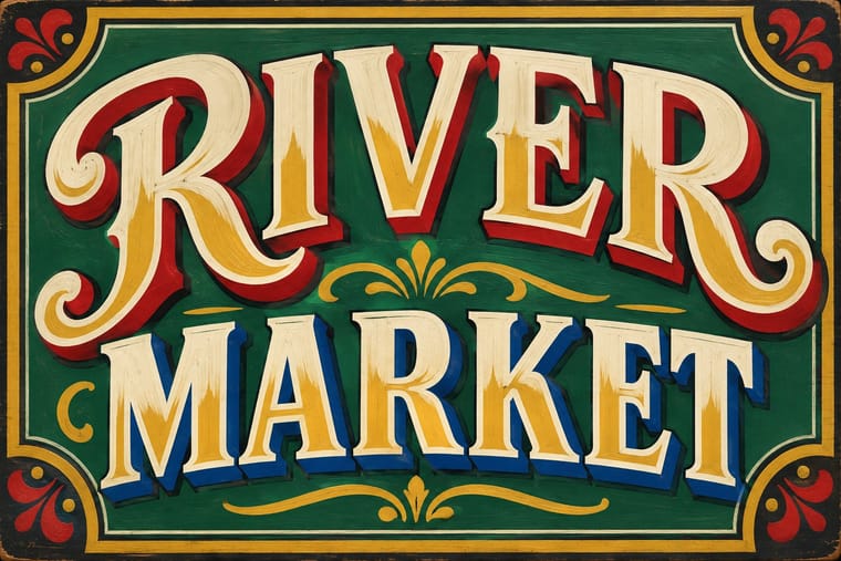
The Cuban historian J. R. Bermúdez (quoted by Calzadilla) credits the label lettering with influencing type founders and sign painters; take the shaded, outlined brand capitals off the label and onto a shop window or bar fascia to carry a tobacco-house identity into the street.
Mix them and make something Cuban Tobacco Lithography Hand-Painted Signage
01
What each style brings
Each part of the design comes from the style with the stronger say in it, and each style gives at least two.
Cuban Tobacco Lithography (Habilitaciones & Marquillas) Hand-Painted Signage & Vernacular Lettering
- Type from Hand-Painted Signage
- Colour from Cuban Tobacco Lithography
- Form from Cuban Tobacco Lithography
- Composition from Cuban Tobacco Lithography
- Surface from Hand-Painted Signage
02
The type
Open fonts standing in for each style’s own type, which is often hand-drawn or commercial.
Text · Cuban Tobacco Lithography
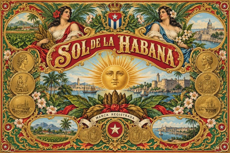
The chromolithographed dress of Havana tobacco. Cigar labels were lithographed in one ink from the late 1840s; from about 1860 La Honradez printed its cigarette wrappers (marquillas) in colour in-house: satirical scenes of Cuban life in collectible series, framed by an allegorical border and the firm's emblem. Cigar boxes got a matched set of labels (habilitación): a vista inside the lid, a bofetón over the cigars, edge strips, seals and cigar bands, with medals, royal arms, allegorical women and Havana views in many inks from the 1880s, and gold leaf and stamped relief from about 1890.
Libre Caslon Text; Cuban Tobacco Lithography used Shaded, outlined and inline display capitals drawn by the lithographers and marquistas on the stone; J. R. Bermúdez (La imagen constante, 2000, quoted by Calzadilla) credits their wide repertoire of letters and ornaments with influencing type founders and sign painters and Brand and factory names on banners, ribbons and cartouches
03
The colours
The ground and leading colours come from Cuban Tobacco Lithography, with a counter-accent from Hand-Painted Signage. The ink reads on the ground at 4.5:1 or more.
Cuban Tobacco Lithography (Habilitaciones & Marquillas) Hand-Painted Signage & Vernacular Lettering
-
#f2e8ccground · 36% -
#4a2e1fink · 14% -
#b51f2eaccent · 18% -
#c99a2eaccent · 14% -
#9ccbdcaccent · 10% -
#2e5a3caccent · 8%
As CSS
:root {
  --ground: #f2e8cc;
  --ink: #4a2e1f;
  --accent-1: #b51f2e;
  --accent-2: #c99a2e;
  --accent-3: #9ccbdc;
  --accent-4: #2e5a3c;
  --font-display: "Yellowtail", cursive;
  --font-text: "Libre Caslon Text", serif;
}
Use it with care
Cuban Tobacco Lithography (Habilitaciones & Marquillas): Many marquillas trade in racist caricature: series such as 'Vida y muerte de la mulata' sexualise mixed-race women and mock Black Cubans in bozal speech, and some labels show enslaved workers on tobacco estates or bare-breasted 'aboriginal' women as exotic decoration; do not reproduce these figures as period charm. Names and dressings such as H. Upmann, Partagás, Punch and Romeo y Julieta are live Habanos trademarks, so draw new marks rather than copying them, and treat images of the Virgen de la Caridad del Cobre, Cuba's patron saint, as devotional, not decorative.
04
The two styles
05
More combinations
With Cuban Tobacco Lithography
- Shanghai Modern & Yuefenpai Pairs well · Shanghai's calendar posters were also given away by tobacco firms; pair their softly modelled women and ornamental borders with the Havana label's medals and arms for a cross-continental tobacco or spirits heritage line.
- Victorian Letterpress & Wood Type Contrasts · The same century's display capitals, borders and medals, but jobbing print leads with type in one or two flat inks while the Havana label leads with a stone-printed picture in many inks, gold and relief; set them side by side to choose between a loud notice and a luxury seal.
- Belle Époque Lithographic Poster Contrasts · Both are colour lithography of the same decades, but the Paris poster puts one figure on a wall at a distance, while the cigar label packs medals, arms and views into a matched set read in the hand; borrow the poster's single figure when a label grows too crowded.
- Hipster Artisanal Revival Contrasts · The craft-boom badge borrows the medal, the banner and the 'Est.' date in one ink on kraft; go back to the Havana label's full colour, bronze gold and embossing when a heritage brand needs real opulence rather than a quotation of it.
- Cuban Revolutionary Poster (OSPAAAL & ICAIC) Contrasts · A century later in the same city, ICAIC and OSPAAAL posters used flat silhouettes, few inks and one conceptual image; compare them to see what the revolution's graphics stripped away from Havana's commercial ornament.
- Egyptian Cigarette Packaging (Cairo Tobacco Houses) Pairs well · Borrow the Havana labels' embossed medals and ribbon banners for a richer lid, but keep the Cairo tin's calm pale ground so it does not tip into clutter.
- Spanish Bullfight Poster (Cartel Taurino) Contrasts · Both are lithographic trades of the Spanish-speaking world that print naturalistic paintings, but the Havana label frames allegories, medals and arms in borders within borders around a brand lettered on the stone, while the cartel vignettes one scene and sets a long programme below it in type.
- Plain Tobacco Packaging Contrasts · The gilded, embossed and bordered cigar label is everything a plain pack is forbidden to be; set the two side by side to show how much of tobacco's appeal was carried by ornament alone.
With Hand-Painted Signage
- Victorian Letterpress & Wood Type Pairs well · Sign writers and type founders traded letterforms; set a wood-type headline and finish it with painted shadows and outlines.
- West African Barbershop & Hair Salon Signs Pairs well · West African barbershop boards are the sign writer's catalogue genre; pair a painted name panel with a grid of numbered hairstyle portraits for a shop menu that reads from the street.
- Graffiti & Hip-Hop Graphics Pairs well · Graffiti writers inherited the sign painter's outlines and drop shadows; pair a disciplined sign alphabet with a wildstyle tag for contrast of control.
- Flat Design Contrasts · Against flat, machine-perfect UI, one hand-painted wordmark signals human craft; keep everything else flat so it stands out.
- Fileteado Porteño Pairs well · Add filete scrolls and bevelled shading to plain painted lettering for a richer, Buenos Aires-style sign.
- Roman-like Thai Typography (modern loopless Thai) Contrasts · A hand-painted shopfront sign, in looped letters or broad-nib Naris, beside a flat loopless headline shows the shift from the letterer's hand to dry transfer and digital type that Manop Srisomporn himself made.
- Generative & Dynamic Identities Contrasts · Hand-painted lettering's one-off irregularity is the human counterpart to algorithmic variation; mix the two only with clear intent.
- Italian Painted Film Poster (Rome Studios) Pairs well · Shares the painted-on-site lettering craft; borrow its bold hand-lettering for the title block.