Style combination · Contrasts
Chinese Modern Woodcut Movement × Shanghai Modern
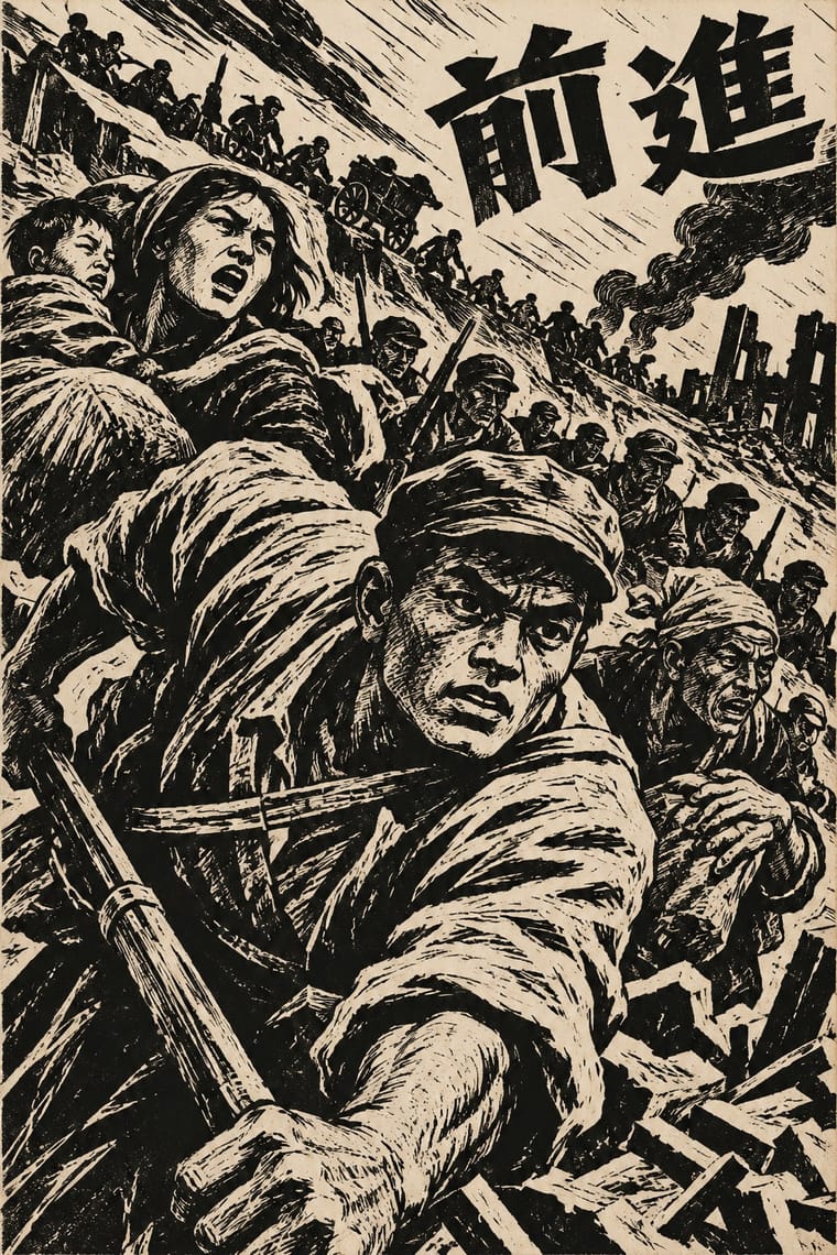
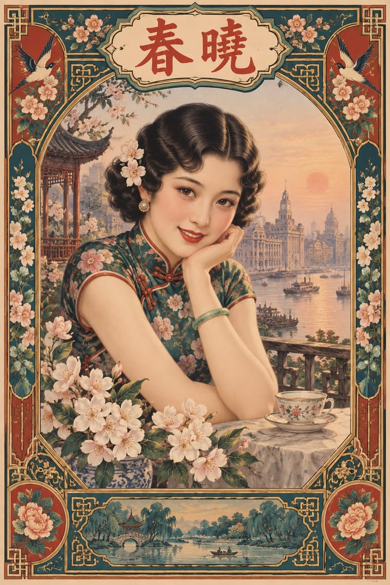
Same city, same decade: airbrushed calendar glamour against gouged black refugees shows two opposite promises of modern China.
Mix them and make something Chinese Modern Woodcut Movement Shanghai Modern
01
What each style brings
Each part of the design comes from the style with the stronger say in it, and each style gives at least two.
Chinese Modern Woodcut Movement Shanghai Modern & Yuefenpai
- Type from Shanghai Modern
- Colour from Chinese Modern Woodcut Movement
- Form from Shanghai Modern
- Composition from Chinese Modern Woodcut Movement
- Surface from Chinese Modern Woodcut Movement
02
The type
Open fonts standing in for each style’s own type, which is often hand-drawn or commercial.
Text · Chinese Modern Woodcut Movement
The leftist print movement launched by Lu Xun's 1931 Shanghai woodcut workshop, which made the self-cut black-and-white woodcut China's art of national crisis and revolution. Young artists learned from Käthe Kollwitz, Frans Masereel and Soviet woodcuts to gouge close-up, diagonal images of workers, refugees and resistance for journals, books and travelling exhibitions; in Yan'an after 1942 they adopted New Year print outlines and colour for peasant audiences.
Shippori Mincho; Chinese Modern Woodcut Movement used Hand-cut Chinese characters carved into the block and Brush-written kaishu titles on journal and book covers
03
The colours
The ground and leading colours come from Chinese Modern Woodcut Movement, with a counter-accent from Shanghai Modern. The ink reads on the ground at 4.5:1 or more.
Chinese Modern Woodcut Movement Shanghai Modern & Yuefenpai
-
#efe7d4ground · 36% -
#141414ink · 14% -
#e0b23aaccent · 18% -
#b8322faccent · 14% -
#8c7b62accent · 10% -
#1f5f5baccent · 8%
As CSS
:root {
  --ground: #efe7d4;
  --ink: #141414;
  --accent-1: #e0b23a;
  --accent-2: #b8322f;
  --accent-3: #8c7b62;
  --accent-4: #1f5f5b;
  --font-display: "Limelight", sans-serif;
  --font-text: "Shippori Mincho", serif;
}
04
The two styles
05
More combinations
With Chinese Modern Woodcut Movement
- Taller de Gráfica Popular Pairs well · Mexico and China built woodcut movements in the same years for the same publics; mix their imagery for internationalist solidarity prints.
- Nianhua & Chinese Folk Print Pairs well · Yan'an artists fused the two; add New Year print outline and flat colour to a woodcut when warmth matters more than shock.
- Expressionist Woodcut Graphics Pairs well · Its parent: borrow the German gouge and distortion, then point them outward at a shared cause instead of inner anguish.
- Republican Chinese Book Cover Design (Lu Xun & Tao Yuanqing) Pairs well · Lu Xun launched the woodcut movement in 1931 and edited woodcut books such as Yinyu ji; a black carved print on a pale cover with a drawn title joins the two.
- Lianhuanhua Picture-Story Books Pairs well · Woodcut picture-stories and lianhuanhua share the one-image-per-page sequence; mix carved frames with drawn ones for documentary storytelling.
- Minjung Woodcut Graphics (Korean People's Art) Pairs well · MMCA names it as a source; keep its self-cut black line but trade the gouged diagonal shock for Minjung's frontal, dancing figures.
With Shanghai Modern
- Socialist Realist Propaganda Poster Contrasts · After 1949 the same painters and rubbed-watercolour technique served propaganda; compare how one rendering style sells glamour versus ideology.
- Nianhua & Chinese Folk Print Pairs well · Fold nianhua's auspicious symbols and bright folk colour into a calendar-poster layout for festive packaging.
- International Typographic Style Contrasts · Its framed, ornamented, figurative poster is the opposite of Swiss reduction; strip elements one by one to find what carries the mood.
- Art Deco Pairs well · Wrap a softly painted yuefenpai figure in Deco borders and geometric lettering for East–West period glamour.
- Republican Chinese Book Cover Design (Lu Xun & Tao Yuanqing) Contrasts · Same city and decades, opposite intent: calendar posters model glamorous women in soft polychrome with ornamental borders, while New Literature covers leave a plain field to one flat, symbolic motif and a drawn title.
- Mexican Calendar Chromo (Cromos calendáricos) Contrasts · Both are tobacco-sponsored calendar pictures of beauties, but yuefenpai set softly rubbed watercolour women inside decorative borders with the products alongside, while the Mexican chromo is an oil painting of a whole scene that fills the sheet, with the pad pasted at its foot.
- Cuban Tobacco Lithography (Habilitaciones & Marquillas) Pairs well · Shanghai's calendar posters were also given away by tobacco firms; pair their softly modelled women and ornamental borders with the Havana label's medals and arms for a cross-continental tobacco or spirits heritage line.
- Showa Modern Commercial Art and Zuan-moji Pairs well · Both put a modern-girl figure in East Asian commercial posters; combine the Japanese geometric lettering with Shanghai's painterly figure for a pan-Asian Deco look.