Style combination · Pairs well
Kawaii Design × Techno-Futurist Graphics
A cute mascot inside a dense techno-corporate layout softens its satire; Groovisions' Chappie is the model.
Drop a flat, cute mascot into a dense corporate-parody layout to soften its satire, as 1990s Tokyo studios did.
Mix them and make something Kawaii Design Techno-Futurist Graphics
01
What each style brings
Each part of the design comes from the style with the stronger say in it, and each style gives at least two.
Kawaii Design Techno-Futurist Graphics
- Type from Kawaii Design
- Colour from Kawaii Design
- Form from Techno-Futurist Graphics
- Composition from Kawaii Design
- Surface from Techno-Futurist Graphics
02
The type
Open fonts standing in for each style’s own type, which is often hand-drawn or commercial.
Display · Kawaii Design
Pop
Zen Maru Gothic, standing in for Maru-ji (rounded teenage handwriting, 1970s)
Text · Techno-Futurist Graphics
Electronic-music and video-game graphics of the late 1980s and 1990s that turned corporate modernism into a sci-fi consumer fantasy. Grids, Helvetica, pictograms, barcodes, warning labels and invented corporate logos were recombined with katakana, manga cuteness and early 3D, producing slick, flat, information-saturated surfaces that both celebrated and satirised technology and branding.
Inter; Techno-Futurist Graphics used Helvetica and Eurostile / Microgramma
03
The colours
The ground and leading colours come from Kawaii Design, with a counter-accent from Techno-Futurist Graphics. The ink reads on the ground at 4.5:1 or more.
Kawaii Design Techno-Futurist Graphics
-
#fff4a3ground · 36% -
#141414ink · 14% -
#e60033accent · 18% -
#00aeefaccent · 14% -
#a8d8ffaccent · 10% -
#ec008caccent · 8%
As CSS
:root {
  --ground: #fff4a3;
  --ink: #141414;
  --accent-1: #e60033;
  --accent-2: #00aeef;
  --accent-3: #a8d8ff;
  --accent-4: #ec008c;
  --font-display: "Zen Maru Gothic", sans-serif;
  --font-text: "Inter", sans-serif;
}
04
The two styles
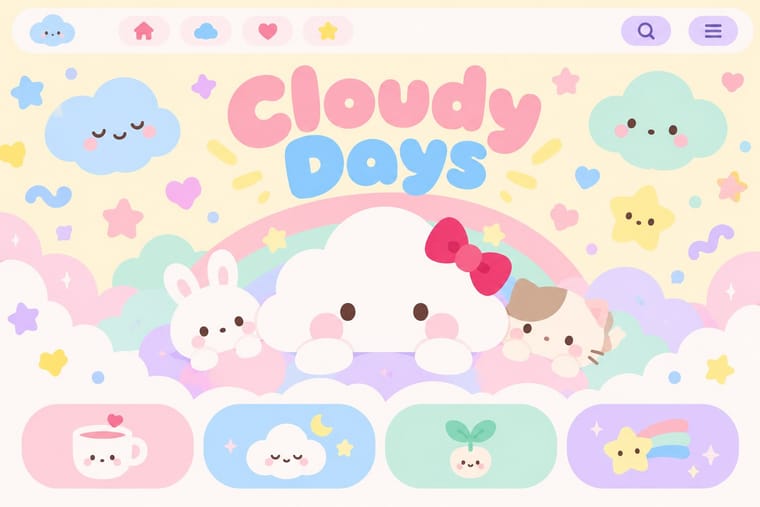
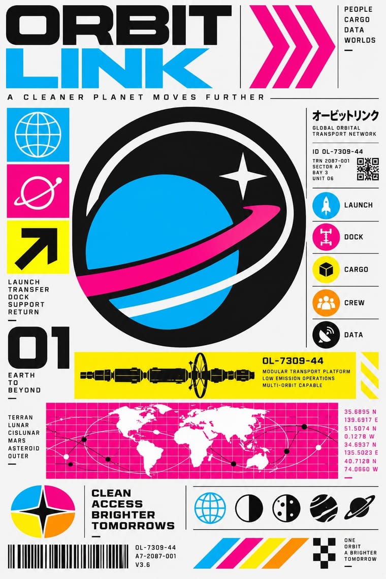
05
More combinations
With Kawaii Design
- Grunge Typography Contrasts · Grunge's dirt and illegibility is kawaii's opposite; one cute character on a distressed texture creates knowing dissonance.
- Memphis Design Pairs well · Kawaii characters sit happily on Memphis pastel geometry; combine them for playful packaging with a little more edge.
- Dark Tech Minimalism Contrasts · Use a single pastel mascot or emoji moment to humanise a cold, dark interface without changing its structure.
- Claymorphism & Soft 3D Pairs well · Kawaii's oversized heads, minimal faces and scattered sparkles translate directly into clay volumes; use its character rules for mascots and emoji so the 3D figures stay simple and readable at small sizes.
- Moomin Graphics (Tove Jansson's Pen-Drawn World and its Licensed Afterlife) Contrasts · Its round, white characters sit near kawaii fancy goods, but they keep a hatched, melancholy world around them that kawaii fancy goods leave out.
- Superflat Contrasts · Kawaii offers sincere, simple, pastel cuteness for fancy goods; switch to Superflat when the cute should be saturated, crowded, many-eyed and ironic, a comment on consumer culture rather than a product of it.
- VTuber Avatar and Stream Graphics Contrasts · Its parent in cute character culture, but kawaii fixes a static mascot on pastel goods and print; switch to VTuber graphics when the character has to move, talk and answer a live chat, with a performer's voice and a whole stream screen around it.
- Yuru-chara (Japanese Local Mascot Design) Contrasts · Both build on rounded, big-headed cute figures, but kawaii sells polished pastel fancy goods for private pleasure, while a yuru-chara speaks for a town in a few bold colours and keeps its awkwardness.
With Techno-Futurist Graphics
- Y2K Futurism Pairs well · Add Y2K chrome and translucent plastics to techno-futurist pictograms for a late-1990s consumer-electronics look.
- Corporate Identity Modernism Contrasts · Use the sincere corporate identity manual as the straight version that techno-futurism parodies.
- Arts & Crafts Movement Contrasts · Handmade, nature-derived craft is its anti-matter; a single hand-drawn element in a techno layout reads as a glitch of humanity.
- Fantasy User Interface (FUI) & Sci-Fi HUD Pairs well · Techno-futurism's invented corporate logos, pictograms and warning labels make convincing in-world branding for FUI screens. Use them on boot screens and on the agencies and corporations whose software the characters run.
- Acid Graphics / New Ugly Pairs well · Borrow The Designers Republic's corporate-parody logos and tiny technical captions to give acid layouts a systematic backbone.
- Superflat Pairs well · groovisions, whose Chappie figure showed in the 2001 Superflat exhibition, links the two; set Superflat characters inside techno-futurist logos, grids and katakana captions for a slicker, more corporate parody.
- Afrofuturist Design Pairs well · Combine interface graphics and chrome with ancestral pattern so technology feels owned rather than imported.