Style combination · Contrasts
Grunge Typography × Kawaii Design
Grunge's dirt and illegibility is kawaii's opposite; one cute character on a distressed texture creates knowing dissonance.
01
What each style brings
Each part of the design comes from the style with the stronger say in it, and each style gives at least two.
Grunge Typography Kawaii Design
- Type from Grunge Typography
- Colour from Kawaii Design
-
Grunge Typography avoids pastel: this is where the two pull against each other, which is the point of the contrast.
- Form from Kawaii Design
- Composition from Grunge Typography
- Surface from Grunge Typography
-
Kawaii Design avoids photocopy & distress: this is where the two pull against each other, which is the point of the contrast.
02
The type
Open fonts standing in for each style’s own type, which is often hand-drawn or commercial.
Text · Kawaii Design
Japan's culture of cuteness, which grew from 1970s teenage rounded handwriting and shōjo fancy goods into a global design language through Sanrio, character merchandise and emoji. Its decisions are simple and consistent: rounded forms, oversized heads and minimal faces, pastel or candy colour in flat fields, scattered hearts and sparkles, and friendly rounded type.
Zen Maru Gothic; Kawaii Design used Maru-ji and Maru Gothic rounded type
03
The colours
The ground and leading colours come from Kawaii Design, with a counter-accent from Grunge Typography. The ink reads on the ground at 4.5:1 or more.
Grunge Typography Kawaii Design
-
#fff4a3ground · 36% -
#141414ink · 14% -
#e60033accent · 18% -
#a8322daccent · 14% -
#a8d8ffaccent · 10% -
#cdb4ffaccent · 8%
As CSS
:root {
  --ground: #fff4a3;
  --ink: #141414;
  --accent-1: #e60033;
  --accent-2: #a8322d;
  --accent-3: #a8d8ff;
  --accent-4: #cdb4ff;
  --font-display: "Rock Salt", cursive;
  --font-text: "Zen Maru Gothic", sans-serif;
}
04
The two styles
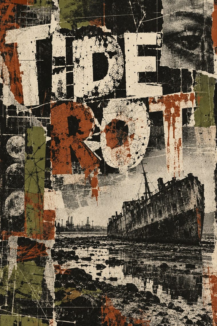
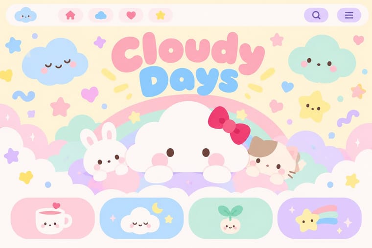
05
More combinations
With Grunge Typography
- International Typographic Style Contrasts · Run a single eroded headline through an otherwise clean grid to signal attitude without sacrificing legibility.
- Acid Graphics / New Ugly Pairs well · Grunge's layered, distressed type is a direct ancestor of acid graphics; add chrome and neon to update it for today.
- Brutalist Web Design Pairs well · Raw web layouts absorb grunge's broken grids naturally; add one scanned texture for an analogue edge.
- Frutiger Aero Contrasts · Clean glossy optimism is grunge's opposite; juxtapose them only when you want the clash itself to be the message.
- Glitch Art & Datamosh Graphics Contrasts · Grunge scanned in photocopier grain and dirt and layered type on the Mac; glitch art breaks the file and lets the codec make the damage. Pick analogue distress or digital failure deliberately rather than stacking both.
- British Style Press (The Face, i-D and Arena) Contrasts · Both broke magazine conventions, but grunge eroded and blurred letters while Brody's stay hard-edged and constructed; choose between decay and construction.
- Indie Sleaze Pairs well · Wikipedia describes the look as combining 1970s and 1980s fashion with grunge fashion, 'grubby' and 'performatively vintage'.
- Black Metal Graphics Contrasts · Both made legibility negotiable in the 1990s, but grunge layered and eroded digital type across a broken grid, while black metal draws one logo by hand and centres it in emptiness; pick analogue symmetry or digital disorder.
With Kawaii Design
- Techno-Futurist Graphics Pairs well · A cute mascot inside a dense techno-corporate layout softens its satire; Groovisions' Chappie is the model.
- Memphis Design Pairs well · Kawaii characters sit happily on Memphis pastel geometry; combine them for playful packaging with a little more edge.
- Dark Tech Minimalism Contrasts · Use a single pastel mascot or emoji moment to humanise a cold, dark interface without changing its structure.
- Claymorphism & Soft 3D Pairs well · Kawaii's oversized heads, minimal faces and scattered sparkles translate directly into clay volumes; use its character rules for mascots and emoji so the 3D figures stay simple and readable at small sizes.
- Moomin Graphics (Tove Jansson's Pen-Drawn World and its Licensed Afterlife) Contrasts · Its round, white characters sit near kawaii fancy goods, but they keep a hatched, melancholy world around them that kawaii fancy goods leave out.
- Superflat Contrasts · Kawaii offers sincere, simple, pastel cuteness for fancy goods; switch to Superflat when the cute should be saturated, crowded, many-eyed and ironic, a comment on consumer culture rather than a product of it.
- VTuber Avatar and Stream Graphics Contrasts · Its parent in cute character culture, but kawaii fixes a static mascot on pastel goods and print; switch to VTuber graphics when the character has to move, talk and answer a live chat, with a performer's voice and a whole stream screen around it.
- Yuru-chara (Japanese Local Mascot Design) Contrasts · Both build on rounded, big-headed cute figures, but kawaii sells polished pastel fancy goods for private pleasure, while a yuru-chara speaks for a town in a few bold colours and keeps its awkwardness.