Style combination · Pairs well
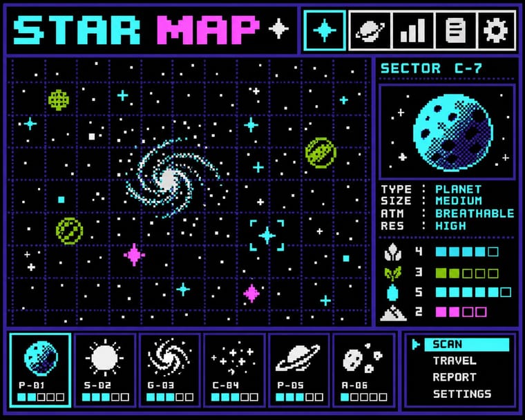
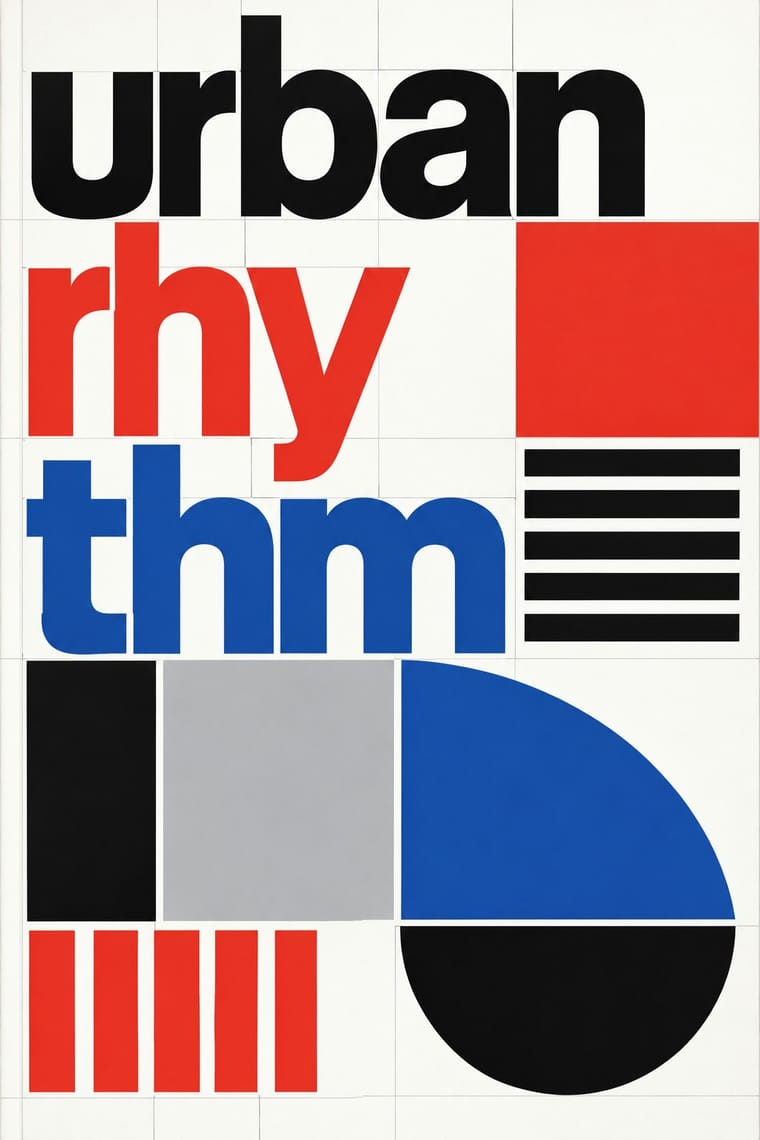
Bitmap × Total Design
Crouwel's New Alphabet anticipated screen type; combine grid-drawn letters with pixel fonts for a historically grounded digital identity.
01
What each style brings
Each part of the design comes from the style with the stronger say in it, and each style gives at least two.
Bitmap & Pixel Graphics Total Design & Dutch Functionalism
- Type from Total Design
- Colour from Total Design
- Form from Bitmap
- Composition from Bitmap
- Surface from Bitmap
02
The type
Open fonts standing in for each style’s own type, which is often hand-drawn or commercial.
Text · Bitmap
Graphics and lettering built from the square pixels of low-resolution screens (arcade and console sprites, home-computer displays and the first graphical user interfaces), where every dot was placed by hand within tight limits of memory, resolution and palette. Designers such as Susan Kare turned those constraints into a language of legible pictogram icons, jagged bitmap fonts and dithered tones.
VT323; Bitmap used Chicago and Geneva and Monaco
03
The colours
The ground and leading colours come from Total Design, with a counter-accent from Bitmap. The ink reads on the ground at 4.5:1 or more.
Bitmap & Pixel Graphics Total Design & Dutch Functionalism
-
#ffffffground · 36% -
#111111ink · 14% -
#e4352aaccent · 18% -
#9bbc0faccent · 14% -
#1e50a2accent · 10% -
#ff55ffaccent · 8%
As CSS
:root {
  --ground: #ffffff;
  --ink: #111111;
  --accent-1: #e4352a;
  --accent-2: #9bbc0f;
  --accent-3: #1e50a2;
  --accent-4: #ff55ff;
  --font-display: "Inter Tight", sans-serif;
  --font-text: "VT323", monospace;
}
04
The two styles
05
More combinations
With Bitmap
- Andean Woven Graphic Systems Pairs well · The woven cell of Andean tapestry is a pre-digital pixel grid; draw pixel icons with its stepped diagonals, but credit weaving communities rather than copying their motifs.
- Skeuomorphic UI Contrasts · Photoreal leather and glass are the opposite pole of 1-bit honesty; jump from one to the other to tell a story of interface history.
- International Typographic Style Pairs well · Snap pixel type and icons to a strict Swiss grid for a rational, screen-native take on modernist order.
- Art Nouveau Contrasts · Whiplash curves cannot survive a coarse pixel grid; staging that clash makes a memorable, deliberately jagged ornament.
- Kawaii Design Pairs well · Sprite-scale characters and kawaii roundness merge naturally; keep the palette limited so pixel mascots stay crisp.
- Demoscene Graphics (Cracktros, Demos & Text-Mode Art) Contrasts · Bitmap graphics is the legible, flat pixel of icons, sprites and system fonts; scene graphics spend the same pixels on chrome, gradients and motion for show. Pick the icon grid for an interface and the scene logo for a title screen.
- Square Kufic (Bannāʾī) Pairs well · Both build letters from square units, and Sakkal compares building bricks to large pixels; set a bitmap Latin wordmark on the same cell size as a square-Kufic mark for a bilingual identity, but keep sacred formulas out of jokey, game-like pixel contexts.
- Isometric Pixel Art Contrasts · Same hand-placed pixels, but front-on icons and sprites under hardware limits against a crammed, full-colour 2:1 city made as a picture.
With Total Design
- Cranbrook & Deconstructivist Typography Contrasts · Cranbrook's layered, reader-dependent pages invert Total Design's single impersonal reading; set one against the other to argue order versus interpretation.
- Neo-Swiss Revival Pairs well · Neo-Swiss layouts gain edge by borrowing Total Design's exposed grid and module-built display letters.
- Op Art Graphics Pairs well · Line-built letters and op line fields share a module; layer them for vibrating posters that remain strictly systematic.
- Zagreb Modernist Graphics (EXAT 51 to Teatar &TD) Contrasts · Both make an institution recognisable by its letters and grids, but Total Design applies one impersonal programme across clients, while on Picelj's gallery posters the unit changes with every artist shown and Arsovski breaks the order with collage, pop photographs and rebuses.
- Jeepney Art Contrasts · Systematic transit signage is the rational opposite of owner-by-owner jeepney lettering; contrast the two when designing public-transport identities.
- Nieuwe Kunst (Dutch Art Nouveau) Contrasts · Dutch design's later ornament-free grid against its own ornamental past: a filled, symmetrical batik cover beside a Crouwel layout in sans-serif on white makes the choice between pattern and pure information explicit.
- Dutch Expressive Postmodernism (Studio Dumbar & Hard Werken) Contrasts · The foil it was 'anti' to: Total Design's visible grid, one cool sans and white space against Hard Werken's and Dumbar's mismatched type, crude assemblage and shrieking colour. The same 1986 exhibition set them up as the two poles of Dutch design; quote one exposed grid inside a staged-photo poster to show the argument.