Style combination · Contrasts
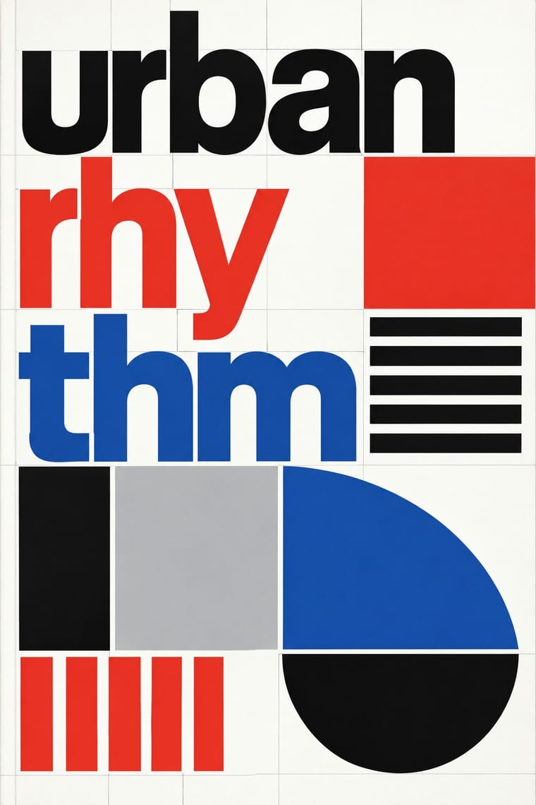
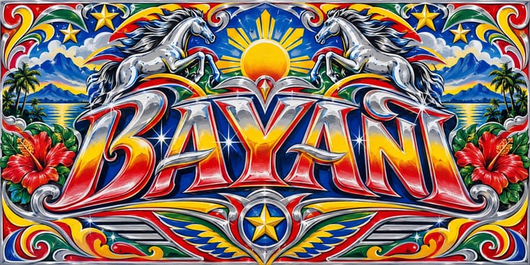
Total Design × Jeepney Art
Systematic transit signage is the rational opposite of owner-by-owner jeepney lettering; contrast the two when designing public-transport identities.
01
What each style brings
Each part of the design comes from the style with the stronger say in it, and each style gives at least two.
Total Design & Dutch Functionalism Jeepney Art
- Type from Jeepney Art
-
Total Design avoids ornamented display: this is where the two pull against each other, which is the point of the contrast.
- Colour from Total Design
- Form from Total Design
- Composition from Total Design
-
Jeepney Art avoids modular grid: this is where the two pull against each other, which is the point of the contrast.
- Surface from Jeepney Art
02
The type
Open fonts standing in for each style’s own type, which is often hand-drawn or commercial.
Text · Total Design
The Dutch strand of systematic modernism took shape when Wim Crouwel, Benno Wissing, Friso Kramer and Paul and Dick Schwarz founded Total Design in Amsterdam in 1963 as the country's first multidisciplinary studio. It pushed Swiss grid logic towards the mechanical: visible grids, alphabets constructed on the same module as the page, and one cool, programmatic order applied to museums, airports and corporations alike.
Inter; Total Design used New Alphabet and Univers
03
The colours
The ground and leading colours come from Total Design, with a counter-accent from Jeepney Art. The ink reads on the ground at 4.5:1 or more.
Total Design & Dutch Functionalism Jeepney Art
-
#ffffffground · 36% -
#111111ink · 14% -
#e4352aaccent · 18% -
#1e50a2accent · 14% -
#bdbdbdaccent · 10% -
#2e8b57accent · 8%
As CSS
:root {
  --ground: #ffffff;
  --ink: #111111;
  --accent-1: #e4352a;
  --accent-2: #1e50a2;
  --accent-3: #bdbdbd;
  --accent-4: #2e8b57;
  --font-display: "Yellowtail", cursive;
  --font-text: "Inter", sans-serif;
}
04
The two styles
05
More combinations
With Total Design
- Cranbrook & Deconstructivist Typography Contrasts · Cranbrook's layered, reader-dependent pages invert Total Design's single impersonal reading; set one against the other to argue order versus interpretation.
- Bitmap & Pixel Graphics Pairs well · Crouwel's New Alphabet anticipated screen type; combine grid-drawn letters with pixel fonts for a historically grounded digital identity.
- Neo-Swiss Revival Pairs well · Neo-Swiss layouts gain edge by borrowing Total Design's exposed grid and module-built display letters.
- Op Art Graphics Pairs well · Line-built letters and op line fields share a module; layer them for vibrating posters that remain strictly systematic.
- Zagreb Modernist Graphics (EXAT 51 to Teatar &TD) Contrasts · Both make an institution recognisable by its letters and grids, but Total Design applies one impersonal programme across clients, while on Picelj's gallery posters the unit changes with every artist shown and Arsovski breaks the order with collage, pop photographs and rebuses.
- Nieuwe Kunst (Dutch Art Nouveau) Contrasts · Dutch design's later ornament-free grid against its own ornamental past: a filled, symmetrical batik cover beside a Crouwel layout in sans-serif on white makes the choice between pattern and pure information explicit.
- Dutch Expressive Postmodernism (Studio Dumbar & Hard Werken) Contrasts · The foil it was 'anti' to: Total Design's visible grid, one cool sans and white space against Hard Werken's and Dumbar's mismatched type, crude assemblage and shrieking colour. The same 1986 exhibition set them up as the two poles of Dutch design; quote one exposed grid inside a staged-photo poster to show the argument.
With Jeepney Art
- Googie & Atomic Age Pairs well · Share chrome, fins and roadside showmanship; pair Googie starbursts with jeepney lettering for retro transport or food-truck branding.
- Pop Art Graphics Pairs well · Jeepneys already mix comic heroes with devotional images; Pop's flat Ben-Day treatment can systematise that mash-up for print.
- Baybayin Revival Graphics Contrasts · Both speak for Filipino identity, but jeepney art crowds chrome, airbrush and polychrome lettering, while baybayin revival sets a single one-ink character in open space; use the contrast to decide between festive abundance and a quiet mark of origin.
- Filipino Komiks Pairs well · Both are Manila's popular street graphics from the same postwar decades. Put a komiks hero, drawn in black brush line, on a jeepney's polychrome panel, chrome trim and shaded sign-painter lettering for a piece that reads as Manila.
- Itasha (Anime Character Car Graphics) Contrasts · Both cover a vehicle in saturated colour, figures and emblems, but a jeepney is a passenger vehicle painted by hired sign painters with chrome, scripts and folk symbols, while an itasha is a private car wearing one fan's printed characters; borrow the jeepney's chrome and lettering only to show what itasha leaves out.
- Dhaka Rickshaw Painting Pairs well · Another street-vehicle painting tradition; rickshaw art is picture-panel and portrait-led rather than metal-trimmed and lettering-heavy.
- Matatu & Nganya Art Contrasts · The nearest vehicle tradition: both are privately owned shared taxis decorated to win passengers, but the jeepney leans on chrome horses, pinstripes, saints and family names, while the nganya is a canvas for near-photographic portraits of global pop, sports and political stars, hip-hop catchphrases, screens and LEDs.