Style combination · Pairs well
Total Design × Op Art Graphics
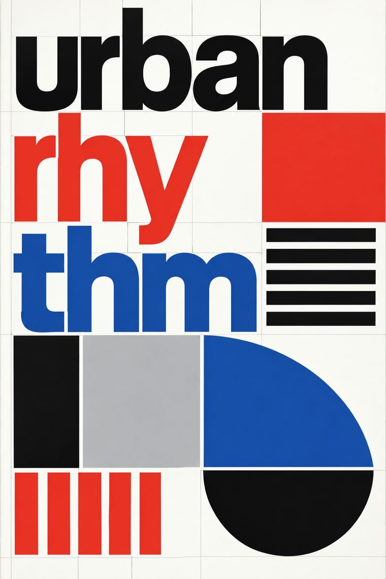
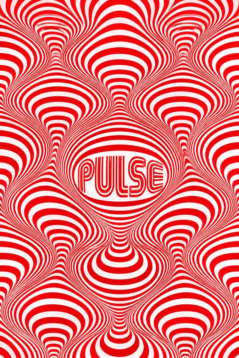
Line-built letters and op line fields share a module; layer them for vibrating posters that remain strictly systematic.
01
What each style brings
Each part of the design comes from the style with the stronger say in it, and each style gives at least two.
Total Design & Dutch Functionalism Op Art Graphics
- Type from Total Design
- Colour from Op Art Graphics
- Form from Total Design
- Composition from Op Art Graphics
- Surface from Total Design
02
The type
Open fonts standing in for each style’s own type, which is often hand-drawn or commercial.
Text · Op Art Graphics
A 1960s style that turned perceptual research into graphic effect: precisely drawn lines, checks, concentric rings and modular grids, usually black and white or complementaries of equal value, that seem to vibrate, swell or move. Rooted in Bauhaus form teaching through Vasarely and Albers and popularised by MoMA's 1965 'The Responsive Eye', it spread quickly into posters, record sleeves, fashion textiles and identities such as Mexico 68.
Jost; Op Art Graphics used Mexico 68 multiline lettering and Futura
03
The colours
The ground and leading colours come from Op Art Graphics, with a counter-accent from Total Design. The ink reads on the ground at 4.5:1 or more.
Total Design & Dutch Functionalism Op Art Graphics
-
#ffffffground · 36% -
#0a0a0aink · 14% -
#e3001baccent · 18% -
#e4352aaccent · 14% -
#0050b5accent · 10% -
#00a651accent · 8%
As CSS
:root {
  --ground: #ffffff;
  --ink: #0a0a0a;
  --accent-1: #e3001b;
  --accent-2: #e4352a;
  --accent-3: #0050b5;
  --accent-4: #00a651;
  --font-display: "Inter Tight", sans-serif;
  --font-text: "Jost", sans-serif;
}
04
The two styles
05
More combinations
With Total Design
- Cranbrook & Deconstructivist Typography Contrasts · Cranbrook's layered, reader-dependent pages invert Total Design's single impersonal reading; set one against the other to argue order versus interpretation.
- Bitmap & Pixel Graphics Pairs well · Crouwel's New Alphabet anticipated screen type; combine grid-drawn letters with pixel fonts for a historically grounded digital identity.
- Neo-Swiss Revival Pairs well · Neo-Swiss layouts gain edge by borrowing Total Design's exposed grid and module-built display letters.
- Zagreb Modernist Graphics (EXAT 51 to Teatar &TD) Contrasts · Both make an institution recognisable by its letters and grids, but Total Design applies one impersonal programme across clients, while on Picelj's gallery posters the unit changes with every artist shown and Arsovski breaks the order with collage, pop photographs and rebuses.
- Jeepney Art Contrasts · Systematic transit signage is the rational opposite of owner-by-owner jeepney lettering; contrast the two when designing public-transport identities.
- Nieuwe Kunst (Dutch Art Nouveau) Contrasts · Dutch design's later ornament-free grid against its own ornamental past: a filled, symmetrical batik cover beside a Crouwel layout in sans-serif on white makes the choice between pattern and pure information explicit.
- Dutch Expressive Postmodernism (Studio Dumbar & Hard Werken) Contrasts · The foil it was 'anti' to: Total Design's visible grid, one cool sans and white space against Hard Werken's and Dumbar's mismatched type, crude assemblage and shrieking colour. The same 1986 exhibition set them up as the two poles of Dutch design; quote one exposed grid inside a staged-photo poster to show the argument.
With Op Art Graphics
- Brazilian Concrete Design Pairs well · Start from concrete design's calm serial module, then introduce op distortions in one zone for controlled movement.
- Generative & Dynamic Identities Pairs well · Code op's progressive line modulation so an identity can animate and vary while staying perceptually striking.
- Ma & Wabi-sabi Aesthetics Contrasts · Wabi-sabi's quiet irregular textures are the antithesis of mechanical vibration; give one op element plenty of calm space to avoid visual fatigue.
- Psychedelic Poster Pairs well · Psychedelic posters borrowed op's vibrating colour edges; combine precise line fields with melting lettering for kinetic music graphics.
- Zagreb Modernist Graphics (EXAT 51 to Teatar &TD) Pairs well · The New Tendencies shows in Zagreb were one of op art's sources; take op's vibrating line fields and hold them inside Picelj's square module and small lowercase credit line for a gallery poster that stays systematic.
- Finnish Bold Print (Marimekko Modernism) Contrasts · Both fill a field edge to edge with one repeated module in the 1960s, but op art's ruled precision makes the eye vibrate while Finnish bold print keeps hand-cut edges and calm flat shapes; choose between perceptual shock and relaxed joy.
- Di Tella Graphic Design (Instituto Torcuato Di Tella) Pairs well · The CLAEM programmes and the Premio Di Tella 64 poster already speak Op; run one heavy grotesque title through an optical field, as Distéfano did, for an event that should vibrate.
- 2 Tone Graphics Pairs well · Let the checkerboard carry optical energy as border and ground around a flat figure.