Style combination · Contrasts
Total Design × Nieuwe Kunst
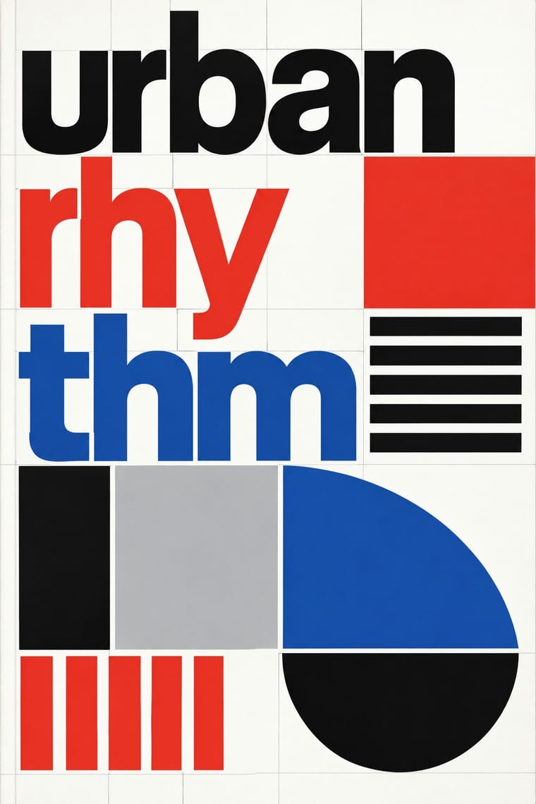
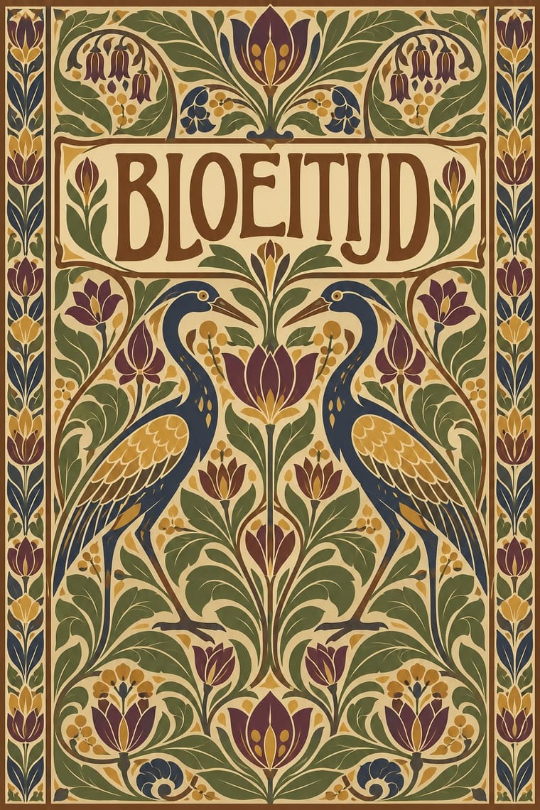
Dutch design's later ornament-free grid against its own ornamental past: a filled, symmetrical batik cover beside a Crouwel layout in sans-serif on white makes the choice between pattern and pure information explicit.
01
What each style brings
Each part of the design comes from the style with the stronger say in it, and each style gives at least two.
Total Design & Dutch Functionalism Nieuwe Kunst (Dutch Art Nouveau)
- Type from Total Design
-
Nieuwe Kunst avoids grotesque & neo-grotesque: this is where the two pull against each other, which is the point of the contrast.
- Colour from Total Design
- Form from Nieuwe Kunst
-
Total Design avoids abundant decoration and floral & vegetal: this is where the two pull against each other, which is the point of the contrast.
- Composition from Nieuwe Kunst
-
Total Design avoids central symmetry: this is where the two pull against each other, which is the point of the contrast.
- Surface from Nieuwe Kunst
02
The type
Open fonts standing in for each style’s own type, which is often hand-drawn or commercial.
Text · Nieuwe Kunst
The Dutch branch of Art Nouveau, seen mostly in book covers, vignettes and posters. Where Brussels and Paris let the line whip and swell, Dutch designers, from 1895 more and more on grids of triangles, built stylised plants and animals into flat, symmetrical repeats. They took Arts and Crafts ideals from England, and from the Dutch East Indies colony they took batik, which they used for covers in cotton, velvet and parchment. Jan Toorop's poster for Delftsche Slaolie (1894) gave the style its mocking nickname, the 'salad-oil style'.
EB Garamond; Nieuwe Kunst used Hand-drawn titles lettered into the decoration of covers and posters, such as Theo Nieuwenhuis's lettering, recognisable enough that Leiden University Libraries attribute a 1908 parchment binding to him on the strength of its typography and Klaas van Leeuwen, Letterboek voor den teekenaar en ambachtsman (1907), a lettering model book, geometric in concept, from the theosophical circle of De Bazel and Lauweriks
03
The colours
The ground and leading colours come from Total Design, with a counter-accent from Nieuwe Kunst. The ink reads on the ground at 4.5:1 or more.
Total Design & Dutch Functionalism Nieuwe Kunst (Dutch Art Nouveau)
-
#ffffffground · 36% -
#111111ink · 14% -
#e4352aaccent · 18% -
#c49a3aaccent · 14% -
#1e50a2accent · 10% -
#6e4426accent · 8%
As CSS
:root {
  --ground: #ffffff;
  --ink: #111111;
  --accent-1: #e4352a;
  --accent-2: #c49a3a;
  --accent-3: #1e50a2;
  --accent-4: #6e4426;
  --font-display: "Inter Tight", sans-serif;
  --font-text: "EB Garamond", serif;
}
Use it with care
Nieuwe Kunst (Dutch Art Nouveau): Nieuwe Kunst took batik and the look of wayang shadow puppets from Java under Dutch colonial rule, largely without naming Javanese makers; when you borrow its batik surfaces or puppet-like figures, credit batik as an Indonesian craft (UNESCO-listed since 2009) whose motifs can carry meaning, and do not present printed batik-look as wax-resist work.
04
The two styles
05
More combinations
With Total Design
- Cranbrook & Deconstructivist Typography Contrasts · Cranbrook's layered, reader-dependent pages invert Total Design's single impersonal reading; set one against the other to argue order versus interpretation.
- Bitmap & Pixel Graphics Pairs well · Crouwel's New Alphabet anticipated screen type; combine grid-drawn letters with pixel fonts for a historically grounded digital identity.
- Neo-Swiss Revival Pairs well · Neo-Swiss layouts gain edge by borrowing Total Design's exposed grid and module-built display letters.
- Op Art Graphics Pairs well · Line-built letters and op line fields share a module; layer them for vibrating posters that remain strictly systematic.
- Zagreb Modernist Graphics (EXAT 51 to Teatar &TD) Contrasts · Both make an institution recognisable by its letters and grids, but Total Design applies one impersonal programme across clients, while on Picelj's gallery posters the unit changes with every artist shown and Arsovski breaks the order with collage, pop photographs and rebuses.
- Jeepney Art Contrasts · Systematic transit signage is the rational opposite of owner-by-owner jeepney lettering; contrast the two when designing public-transport identities.
- Dutch Expressive Postmodernism (Studio Dumbar & Hard Werken) Contrasts · The foil it was 'anti' to: Total Design's visible grid, one cool sans and white space against Hard Werken's and Dumbar's mismatched type, crude assemblage and shrieking colour. The same 1986 exhibition set them up as the two poles of Dutch design; quote one exposed grid inside a staged-photo poster to show the argument.
With Nieuwe Kunst
- Vienna Secession Pairs well · Both pulled Art Nouveau toward geometry, symmetry and strict repetition in the same years; add Vienna's black, white and gold and its white margins to the Dutch earth-colour repeat for a more open page.
- Batik Pattern Tradition Pairs well · Its direct source: Dutch designers used wax-resist dyeing for covers in cotton, velvet and parchment; pair a constructed Nieuwe Kunst repeat with real batik colour layering, and credit the Javanese craft.
- Wendingen & Amsterdam School Typography Pairs well · Its Amsterdam successor kept the symmetry, the closed frame and the systematic construction (Lauweriks drew Wendingen's first cover) but traded plants and batik for heavy capitals built from brass rules; combine them for a vegetal pattern inside a monumental frame.
- Art Nouveau Contrasts · The same years and the same plants, but Mucha's whiplash and swelling figures move while the Dutch line is constructed on triangles and repeated flat; set one against the other to choose between a line that flows and a line that is built.
- Javanese Wayang Kulit (Tatah Sungging) Contrasts · Toorop's long-limbed figures, whose silhouettes evoke Javanese shadow puppets, borrowed the outline under Dutch colonial rule without its code; compare them with a puppet whose every feature names a character.