Style combination · Pairs well
Total Design × Neo-Swiss Revival
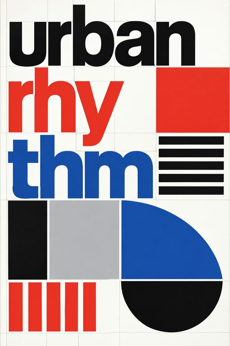
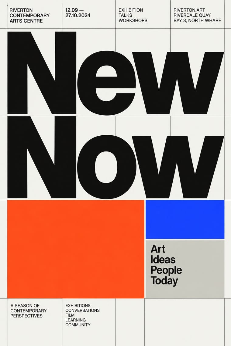
Neo-Swiss layouts gain edge by borrowing Total Design's exposed grid and module-built display letters.
01
What each style brings
Each part of the design comes from the style with the stronger say in it, and each style gives at least two.
Total Design & Dutch Functionalism Neo-Swiss Revival
- Type from Neo-Swiss Revival
- Colour from Total Design
- Form from Total Design
- Composition from Neo-Swiss Revival
- Surface from Neo-Swiss Revival
02
The type
Open fonts standing in for each style’s own type, which is often hand-drawn or commercial.
Display · Neo-Swiss Revival
Order
Inter Tight, standing in for Neue Haas Grotesk (Christian Schwartz revival)
Text · Total Design
The Dutch strand of systematic modernism took shape when Wim Crouwel, Benno Wissing, Friso Kramer and Paul and Dick Schwarz founded Total Design in Amsterdam in 1963 as the country's first multidisciplinary studio. It pushed Swiss grid logic towards the mechanical: visible grids, alphabets constructed on the same module as the page, and one cool, programmatic order applied to museums, airports and corporations alike.
Inter; Total Design used New Alphabet and Univers
03
The colours
The ground and leading colours come from Total Design, with a counter-accent from Neo-Swiss Revival. The ink reads on the ground at 4.5:1 or more.
Total Design & Dutch Functionalism Neo-Swiss Revival
-
#ffffffground · 36% -
#111111ink · 14% -
#e4352aaccent · 18% -
#1e50a2accent · 14% -
#1d3bffaccent · 10% -
#bdbdbdaccent · 8%
As CSS
:root {
  --ground: #ffffff;
  --ink: #111111;
  --accent-1: #e4352a;
  --accent-2: #1e50a2;
  --accent-3: #1d3bff;
  --accent-4: #bdbdbd;
  --font-display: "Inter Tight", sans-serif;
  --font-text: "Inter", sans-serif;
}
04
The two styles
05
More combinations
With Total Design
- Cranbrook & Deconstructivist Typography Contrasts · Cranbrook's layered, reader-dependent pages invert Total Design's single impersonal reading; set one against the other to argue order versus interpretation.
- Bitmap & Pixel Graphics Pairs well · Crouwel's New Alphabet anticipated screen type; combine grid-drawn letters with pixel fonts for a historically grounded digital identity.
- Op Art Graphics Pairs well · Line-built letters and op line fields share a module; layer them for vibrating posters that remain strictly systematic.
- Zagreb Modernist Graphics (EXAT 51 to Teatar &TD) Contrasts · Both make an institution recognisable by its letters and grids, but Total Design applies one impersonal programme across clients, while on Picelj's gallery posters the unit changes with every artist shown and Arsovski breaks the order with collage, pop photographs and rebuses.
- Jeepney Art Contrasts · Systematic transit signage is the rational opposite of owner-by-owner jeepney lettering; contrast the two when designing public-transport identities.
- Nieuwe Kunst (Dutch Art Nouveau) Contrasts · Dutch design's later ornament-free grid against its own ornamental past: a filled, symmetrical batik cover beside a Crouwel layout in sans-serif on white makes the choice between pattern and pure information explicit.
- Dutch Expressive Postmodernism (Studio Dumbar & Hard Werken) Contrasts · The foil it was 'anti' to: Total Design's visible grid, one cool sans and white space against Hard Werken's and Dumbar's mismatched type, crude assemblage and shrieking colour. The same 1986 exhibition set them up as the two poles of Dutch design; quote one exposed grid inside a staged-photo poster to show the argument.
With Neo-Swiss Revival
- Risograph & Indie Print Culture Pairs well · Print neo-Swiss posters in two riso spot inks to add grain and warmth to a strict grid.
- Acid Graphics / New Ugly Contrasts · Acid graphics' chrome chaos is the opposite pole; one liquid-metal element can puncture a too-polite grid.
- Brutalist Web Design Pairs well · Expose neo-Swiss grids with raw HTML defaults and visible borders for a stripped, contemporary web voice.
- Victorian Letterpress & Wood Type Contrasts · Victorian wood-type eclecticism is the history Swiss typography rejected; a single wood-type headline can warm a cold grid.
- Seoul Independent Graphic Design (Small-Studio Scene) Contrasts · The Seoul studios share Neo-Swiss's Dutch and Swiss roots (Mevis & Van Deursen, Jude Kang's studies in Switzerland, Favorit Hangul extending the Swiss foundry Dinamo's Favorit), but Neo-Swiss sets one Latin grotesque flush left on a modular grid, while the Seoul studios centre their text, repeat circles and letters as objects, and make Hangul, reshaped and set beside Latin, the main material.
- Blue Note Jazz Sleeve Modernism Contrasts · The atlas's nearest genome: both blow a grotesque up to fill the format on a white ground with one signal colour, but Swiss revival locks it to a modular grid, flush left, in one neo-grotesque; Blue Note crops and tints a documentary photograph, mixes in Ultra Bodoni and Clarendon, and squeezes, warps and runs words off the edge by eye. Choose Blue Note when the type should swing rather than align.
- Lucerne Poster Scene (Neubad & Südpol Posters) Contrasts · Neo-Swiss keeps the grotesque intact on a modular grid for identities and the web; Lucerne keeps the grotesque only for the small print and distorts the title itself, poster by poster. Choose neo-Swiss for a system, Lucerne for a one-off event.
- Emigre & Early Digital Type Contrasts · Neo-Swiss restraint is the foil to Emigre's typographic overload; one Emigre display face in a neo-Swiss layout adds personality.