Style combination · Pairs well
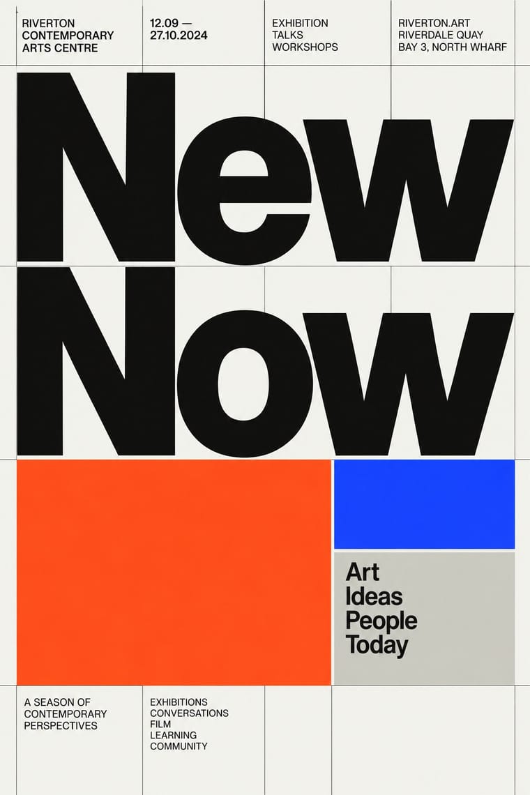
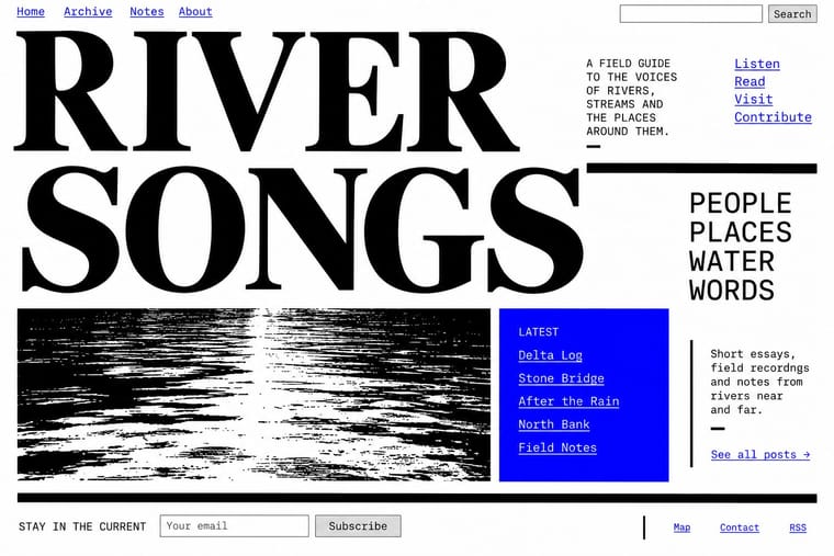
Neo-Swiss Revival × Brutalist Web Design
Expose neo-Swiss grids with raw HTML defaults and visible borders for a stripped, contemporary web voice.
Mix them and make something Neo-Swiss Revival Brutalist Web Design
01
What each style brings
Each part of the design comes from the style with the stronger say in it, and each style gives at least two.
Neo-Swiss Revival Brutalist Web Design
- Type from Neo-Swiss Revival
- Colour from Brutalist Web Design
- Form from Brutalist Web Design
- Composition from Neo-Swiss Revival
- Surface from Neo-Swiss Revival
02
The type
Open fonts standing in for each style’s own type, which is often hand-drawn or commercial.
Display · Neo-Swiss Revival
Order
Inter Tight, standing in for Neue Haas Grotesk (Christian Schwartz revival)
Text · Brutalist Web Design
A reaction against templated, conversion-optimised web design that exposes the raw materials of the browser: default system fonts, blue underlined links, visible borders, unstyled forms and plain document flow. Named after architectural Brutalism by Pascal Deville's survey site brutalistwebsites.com (2014), it ranges from functional austerity to deliberately abrasive antidesign.
Courier Prime; Brutalist Web Design used Times New Roman and Courier New and system monospace
03
The colours
The ground and leading colours come from Brutalist Web Design, with a counter-accent from Neo-Swiss Revival. The ink reads on the ground at 4.5:1 or more.
Neo-Swiss Revival Brutalist Web Design
-
#ffffffground · 36% -
#000000ink · 14% -
#ff0000accent · 18% -
#ff4a1caccent · 14% -
#0000eeaccent · 10% -
#1d3bffaccent · 8%
As CSS
:root {
  --ground: #ffffff;
  --ink: #000000;
  --accent-1: #ff0000;
  --accent-2: #ff4a1c;
  --accent-3: #0000ee;
  --accent-4: #1d3bff;
  --font-display: "Inter Tight", sans-serif;
  --font-text: "Courier Prime", monospace;
}
04
The two styles
05
More combinations
With Neo-Swiss Revival
- Risograph & Indie Print Culture Pairs well · Print neo-Swiss posters in two riso spot inks to add grain and warmth to a strict grid.
- Acid Graphics / New Ugly Contrasts · Acid graphics' chrome chaos is the opposite pole; one liquid-metal element can puncture a too-polite grid.
- Victorian Letterpress & Wood Type Contrasts · Victorian wood-type eclecticism is the history Swiss typography rejected; a single wood-type headline can warm a cold grid.
- Seoul Independent Graphic Design (Small-Studio Scene) Contrasts · The Seoul studios share Neo-Swiss's Dutch and Swiss roots (Mevis & Van Deursen, Jude Kang's studies in Switzerland, Favorit Hangul extending the Swiss foundry Dinamo's Favorit), but Neo-Swiss sets one Latin grotesque flush left on a modular grid, while the Seoul studios centre their text, repeat circles and letters as objects, and make Hangul, reshaped and set beside Latin, the main material.
- Blue Note Jazz Sleeve Modernism Contrasts · The atlas's nearest genome: both blow a grotesque up to fill the format on a white ground with one signal colour, but Swiss revival locks it to a modular grid, flush left, in one neo-grotesque; Blue Note crops and tints a documentary photograph, mixes in Ultra Bodoni and Clarendon, and squeezes, warps and runs words off the edge by eye. Choose Blue Note when the type should swing rather than align.
- Lucerne Poster Scene (Neubad & Südpol Posters) Contrasts · Neo-Swiss keeps the grotesque intact on a modular grid for identities and the web; Lucerne keeps the grotesque only for the small print and distorts the title itself, poster by poster. Choose neo-Swiss for a system, Lucerne for a one-off event.
- Emigre & Early Digital Type Contrasts · Neo-Swiss restraint is the foil to Emigre's typographic overload; one Emigre display face in a neo-Swiss layout adds personality.
- Swiss Punk / New Wave Typography Pairs well · Borrow New Wave's letterspacing and stepped lines to make a contemporary neo-Swiss grid feel alive.
With Brutalist Web Design
- International Typographic Style Pairs well · Pair raw HTML with a strict Swiss grid and one grotesque so brutalism reads as intentional rather than broken.
- Glassmorphism Contrasts · Glass's layered translucency is everything brutalism strips away; use the contrast to decide how much polish a product really needs.
- Corporate Memphis Contrasts · Corporate Memphis is the friendly corporate gloss brutalism rejects; quote it ironically to sharpen a critique.
- Punk & DIY Zine Pairs well · Borrow zine cut-and-paste attitude: collide screenshots, default fonts and scrawled notes on one page.
- Frutiger Aero Contrasts · Raw HTML against bubbly gloss is a sharp foil for ironic or nostalgic web projects.
- Glitch Art & Datamosh Graphics Pairs well · Both put the machinery on show; set corrupted images on a raw-HTML page of default fonts so the code and the broken pictures make one argument about the medium.
- Internet Ugly & Meme Vernacular Pairs well · Put MS Paint drawings and image macros on a raw-HTML page of default fonts and blue links; both treat software defaults as honesty rather than lack of taste.
- Flash-Era Web Design (Flash Portfolio Sites) Contrasts · Raw, static HTML defaults against the fully art-directed animated stage.