Style combination · Contrasts
Lucerne Poster Scene × Neo-Swiss Revival
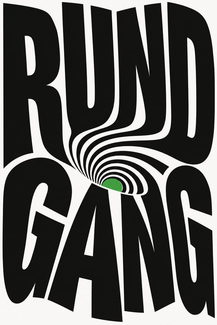
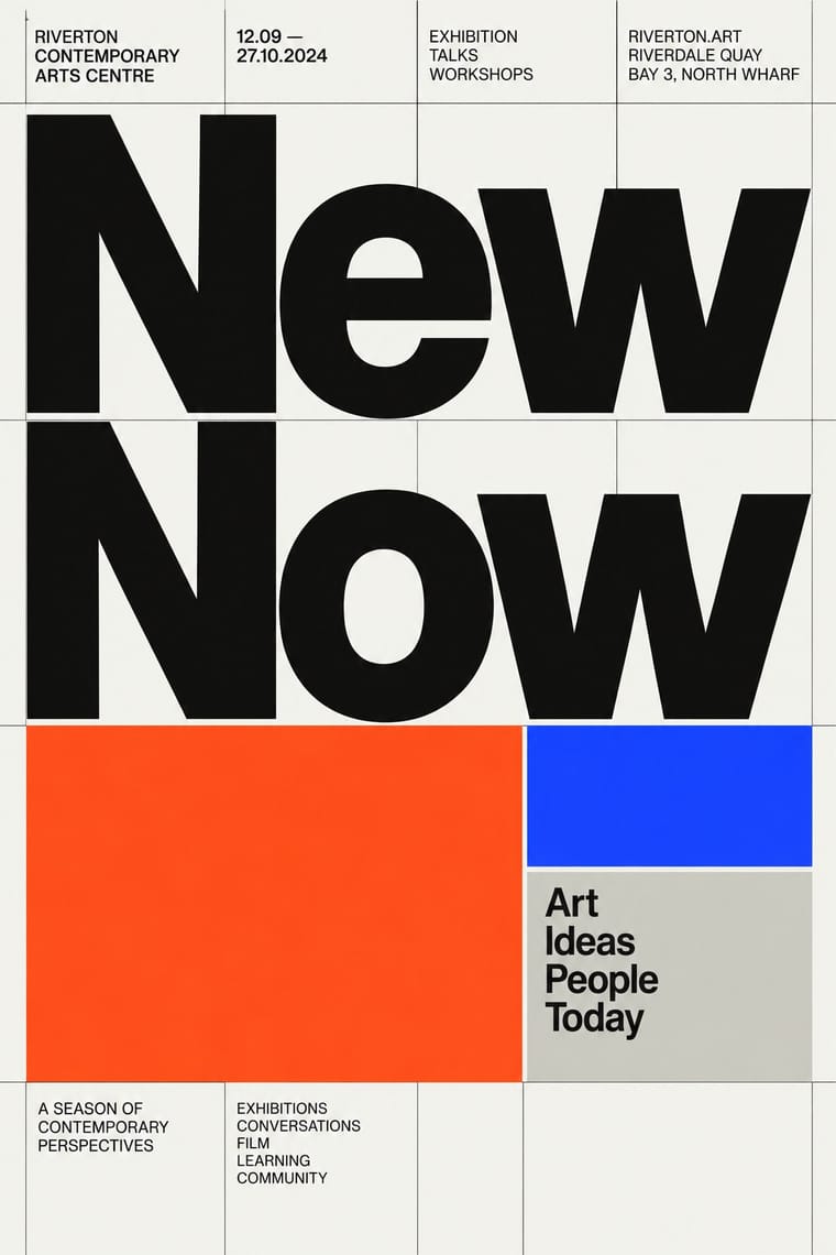
Neo-Swiss keeps the grotesque intact on a modular grid for identities and the web; Lucerne keeps the grotesque only for the small print and distorts the title itself, poster by poster. Choose neo-Swiss for a system, Lucerne for a one-off event.
Mix them and make something Lucerne Poster Scene Neo-Swiss Revival
01
What each style brings
Each part of the design comes from the style with the stronger say in it, and each style gives at least two.
Lucerne Poster Scene (Neubad & Südpol Posters) Neo-Swiss Revival
- Type from Neo-Swiss Revival
- Colour from Neo-Swiss Revival
- Form from Lucerne Poster Scene
- Composition from Lucerne Poster Scene
- Surface from Lucerne Poster Scene
02
The type
Open fonts standing in for each style’s own type, which is often hand-drawn or commercial.
Display · Neo-Swiss Revival
Grid
Inter Tight, standing in for Neue Haas Grotesk (Christian Schwartz revival)
Text · Lucerne Poster Scene
Lucerne's poster culture for small non-commercial venues (Südpol, Neubad, Treibhaus) and the Weltformat festival. Each event gets a one-off poster, most often with the title as the picture: letters built, twisted or warped into one optical motif. Neubad's posters are black and white only; Felix Pfäffli's Südpol series (2010–2015) added Risograph colour. The scene rests on local designers' exchange, fostered by Brechbühl through Weltformat (co-founded 2009) and the Show & Tell meetings (2012); in 2015, 26 of the 100 best posters from Germany, Austria and Switzerland came from the Lucerne area.
Space Grotesk; Lucerne Poster Scene used Letters constructed or distorted for each poster and The Südpol typeface drawn by Erich Brechbühl in 2008 from the letterforms of the signage of the old slaughterhouse, used for the SÜDPOL wordmark that recurs, in varying positions, on the Südpol posters
03
The colours
The ground and leading colours come from Neo-Swiss Revival, with a counter-accent from Lucerne Poster Scene. The ink reads on the ground at 4.5:1 or more.
Lucerne Poster Scene (Neubad & Südpol Posters) Neo-Swiss Revival
-
#f5f5f0ground · 36% -
#111111ink · 14% -
#ff4a1caccent · 18% -
#ff415baccent · 14% -
#1d3bffaccent · 10% -
#744dc9accent · 8%
As CSS
:root {
  --ground: #f5f5f0;
  --ink: #111111;
  --accent-1: #ff4a1c;
  --accent-2: #ff415b;
  --accent-3: #1d3bff;
  --accent-4: #744dc9;
  --font-display: "Inter Tight", sans-serif;
  --font-text: "Space Grotesk", sans-serif;
}
04
The two styles
05
More combinations
With Lucerne Poster Scene
- Polish Poster School Contrasts · Another cultural-venue poster culture of one idea per sheet, but painted and hand-lettered as a metaphor; Lucerne builds the idea from the letters and optical effects on the computer. Borrow the Polish wit, not the brush.
- Op Art Graphics Pairs well · The Neubad's black-and-white rule led Brechbühl straight to Op Art for The Notwist; take Op's vibrating line fields and checks, but bend them into the letters of the title instead of filling the sheet with pattern alone.
- Di Tella Graphic Design (Instituto Torcuato Di Tella) Pairs well · Both make the event title an optical picture for a small cultural institution under tight means; add the Di Tella's one or two flat inks and blunt grotesque to a Lucerne letter construction for a sterner, more 1960s sheet.
- Kinetic Typography & Variable Type Pairs well · Lucerne's twisted and warped letters are already halfway to motion (The Notwist also ran as an animated poster); animate the construction for screens while keeping the printed F4 as the still.
- Screenprinted Gig & Alt-Movie Poster Contrasts · Gig posters are illustrated editions made for collectors; Lucerne's concert posters are mostly typographic, made for the city's walls and small venue runs. Use the contrast to decide between picture and title.
With Neo-Swiss Revival
- Risograph & Indie Print Culture Pairs well · Print neo-Swiss posters in two riso spot inks to add grain and warmth to a strict grid.
- Acid Graphics / New Ugly Contrasts · Acid graphics' chrome chaos is the opposite pole; one liquid-metal element can puncture a too-polite grid.
- Brutalist Web Design Pairs well · Expose neo-Swiss grids with raw HTML defaults and visible borders for a stripped, contemporary web voice.
- Victorian Letterpress & Wood Type Contrasts · Victorian wood-type eclecticism is the history Swiss typography rejected; a single wood-type headline can warm a cold grid.
- Seoul Independent Graphic Design (Small-Studio Scene) Contrasts · The Seoul studios share Neo-Swiss's Dutch and Swiss roots (Mevis & Van Deursen, Jude Kang's studies in Switzerland, Favorit Hangul extending the Swiss foundry Dinamo's Favorit), but Neo-Swiss sets one Latin grotesque flush left on a modular grid, while the Seoul studios centre their text, repeat circles and letters as objects, and make Hangul, reshaped and set beside Latin, the main material.
- Blue Note Jazz Sleeve Modernism Contrasts · The atlas's nearest genome: both blow a grotesque up to fill the format on a white ground with one signal colour, but Swiss revival locks it to a modular grid, flush left, in one neo-grotesque; Blue Note crops and tints a documentary photograph, mixes in Ultra Bodoni and Clarendon, and squeezes, warps and runs words off the edge by eye. Choose Blue Note when the type should swing rather than align.
- Emigre & Early Digital Type Contrasts · Neo-Swiss restraint is the foil to Emigre's typographic overload; one Emigre display face in a neo-Swiss layout adds personality.
- Swiss Punk / New Wave Typography Pairs well · Borrow New Wave's letterspacing and stepped lines to make a contemporary neo-Swiss grid feel alive.