Style combination · Pairs well
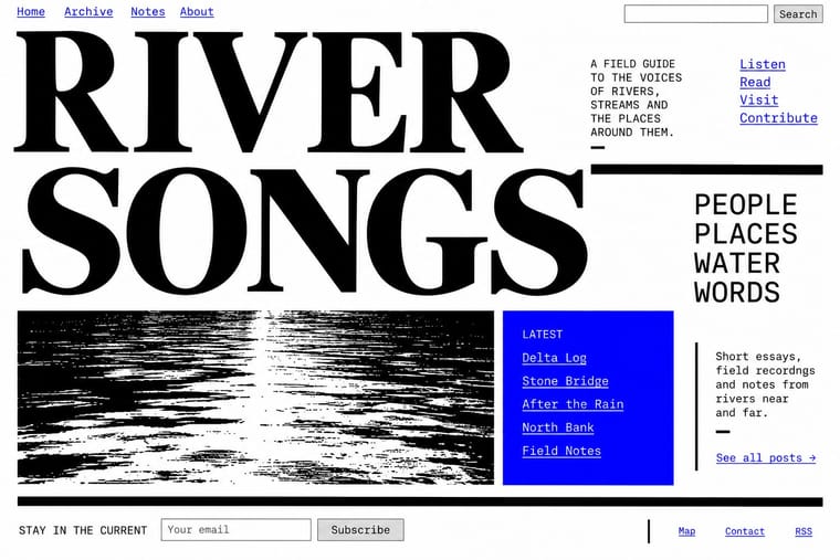
Internet Ugly × Brutalist Web Design
Put MS Paint drawings and image macros on a raw-HTML page of default fonts and blue links; both treat software defaults as honesty rather than lack of taste.
Mix them and make something Internet Ugly Brutalist Web Design
01
What each style brings
Each part of the design comes from the style with the stronger say in it, and each style gives at least two.
Internet Ugly & Meme Vernacular Brutalist Web Design
- Type from Internet Ugly
- Colour from Brutalist Web Design
- Form from Brutalist Web Design
- Composition from Internet Ugly
- Surface from Internet Ugly
02
The type
Open fonts standing in for each style’s own type, which is often hand-drawn or commercial.
Display · Internet Ugly
Loud
Anton, standing in for Impact (Geoffrey Lee, Stephenson Blake, 1965), set white with a black outline
Text · Brutalist Web Design
A reaction against templated, conversion-optimised web design that exposes the raw materials of the browser: default system fonts, blue underlined links, visible borders, unstyled forms and plain document flow. Named after architectural Brutalism by Pascal Deville's survey site brutalistwebsites.com (2014), it ranges from functional austerity to deliberately abrasive antidesign.
Courier Prime; Brutalist Web Design used Times New Roman and Courier New and system monospace
03
The colours
The ground and leading colours come from Brutalist Web Design, with a counter-accent from Internet Ugly. The ink reads on the ground at 4.5:1 or more.
Internet Ugly & Meme Vernacular Brutalist Web Design
-
#ffffffground · 36% -
#000000ink · 14% -
#ff0000accent · 18% -
#00a2e8accent · 14% -
#0000eeaccent · 10% -
#ff7f27accent · 8%
As CSS
:root {
  --ground: #ffffff;
  --ink: #000000;
  --accent-1: #ff0000;
  --accent-2: #00a2e8;
  --accent-3: #0000ee;
  --accent-4: #ff7f27;
  --font-display: "Anton", sans-serif;
  --font-text: "Courier Prime", monospace;
}
Use it with care
Internet Ugly & Meme Vernacular: Most meme templates are photographs of real people, often children, or licensed stock. Success Kid is Laney Griner's son: the photo has been licensed to advertisers, and in January 2020 she sent a cease-and-desist letter to a congressman whose fundraising campaign used it without permission. Distracted Boyfriend is microstock, and its photographer says use without a proper licence is not allowed. License a template or make a new picture for commercial or political work. Check what a format means now: some characters that spread through 4chan were taken up as hate symbols (the ADL listed Pepe the Frog, Matt Furie's 2005 Boy's Club character, in 2016, while noting that most uses are not hateful). Reaction images of Black people posted by non-Black users and brands read as digital blackface (Lauren Michele Jackson, Teen Vogue, 2017), and deep-fried memes came out of Black Twitter, so credit where formats come from. When brands and campaigns borrow a format, its makers often protest or drop it (Douglas).
04
The two styles
05
More combinations
With Internet Ugly
- Punk & DIY Zine Pairs well · Both make amateur, cheap reproduction a stance; combine ransom-note cut-ups with Impact captions and crude pasted photos for zine-style posters that still read as a joke.
- International Typographic Style Contrasts · Drop one rage face or Impact caption into a strict Swiss grid to show how much of design's authority comes from polish.
- Acid Graphics / New Ugly Contrasts · Acid Graphics' 'New Ugly' is rendered by professionals in chrome and 3D; Internet Ugly is ugly because it is quick and amateur. Decide which kind of ugly a brief needs before borrowing either.
- Corporate Memphis Contrasts · Brand-safe flat illustration is what meme makers mock; a brand that borrows meme templates risks the backlash Douglas describes, as communities drop co-opted formats.
- Indie Sleaze Pairs well · Both live on casual web platforms and refuse polish; Indie Sleaze takes the music-scene snapshot where Internet Ugly takes meme vernacular.
- Instagram Slideshow Activism (Social-Justice Infographics) Contrasts · The meme vernacular is its ironic other and the language of its parodies: crude, found and knowing where the slideshow is polished and sincere.
- 'Good Morning' Greeting Images (WhatsApp Forward Vernacular) Contrasts · The same forwarding networks with the opposite intent: borrow the meme's speed and template logic, and even its jokes, but keep the greeting affectionate rather than ironic.
- Forum Signature Art (Sig & C4D Render Graphics) Contrasts · The crude, ironic meme dialect of the same forums; sig art aims at the opposite, a slick and earnest technical finish.
With Brutalist Web Design
- International Typographic Style Pairs well · Pair raw HTML with a strict Swiss grid and one grotesque so brutalism reads as intentional rather than broken.
- Glassmorphism Contrasts · Glass's layered translucency is everything brutalism strips away; use the contrast to decide how much polish a product really needs.
- Corporate Memphis Contrasts · Corporate Memphis is the friendly corporate gloss brutalism rejects; quote it ironically to sharpen a critique.
- Punk & DIY Zine Pairs well · Borrow zine cut-and-paste attitude: collide screenshots, default fonts and scrawled notes on one page.
- Frutiger Aero Contrasts · Raw HTML against bubbly gloss is a sharp foil for ironic or nostalgic web projects.
- Glitch Art & Datamosh Graphics Pairs well · Both put the machinery on show; set corrupted images on a raw-HTML page of default fonts so the code and the broken pictures make one argument about the medium.
- Flash-Era Web Design (Flash Portfolio Sites) Contrasts · Raw, static HTML defaults against the fully art-directed animated stage.
- Material Design Contrasts · Where Material hides structure behind polished components, brutalism exposes it; one raw, default-styled element signals 'under the hood' in a polished product.