Style combination · Contrasts
Frutiger Aero × Brutalist Web Design
Raw HTML against bubbly gloss is a sharp foil for ironic or nostalgic web projects.
Mix them and make something Frutiger Aero Brutalist Web Design
01
What each style brings
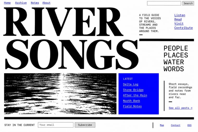
Each part of the design comes from the style with the stronger say in it, and each style gives at least two.
Frutiger Aero Brutalist Web Design
- Type from Frutiger Aero
- Colour from Brutalist Web Design
- Form from Brutalist Web Design
- Composition from Frutiger Aero
- Surface from Frutiger Aero
-
Brutalist Web Design avoids gloss & highlights and frosted glass: this is where the two pull against each other, which is the point of the contrast.
02
The type
Open fonts standing in for each style’s own type, which is often hand-drawn or commercial.
Text · Brutalist Web Design
A reaction against templated, conversion-optimised web design that exposes the raw materials of the browser: default system fonts, blue underlined links, visible borders, unstyled forms and plain document flow. Named after architectural Brutalism by Pascal Deville's survey site brutalistwebsites.com (2014), it ranges from functional austerity to deliberately abrasive antidesign.
Courier Prime; Brutalist Web Design used Times New Roman and Courier New and system monospace
03
The colours
The ground and leading colours come from Brutalist Web Design, with a counter-accent from Frutiger Aero. The ink reads on the ground at 4.5:1 or more.
Frutiger Aero Brutalist Web Design
-
#ffffffground · 36% -
#000000ink · 14% -
#ff0000accent · 18% -
#22c3c9accent · 14% -
#0000eeaccent · 10% -
#4fb3e8accent · 8%
As CSS
:root {
  --ground: #ffffff;
  --ink: #000000;
  --accent-1: #ff0000;
  --accent-2: #22c3c9;
  --accent-3: #0000ee;
  --accent-4: #4fb3e8;
  --font-display: "Fira Sans", sans-serif;
  --font-text: "Courier Prime", monospace;
}
04
The two styles
05
More combinations
With Frutiger Aero
- Vaporwave Pairs well · Both trade on mid-2000s tech nostalgia; mix Aero bubbles and skies with vaporwave's pastel 3D for retro-internet campaigns.
- Glassmorphism Pairs well · Glassmorphism is its flatter heir; reintroduce a touch of Aero gloss and nature photography to warm up frosted-glass UI.
- Flat Design Contrasts · Flat design was the reaction that ended it; toggle gloss against flat to signal ‘then and now’ in retro tech work.
- Forum Signature Art (Sig & C4D Render Graphics) Contrasts · The same years' glossy, light and airy interface look against the sig's dark, smudged depth.
- Skeuomorphic UI Pairs well · Share gloss and depth; combine Aero's glass and nature with skeuomorphic objects for convincing 2000s-nostalgia interfaces.
- Punk & DIY Zine Contrasts · Glossy optimism is everything punk rejects; one torn xerox fragment on an aero gradient reads as instant sabotage.
- Solarpunk Contrasts · Both pair green nature with optimistic technology, but Aero renders it as glossy stock photography, bubbles and glass for a product; choose solarpunk for painted, handmade, lived-in places and shared infrastructure.
- Glitch Art & Datamosh Graphics Contrasts · Aero's glossy, seamless interface is the frictionless technology glitch art questions; corrupt one Aero-style screen to show what the gloss hides.
With Brutalist Web Design
- International Typographic Style Pairs well · Pair raw HTML with a strict Swiss grid and one grotesque so brutalism reads as intentional rather than broken.
- Glassmorphism Contrasts · Glass's layered translucency is everything brutalism strips away; use the contrast to decide how much polish a product really needs.
- Corporate Memphis Contrasts · Corporate Memphis is the friendly corporate gloss brutalism rejects; quote it ironically to sharpen a critique.
- Punk & DIY Zine Pairs well · Borrow zine cut-and-paste attitude: collide screenshots, default fonts and scrawled notes on one page.
- Glitch Art & Datamosh Graphics Pairs well · Both put the machinery on show; set corrupted images on a raw-HTML page of default fonts so the code and the broken pictures make one argument about the medium.
- Internet Ugly & Meme Vernacular Pairs well · Put MS Paint drawings and image macros on a raw-HTML page of default fonts and blue links; both treat software defaults as honesty rather than lack of taste.
- Flash-Era Web Design (Flash Portfolio Sites) Contrasts · Raw, static HTML defaults against the fully art-directed animated stage.
- Material Design Contrasts · Where Material hides structure behind polished components, brutalism exposes it; one raw, default-styled element signals 'under the hood' in a polished product.