Style combination · Contrasts
Blue Note Jazz Sleeve Modernism × Neo-Swiss Revival
The atlas's nearest genome: both blow a grotesque up to fill the format on a white ground with one signal colour, but Swiss revival locks it to a modular grid, flush left, in one neo-grotesque; Blue Note crops and tints a documentary photograph, mixes in Ultra Bodoni and Clarendon, and squeezes, warps and runs words off the edge by eye. Choose Blue Note when the type should swing rather than align.
Mix them and make something Blue Note Jazz Sleeve Modernism Neo-Swiss Revival
01
What each style brings
Each part of the design comes from the style with the stronger say in it, and each style gives at least two.
Blue Note Jazz Sleeve Modernism Neo-Swiss Revival
- Type from Neo-Swiss Revival
- Colour from Blue Note Jazz Sleeve Modernism
- Form from Neo-Swiss Revival
- Composition from Blue Note Jazz Sleeve Modernism
- Surface from Blue Note Jazz Sleeve Modernism
02
The type
Open fonts standing in for each style’s own type, which is often hand-drawn or commercial.
Display · Neo-Swiss Revival
Order
Inter Tight, standing in for Neue Haas Grotesk (Christian Schwartz revival)
Text · Blue Note Jazz Sleeve Modernism
The record-sleeve language of Blue Note Records, set by art director Reid Miles, who designed some 350 twelve-inch LP covers between about 1956 and 1967, often around Francis Wolff's session photographs. With what Miles called 'one or two colors to work with', he tinted and cropped black-and-white photographs, ran flat bands of colour, and set titles huge in grotesques, slabs and fat faces that are stacked, squeezed, repeated or cut off by the edge. It made mid-century American modernism a serial system of photograph and type for one square format.
Archivo; Blue Note Jazz Sleeve Modernism used Trade Gothic and Trade Gothic Extended and Ultra Bodoni
03
The colours
The ground and leading colours come from Blue Note Jazz Sleeve Modernism, with a counter-accent from Neo-Swiss Revival. The ink reads on the ground at 4.5:1 or more.
Blue Note Jazz Sleeve Modernism Neo-Swiss Revival
-
#f3efe2ground · 36% -
#0d0d0dink · 14% -
#e4532aaccent · 18% -
#d19a39accent · 14% -
#1d3bffaccent · 10% -
#0b50a1accent · 8%
As CSS
:root {
  --ground: #f3efe2;
  --ink: #0d0d0d;
  --accent-1: #e4532a;
  --accent-2: #d19a39;
  --accent-3: #1d3bff;
  --accent-4: #0b50a1;
  --font-display: "Inter Tight", sans-serif;
  --font-text: "Archivo", sans-serif;
}
Use it with care
Blue Note Jazz Sleeve Modernism: The covers, Wolff's photographs, the Blue Note name and its oval logo are still owned and reissued by the label. Borrow the system (one tint, a hard crop, one giant word), never a particular sleeve, the label's logo or its catalogue-number line, and never present a new design as a Blue Note release. The photographs record named Black musicians at work: photograph or license your own named subject, or crop to an instrument, hands or an object, rather than inventing a generic Black jazz musician as period decor for 'cool'. Do not copy the generic 'tribal' pictograms of Afro-Cuban (1957) as shorthand for music of the African diaspora.
04
The two styles
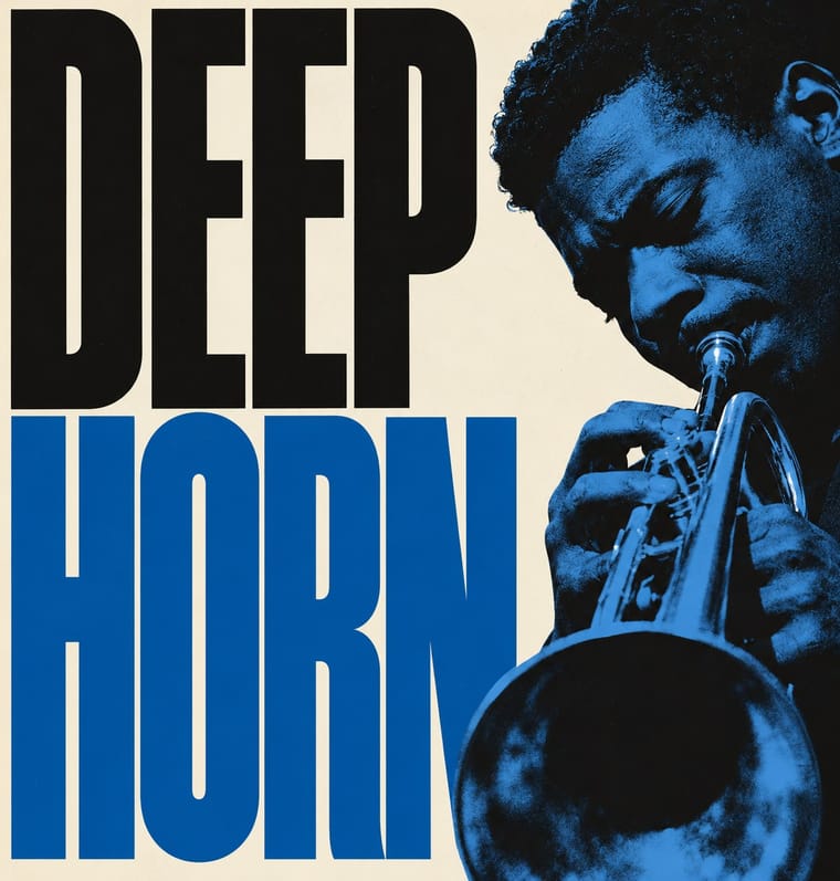
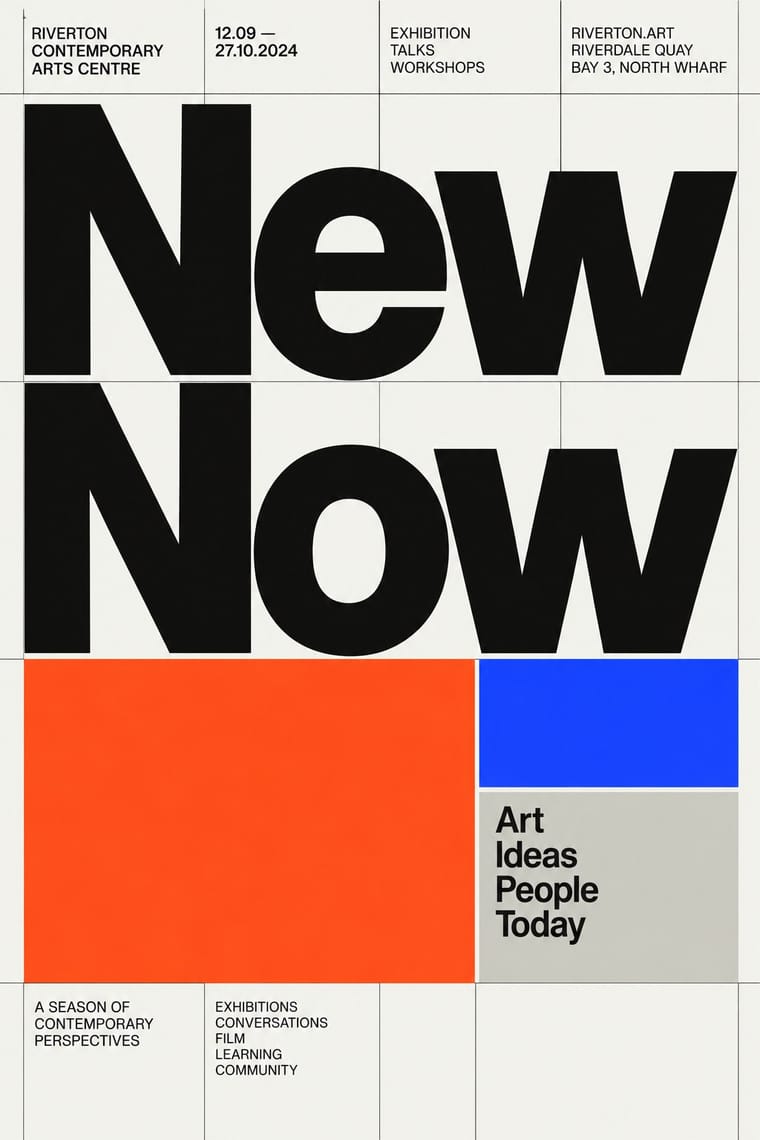
05
More combinations
With Blue Note Jazz Sleeve Modernism
- Push Pin Style Contrasts · Same city and years, opposite method: Push Pin draws figures and revives Victorian display letters, while Blue Note crops a photograph and sets one grotesque huge.
- International Typographic Style Pairs well · Both rest on grotesque type, white grounds and asymmetric balance; add Blue Note's tinted, hard-cropped photograph, a fat Bodoni or Clarendon, and type blown up past the edge to loosen a Swiss layout.
- Risograph & Indie Print Culture Pairs well · Riso's two-ink duotones reproduce a Miles-style tinted photograph honestly, which makes the pair a natural fit for small-run gig posters and record sleeves today.
- Afrobeat Sleeve Art Contrasts · The same twelve-inch square used two ways: Lemi Ghariokwu packs it with painted, captioned satire, Reid Miles empties it to one photograph, one colour and one giant word.
- Drum Magazine & Sophiatown Photojournalism Pairs well · Two 1950s ways of picturing jazz musicians in black-and-white photographs with condensed capitals; take Blue Note's single giant word and one tint for a calmer, more modernist Drum page.
- Phototype Expressive Typography (Lubalin & U&lc) Pairs well · Same New York years and the same belief that the title can be the picture; give a Miles-style tinted photograph a Lubalin logotype whose letters touch and interlock instead of a plain blown-up grotesque.
- Fania and Nuyorican Salsa LP Sleeves Contrasts · Cool restraint, cropped photography and grotesque type against salsa's loud crowded frontality.
- Bossa Nova Sleeve Modernism (César Villela and Elenco) Contrasts · The parent: Egeu Laus traces the first bossa-nova covers at Odeon to American jazz sleeves, and Vidal (2008) calls Reid Miles's Blue Note the main source of Elenco's covers too (compare Baden Powell à Vontade with Miles and Andy Warhol's line-drawn guitarist on Blue Note's Kenny Burrell), though Villela and Pereira denied it and blamed the economy on lack of money; Villela is often called the Brazilian Reid Miles. Both run a label's covers as a serial system of one or two inks and treated photographs of the players. Miles fills the square with a tinted, hard-cropped, often full-bleed photograph and flat colour bands, sometimes on black; Villela empties it to white, cuts the figure out and uses red only as a placed beat. Choose Elenco when the sleeve should breathe rather than shout.
With Neo-Swiss Revival
- Risograph & Indie Print Culture Pairs well · Print neo-Swiss posters in two riso spot inks to add grain and warmth to a strict grid.
- Acid Graphics / New Ugly Contrasts · Acid graphics' chrome chaos is the opposite pole; one liquid-metal element can puncture a too-polite grid.
- Brutalist Web Design Pairs well · Expose neo-Swiss grids with raw HTML defaults and visible borders for a stripped, contemporary web voice.
- Victorian Letterpress & Wood Type Contrasts · Victorian wood-type eclecticism is the history Swiss typography rejected; a single wood-type headline can warm a cold grid.
- Seoul Independent Graphic Design (Small-Studio Scene) Contrasts · The Seoul studios share Neo-Swiss's Dutch and Swiss roots (Mevis & Van Deursen, Jude Kang's studies in Switzerland, Favorit Hangul extending the Swiss foundry Dinamo's Favorit), but Neo-Swiss sets one Latin grotesque flush left on a modular grid, while the Seoul studios centre their text, repeat circles and letters as objects, and make Hangul, reshaped and set beside Latin, the main material.
- Lucerne Poster Scene (Neubad & Südpol Posters) Contrasts · Neo-Swiss keeps the grotesque intact on a modular grid for identities and the web; Lucerne keeps the grotesque only for the small print and distorts the title itself, poster by poster. Choose neo-Swiss for a system, Lucerne for a one-off event.
- Emigre & Early Digital Type Contrasts · Neo-Swiss restraint is the foil to Emigre's typographic overload; one Emigre display face in a neo-Swiss layout adds personality.
- Swiss Punk / New Wave Typography Pairs well · Borrow New Wave's letterspacing and stepped lines to make a contemporary neo-Swiss grid feel alive.