Style combination · Contrasts
Glassmorphism × Brutalist Web Design
Glass's layered translucency is everything brutalism strips away; use the contrast to decide how much polish a product really needs.
Brutalism's opaque, bordered boxes are the antidote when stacked translucency starts to hurt legibility.
Mix them and make something Glassmorphism Brutalist Web Design
01
What each style brings
Each part of the design comes from the style with the stronger say in it, and each style gives at least two.
Glassmorphism Brutalist Web Design
- Type from Brutalist Web Design
- Colour from Brutalist Web Design
- Form from Glassmorphism
-
Brutalist Web Design avoids rounded & pill: this is where the two pull against each other, which is the point of the contrast.
- Composition from Glassmorphism
-
Brutalist Web Design avoids illusion of depth: this is where the two pull against each other, which is the point of the contrast.
- Surface from Glassmorphism
-
Brutalist Web Design avoids frosted glass: this is where the two pull against each other, which is the point of the contrast.
02
The type
Open fonts standing in for each style’s own type, which is often hand-drawn or commercial.
Display · Brutalist Web Design
No!
Newsreader; Brutalist Web Design used Times New Roman and Courier New and system monospace
Text · Glassmorphism
An interface style of translucent, frosted panels floating over vivid, blurred backgrounds, so that depth and hierarchy come from layered transparency. Rooted in Windows Aero glass, the blur layers of iOS 7 and Fluent Design's Acrylic, it was named in 2020 around the launch of macOS Big Sur and returned in 2025 as Apple's refractive Liquid Glass.
Inter; Glassmorphism used SF Pro and Segoe UI Variable
03
The colours
The ground and leading colours come from Brutalist Web Design, with a counter-accent from Glassmorphism. The ink reads on the ground at 4.5:1 or more.
Glassmorphism Brutalist Web Design
-
#ffffffground · 36% -
#000000ink · 14% -
#ff0000accent · 18% -
#2cb1fcaccent · 14% -
#0000eeaccent · 10% -
#7f5af0accent · 8%
As CSS
:root {
  --ground: #ffffff;
  --ink: #000000;
  --accent-1: #ff0000;
  --accent-2: #2cb1fc;
  --accent-3: #0000ee;
  --accent-4: #7f5af0;
  --font-display: "Newsreader", serif;
  --font-text: "Inter", sans-serif;
}
04
The two styles
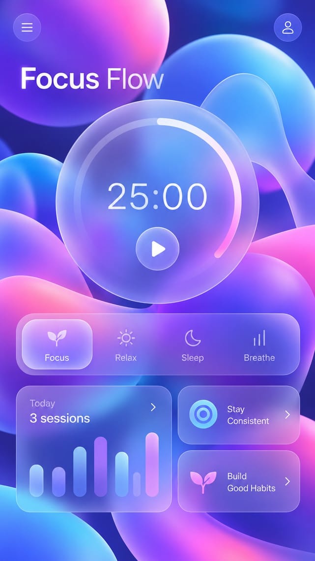
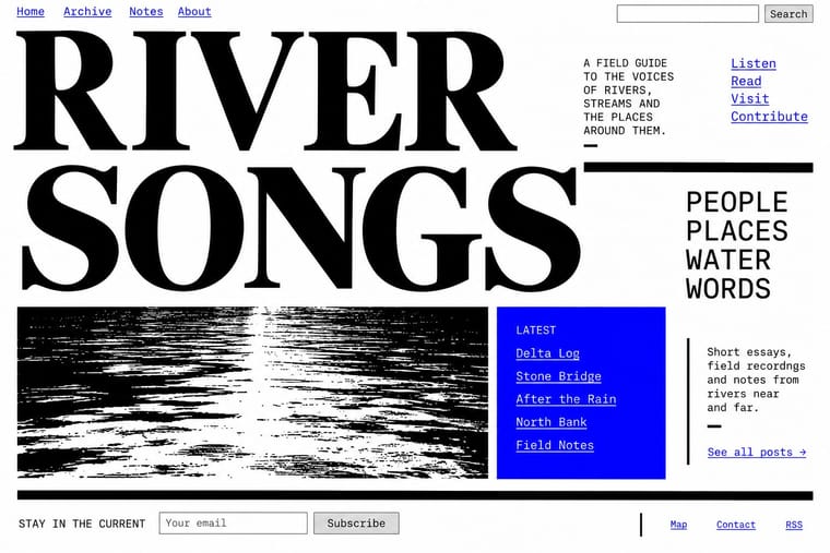
05
More combinations
With Glassmorphism
- Dark Tech Minimalism Pairs well · On near-black grounds, a single glass pane with a 1px light border and a soft glow adds depth without clutter.
- Risograph & Indie Print Culture Contrasts · Riso grain and misregistered spot inks offer a tactile print counterpoint to pristine digital translucency.
- Y2K Futurism Pairs well · Add Y2K iridescent sheen and chrome icons to frosted panes for a playful retro-future variant.
- Fantasy User Interface (FUI) & Sci-Fi HUD Contrasts · Glassmorphism's frosted, rounded panes are soft and meant to be used. FUI's clear glass carries hard hairlines and brackets. Take glassmorphism's blur behind an FUI panel when real users have to read it.
- Metro (Microsoft Design Language) Contrasts · Translucent depth against opaque flat colour blocks; use blur sparingly to soften an overly stark tile wall.
- Claymorphism & Soft 3D Pairs well · Set opaque clay icons on or behind frosted glass panes: the blur gives the toys a layered backdrop, and the solid objects anchor translucent cards that would otherwise drift.
- Frutiger Aero Pairs well · Glassmorphism is its flatter heir; reintroduce a touch of Aero gloss and nature photography to warm up frosted-glass UI.
- Material Design Pairs well · Replace opaque sheets with frosted panes at the highest elevations (dialogs, navigation) so the stack stays legible over imagery.
With Brutalist Web Design
- International Typographic Style Pairs well · Pair raw HTML with a strict Swiss grid and one grotesque so brutalism reads as intentional rather than broken.
- Corporate Memphis Contrasts · Corporate Memphis is the friendly corporate gloss brutalism rejects; quote it ironically to sharpen a critique.
- Punk & DIY Zine Pairs well · Borrow zine cut-and-paste attitude: collide screenshots, default fonts and scrawled notes on one page.
- Frutiger Aero Contrasts · Raw HTML against bubbly gloss is a sharp foil for ironic or nostalgic web projects.
- Glitch Art & Datamosh Graphics Pairs well · Both put the machinery on show; set corrupted images on a raw-HTML page of default fonts so the code and the broken pictures make one argument about the medium.
- Internet Ugly & Meme Vernacular Pairs well · Put MS Paint drawings and image macros on a raw-HTML page of default fonts and blue links; both treat software defaults as honesty rather than lack of taste.
- Flash-Era Web Design (Flash Portfolio Sites) Contrasts · Raw, static HTML defaults against the fully art-directed animated stage.
- Material Design Contrasts · Where Material hides structure behind polished components, brutalism exposes it; one raw, default-styled element signals 'under the hood' in a polished product.