Style combination · Pairs well
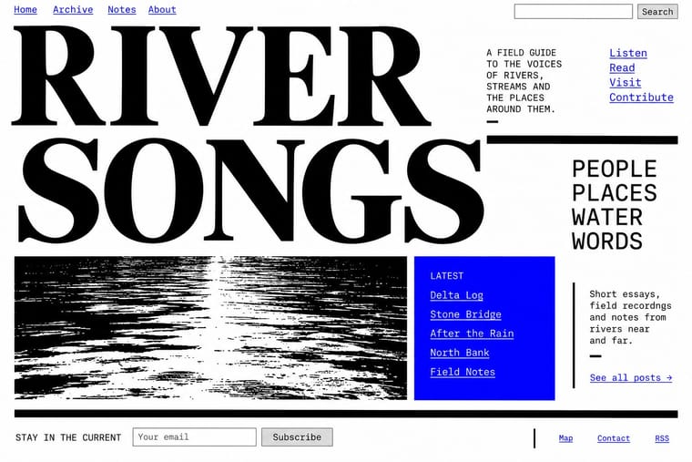
Punk × Brutalist Web Design
Borrow zine cut-and-paste attitude: collide screenshots, default fonts and scrawled notes on one page.
01
What each style brings
Each part of the design comes from the style with the stronger say in it, and each style gives at least two.
Punk & DIY Zine Brutalist Web Design
- Type from Punk
- Colour from Brutalist Web Design
- Form from Brutalist Web Design
- Composition from Punk
- Surface from Punk
02
The type
Open fonts standing in for each style’s own type, which is often hand-drawn or commercial.
Text · Brutalist Web Design
A reaction against templated, conversion-optimised web design that exposes the raw materials of the browser: default system fonts, blue underlined links, visible borders, unstyled forms and plain document flow. Named after architectural Brutalism by Pascal Deville's survey site brutalistwebsites.com (2014), it ranges from functional austerity to deliberately abrasive antidesign.
Courier Prime; Brutalist Web Design used Times New Roman and Courier New and system monospace
03
The colours
The ground and leading colours come from Brutalist Web Design, with a counter-accent from Punk. The ink reads on the ground at 4.5:1 or more.
Punk & DIY Zine Brutalist Web Design
-
#ffffffground · 36% -
#000000ink · 14% -
#ff0000accent · 18% -
#f7e400accent · 14% -
#0000eeaccent · 10% -
#ff2fa0accent · 8%
As CSS
:root {
  --ground: #ffffff;
  --ink: #000000;
  --accent-1: #ff0000;
  --accent-2: #f7e400;
  --accent-3: #0000ee;
  --accent-4: #ff2fa0;
  --font-display: "Rock Salt", cursive;
  --font-text: "Courier Prime", monospace;
}
04
The two styles
05
More combinations
With Punk
- Russian Constructivism Pairs well · Borrow Constructivist diagonals and red-and-black bars to give punk collage the agitprop structure post-punk sleeves later adopted.
- Risograph & Indie Print Culture Pairs well · Run punk collages through a riso in fluoro pink and black to keep the DIY ethic while gaining richer, layered colour.
- Corporate Identity Modernism Contrasts · Deface a clean corporate identity with xerox collage to make the critique of polish and authority explicit.
- Frutiger Aero Contrasts · Glossy optimism is everything punk rejects; one torn xerox fragment on an aero gradient reads as instant sabotage.
- Fluxus Graphics (Maciunas) Contrasts · Both mix found type with appropriated pictures, but punk tears and photocopies while Fluxus keeps a clean offset black, justified blocks and a tight edge-to-edge grid; use the Fluxus version when cheap materials should still look ordered.
- Natural Wine Label Art Pairs well · Alice Feiring calls the earlier natural-wine scene punk rock: of Gut Oggau she says 'This is where things grow up and stop being so punk rock' (Punch, 2021). Take punk's refusal of professional polish but drop the collage and the anger: one felt-pen picture on a white label carries the same do-it-yourself stance in a friendlier voice.
- Grapus (French Militant Graphic Collective) Contrasts · Both scribble over photographs, but punk's photocopied blacks and ransom-note type are cheap and nihilist, while Grapus prints bright offset colour, mostly on white, in an optimistic, party-backed voice.
- Situationist Détournement Graphics Contrasts · Punk reprised the situationist prank in the late 1970s, but it packs torn photocopies and mixed type into crowded pages; détournement keeps a few recognisable fragments and lets each one say the opposite of what it said. Borrow the rewritten balloon when a punk layout needs a sharper argument.
With Brutalist Web Design
- International Typographic Style Pairs well · Pair raw HTML with a strict Swiss grid and one grotesque so brutalism reads as intentional rather than broken.
- Glassmorphism Contrasts · Glass's layered translucency is everything brutalism strips away; use the contrast to decide how much polish a product really needs.
- Corporate Memphis Contrasts · Corporate Memphis is the friendly corporate gloss brutalism rejects; quote it ironically to sharpen a critique.
- Frutiger Aero Contrasts · Raw HTML against bubbly gloss is a sharp foil for ironic or nostalgic web projects.
- Glitch Art & Datamosh Graphics Pairs well · Both put the machinery on show; set corrupted images on a raw-HTML page of default fonts so the code and the broken pictures make one argument about the medium.
- Internet Ugly & Meme Vernacular Pairs well · Put MS Paint drawings and image macros on a raw-HTML page of default fonts and blue links; both treat software defaults as honesty rather than lack of taste.
- Flash-Era Web Design (Flash Portfolio Sites) Contrasts · Raw, static HTML defaults against the fully art-directed animated stage.
- Material Design Contrasts · Where Material hides structure behind polished components, brutalism exposes it; one raw, default-styled element signals 'under the hood' in a polished product.