Style combination · Contrasts
Acid Graphics × Neo-Swiss Revival
Acid graphics' chrome chaos is the opposite pole; one liquid-metal element can puncture a too-polite grid.
Set a single liquid-chrome wordmark inside a clean neo-Swiss grid so information stays legible around the spectacle.
01
What each style brings
Each part of the design comes from the style with the stronger say in it, and each style gives at least two.
Acid Graphics / New Ugly Neo-Swiss Revival
- Type from Neo-Swiss Revival
- Colour from Acid Graphics
- Form from Acid Graphics
- Composition from Neo-Swiss Revival
- Surface from Acid Graphics
02
The type
Open fonts standing in for each style’s own type, which is often hand-drawn or commercial.
Display · Neo-Swiss Revival
Form
Inter Tight, standing in for Neue Haas Grotesk (Christian Schwartz revival)
Text · Acid Graphics
A late-2010s club and poster style that updates 1990s rave graphics with modern 3D tools: liquid-chrome and melting lettering, neo-tribal spikes, wireframes, op-art patterns and acid-green palettes on black, mixed with blackletter and stretched grotesques. Associated with David Rudnick, Studio Cryo and Anja Kaiser and collected on Instagram's @acidgraphix, it overlaps with the 'New Ugly' turn towards deliberate antidesign.
VT323; Acid Graphics used Liquid-chrome and melted custom lettering and Blackletter and neo-gothic display
03
The colours
The ground and leading colours come from Acid Graphics, with a counter-accent from Neo-Swiss Revival. The ink reads on the ground at 4.5:1 or more.
Acid Graphics / New Ugly Neo-Swiss Revival
-
#000000ground · 36% -
#ffffffink · 14% -
#ccff00accent · 18% -
#ff4a1caccent · 14% -
#ff1ad9accent · 10% -
#1d3bffaccent · 8%
As CSS
:root {
  --ground: #000000;
  --ink: #ffffff;
  --accent-1: #ccff00;
  --accent-2: #ff4a1c;
  --accent-3: #ff1ad9;
  --accent-4: #1d3bff;
  --font-display: "Inter Tight", sans-serif;
  --font-text: "VT323", monospace;
}
04
The two styles
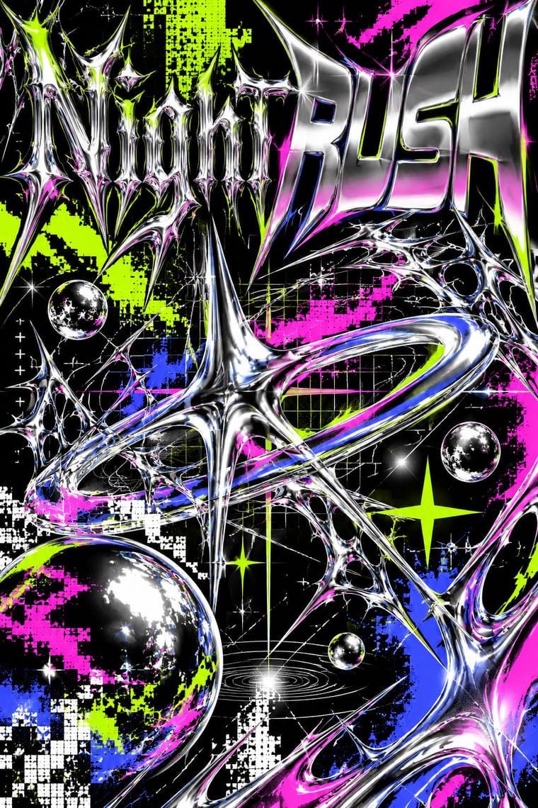
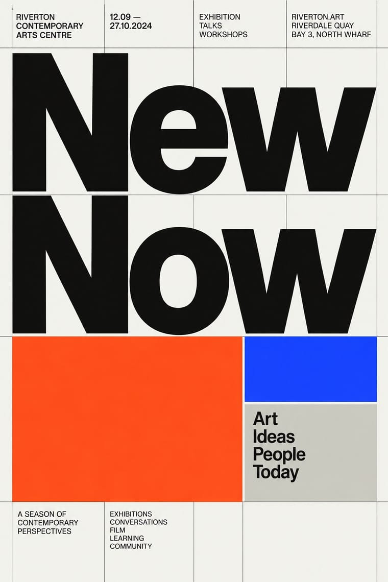
05
More combinations
With Acid Graphics
- Graffiti & Hip-Hop Graphics Pairs well · Graffiti wildstyle letter structures translate naturally into chrome 3D renders for gig posters and merch.
- Corporate Memphis Contrasts · Acid graphics defines itself against Corporate Memphis' friendliness; lean into the contrast to signal underground credibility.
- Techno-Futurist Graphics Pairs well · Borrow The Designers Republic's corporate-parody logos and tiny technical captions to give acid layouts a systematic backbone.
- Rave & Acid House Graphics Pairs well · Acid graphics is rave's digital heir; reuse the chrome logotype and fluorescent-on-black palette with contemporary 3D tools.
- Post-Binary Typography (Bye Bye Binary and Inclusive French Type) Pairs well · The collective's banners share Acid Graphics' blackletter, spiky stars, gradients and chrome-like lettering; borrow that repertoire for a manifesto banner or flyer, but keep the post-binary glyph legible as the subject rather than the surface effect.
- Glitch Art & Datamosh Graphics Contrasts · Acid graphics renders polished chrome and adds glitch as a finish; glitch art breaks the file and keeps what comes out. Decide whether a brief wants spectacle or exposure.
- Gothic Blackletter & Fraktur Tradition Pairs well · Its club-poster revival: acid graphics mixes blackletter with liquid chrome, ultra-wide grotesques and pixel faces. Render one broken-letter wordmark in chrome on black and leave the parchment, rubrics and justified page behind.
- PC Music Graphics Contrasts · Neighbours in the late 2010s club scene, but acid graphics crowd chrome, blackletter and neon on black, where PC Music isolates one clean object on a plain field.
With Neo-Swiss Revival
- Risograph & Indie Print Culture Pairs well · Print neo-Swiss posters in two riso spot inks to add grain and warmth to a strict grid.
- Brutalist Web Design Pairs well · Expose neo-Swiss grids with raw HTML defaults and visible borders for a stripped, contemporary web voice.
- Victorian Letterpress & Wood Type Contrasts · Victorian wood-type eclecticism is the history Swiss typography rejected; a single wood-type headline can warm a cold grid.
- Seoul Independent Graphic Design (Small-Studio Scene) Contrasts · The Seoul studios share Neo-Swiss's Dutch and Swiss roots (Mevis & Van Deursen, Jude Kang's studies in Switzerland, Favorit Hangul extending the Swiss foundry Dinamo's Favorit), but Neo-Swiss sets one Latin grotesque flush left on a modular grid, while the Seoul studios centre their text, repeat circles and letters as objects, and make Hangul, reshaped and set beside Latin, the main material.
- Blue Note Jazz Sleeve Modernism Contrasts · The atlas's nearest genome: both blow a grotesque up to fill the format on a white ground with one signal colour, but Swiss revival locks it to a modular grid, flush left, in one neo-grotesque; Blue Note crops and tints a documentary photograph, mixes in Ultra Bodoni and Clarendon, and squeezes, warps and runs words off the edge by eye. Choose Blue Note when the type should swing rather than align.
- Lucerne Poster Scene (Neubad & Südpol Posters) Contrasts · Neo-Swiss keeps the grotesque intact on a modular grid for identities and the web; Lucerne keeps the grotesque only for the small print and distorts the title itself, poster by poster. Choose neo-Swiss for a system, Lucerne for a one-off event.
- Emigre & Early Digital Type Contrasts · Neo-Swiss restraint is the foil to Emigre's typographic overload; one Emigre display face in a neo-Swiss layout adds personality.
- Swiss Punk / New Wave Typography Pairs well · Borrow New Wave's letterspacing and stepped lines to make a contemporary neo-Swiss grid feel alive.