Style combination · Contrasts
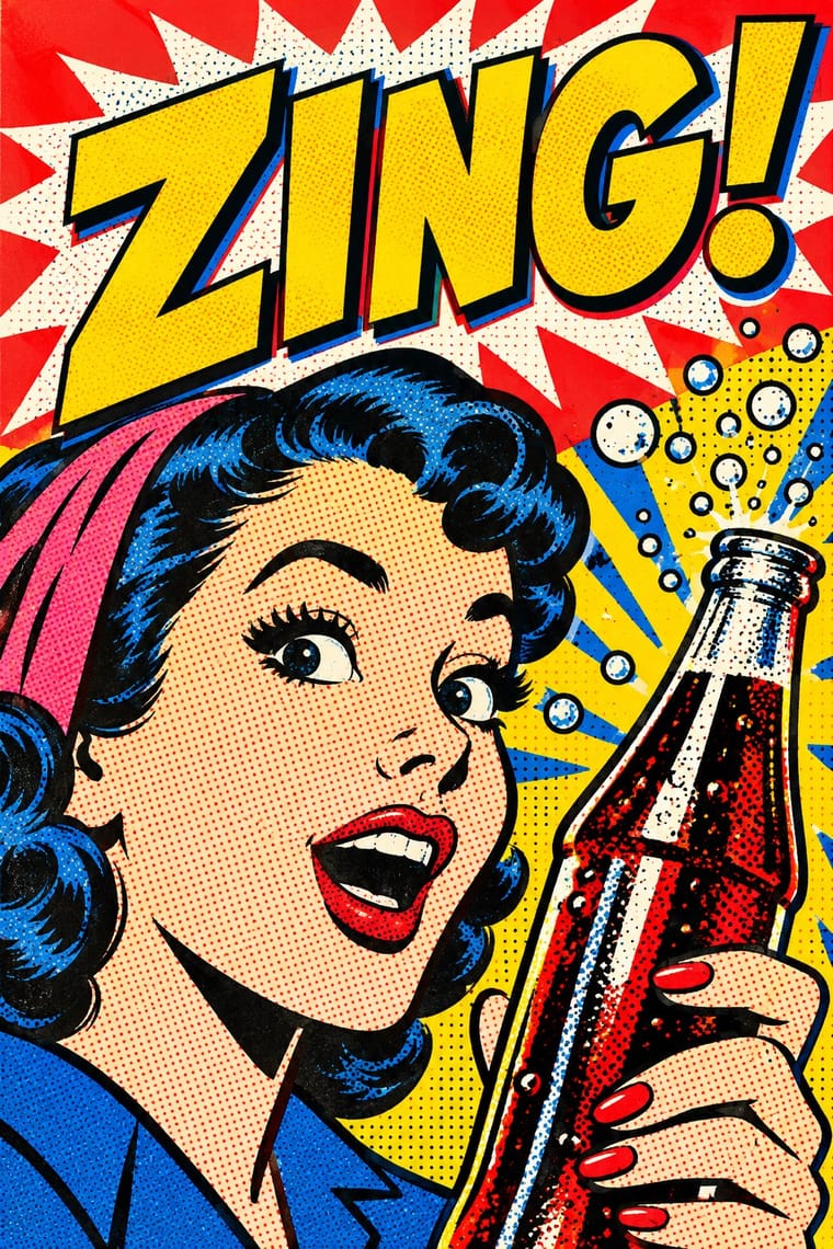
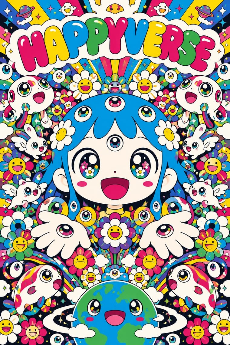
Pop Art Graphics × Superflat
Both turn commodities into art; take Pop's repetition and frontal commodity but swap its halftone and off-register silkscreen for Superflat's smooth vector fills and anime characters, so the print process disappears.
01
What each style brings
Each part of the design comes from the style with the stronger say in it, and each style gives at least two.
Pop Art Graphics Superflat
- Type from Pop Art Graphics
- Colour from Superflat
- Form from Superflat
- Composition from Pop Art Graphics
- Surface from Pop Art Graphics
-
Superflat avoids halftone & ben-day dots: this is where the two pull against each other, which is the point of the contrast.
02
The type
Open fonts standing in for each style’s own type, which is often hand-drawn or commercial.
Display · Pop Art Graphics
Okay
Bangers; Pop Art Graphics used Comic-book hand lettering and Franklin Gothic
Text · Superflat
The flat, saturated, cartoon-crowded look that Takashi Murakami named in his exhibition and manifesto Superflat (Tokyo, 2000; US tour 2001). It draws a line from Edo painting and prints to postwar anime and manga, and flattens high and low, art and merchandise into one plane. Smiling flowers, many-eyed characters and anime figures come in unshaded polychrome, smooth and glossy, cute and grotesque at once, sold as handbags and album covers as well as paintings. This entry follows the drawn core of Murakami and his Kaikai Kiki circle; the shows also held photography, video and sculpture.
Zen Maru Gothic; Superflat used Letters drawn into the character and Many-coloured repeated monogram
03
The colours
The ground and leading colours come from Superflat, with a counter-accent from Pop Art Graphics. The ink reads on the ground at 4.5:1 or more.
Pop Art Graphics Superflat
-
#fbfaf5ground · 36% -
#1a1a1aink · 14% -
#ffd900accent · 18% -
#00a0e9accent · 14% -
#e10600accent · 10% -
#e4007faccent · 8%
As CSS
:root {
  --ground: #fbfaf5;
  --ink: #1a1a1a;
  --accent-1: #ffd900;
  --accent-2: #00a0e9;
  --accent-3: #e10600;
  --accent-4: #e4007f;
  --font-display: "Bangers", sans-serif;
  --font-text: "Zen Maru Gothic", sans-serif;
}
Use it with care
Superflat: Some canonical works use explicit otaku sexual imagery, such as Murakami's My Lonesome Cowboy (1998), and associated artists engage with lolicon art: Mr. describes himself as a lolicon and Henmaru Machino parodies it; never sexualise childlike figures. The mushroom-cloud skulls of Murakami's Time Bokan works and the title Little Boy, the name of the Hiroshima bomb, refer to the atomic bombings, and critics such as Dong-Yeon Koh argue that this victim narrative obscures Japanese aggression in China and Korea; do not use mushroom clouds or skulls as cute decoration. Handle borrowed Buddhist iconography and phrases, such as Kannon, with respect, and draw original characters and flowers: Mr. DOB, the smiling flowers and the Louis Vuitton monogram are owned designs.
04
The two styles
05
More combinations
With Pop Art Graphics
- International Typographic Style Contrasts · Set one loud appropriated Pop image inside a strict grid with a neutral grotesque so the irony reads as deliberate rather than chaotic.
- Ma & Wabi-sabi Aesthetics Contrasts · Where Pop multiplies glossy commodities, wabi-sabi values the single worn object; use one to puncture the mood of the other.
- Guna Mola Pairs well · Guna women redraw brand logos and cartoons (RCA Victor, Bullwinkle) in reverse appliqué; let that act of translation inspire Pop work, but buy or commission molas rather than imitating them.
- Neo-Brutalism Pairs well · Lift Pop's thick black outlines and flat primaries into UI cards and buttons for a confident, comic-strip interface.
- Risograph & Indie Print Culture Pairs well · Print Ben-Day dot screens in fluorescent pink and yellow riso inks to give Pop's mass-media imagery a small-run, handmade warmth.
- Screenprinted Gig & Alt-Movie Poster Pairs well · Shepard Fairey called Kozik 'the punk rock Warhol'; take Pop's appropriated cartoons and halftones and give them a gig poster's single idea and hand-lettered title.
- Finnish Bold Print (Marimekko Modernism) Pairs well · Contemporaries in saturated flat colour at a giant scale; borrow pop's isolated, enlarged object for a poster, but drop its halftone and irony to keep Marimekko's sincerity.
- Woodland School (Legend Painting) Contrasts · Both arrived in screenprint with flat colour behind a black line in the 1960s and 70s, but Pop quotes consumer images with irony and halftone, while Woodland prints carry legend and vision with none of either.
With Superflat
- Kawaii Design Contrasts · Kawaii offers sincere, simple, pastel cuteness for fancy goods; switch to Superflat when the cute should be saturated, crowded, many-eyed and ironic, a comment on consumer culture rather than a product of it.
- Minimalist Graphic Design Contrasts · One dense field of smiling flowers on an otherwise empty white page gives a minimal layout a single loud focal point without giving up its calm.
- Ukiyo-e Woodblock Prints Pairs well · Murakami traces Superflat's flatness back to Hokusai's prints; borrow the woodblock keyline, the stylised wave and the cropped composition and fill them with Superflat's saturated characters.
- Techno-Futurist Graphics Pairs well · groovisions, whose Chappie figure showed in the 2001 Superflat exhibition, links the two; set Superflat characters inside techno-futurist logos, grids and katakana captions for a slicker, more corporate parody.
- Angura Theatre Poster Contrasts · Both quote ukiyo-e and Pop from Japan, but angura crams photographs and fluorescent silkscreen into a rebellious collage while Superflat draws everything smooth and flat; set one flat Superflat character against an angura photomontage for a clash of eras.
- Story Manga (Postwar Japanese Comics) Contrasts · Murakami's Superflat lifts anime and manga figures out of the story onto one flat, glossy, polychrome plane for the gallery; story manga keeps the sequence, the depth of its backgrounds and its single black ink.
- Lo-fi Anime Aesthetic Contrasts · Both draw on anime, but superflat flattens otaku imagery into ironic, polychrome, all-over fields with no depth; choose lofi for one sincere, softly lit room with depth, and superflat when the brief wants pop density and knowing play.
- Light Novel Cover Illustration Contrasts · Murakami's fine-art quotation of the same otaku idiom, flattened and ironic, where the cover sells a book sincerely.